Upptäck över 5000+ produkter!
Streetwear & träningskläder
Upptäck produkter från över 20 varumärken
Gratis gåva för olika ordervärden
Senaste trenderna


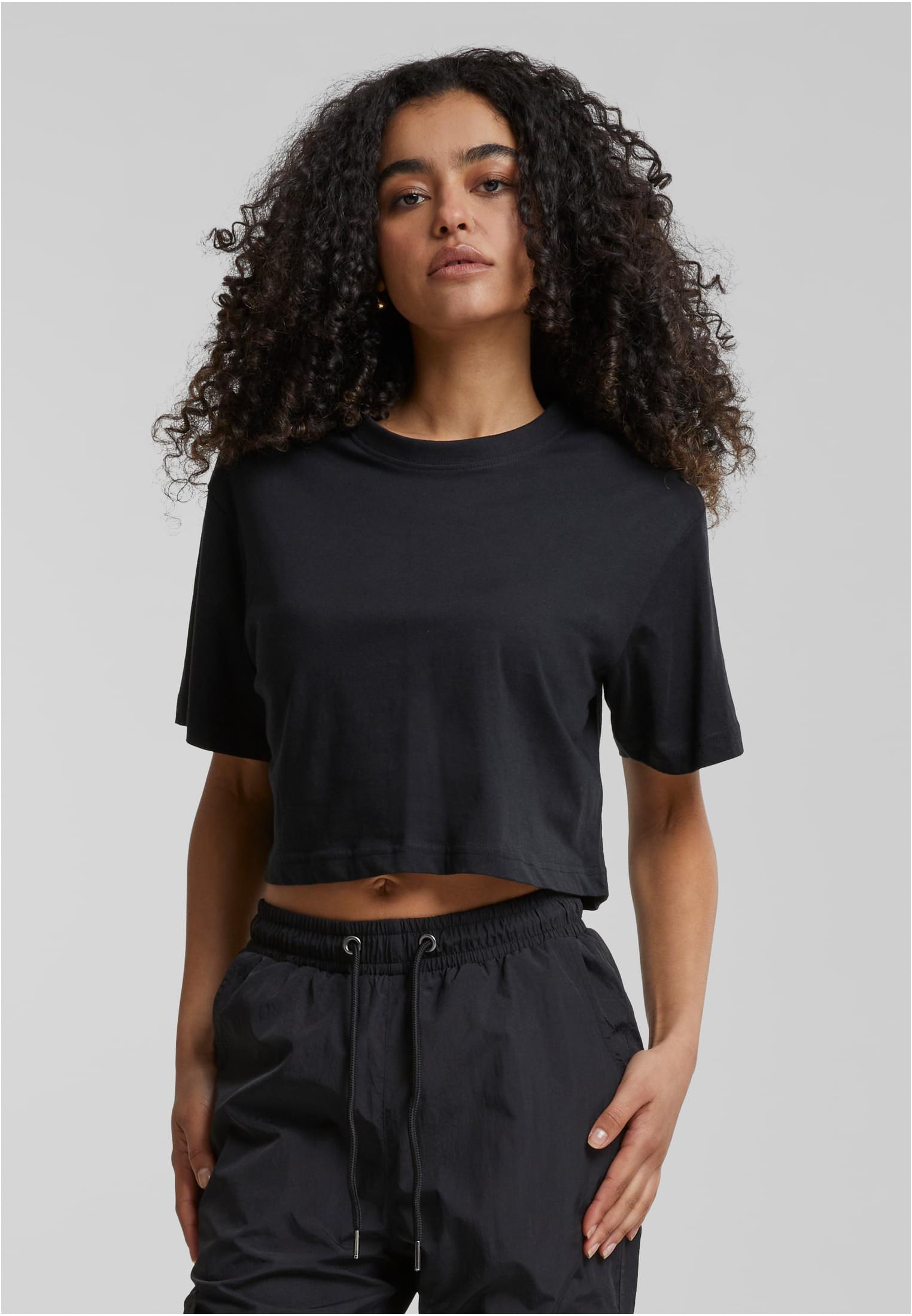
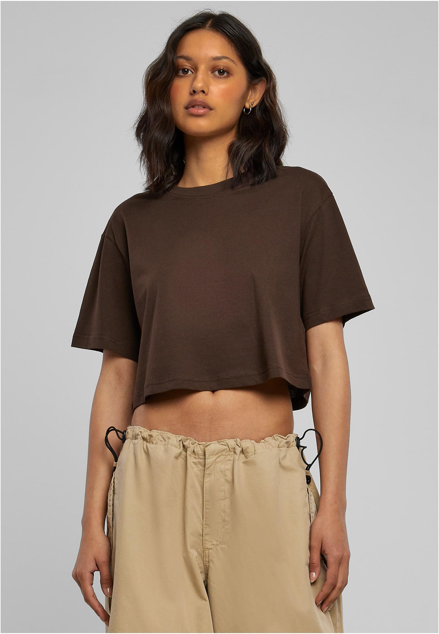
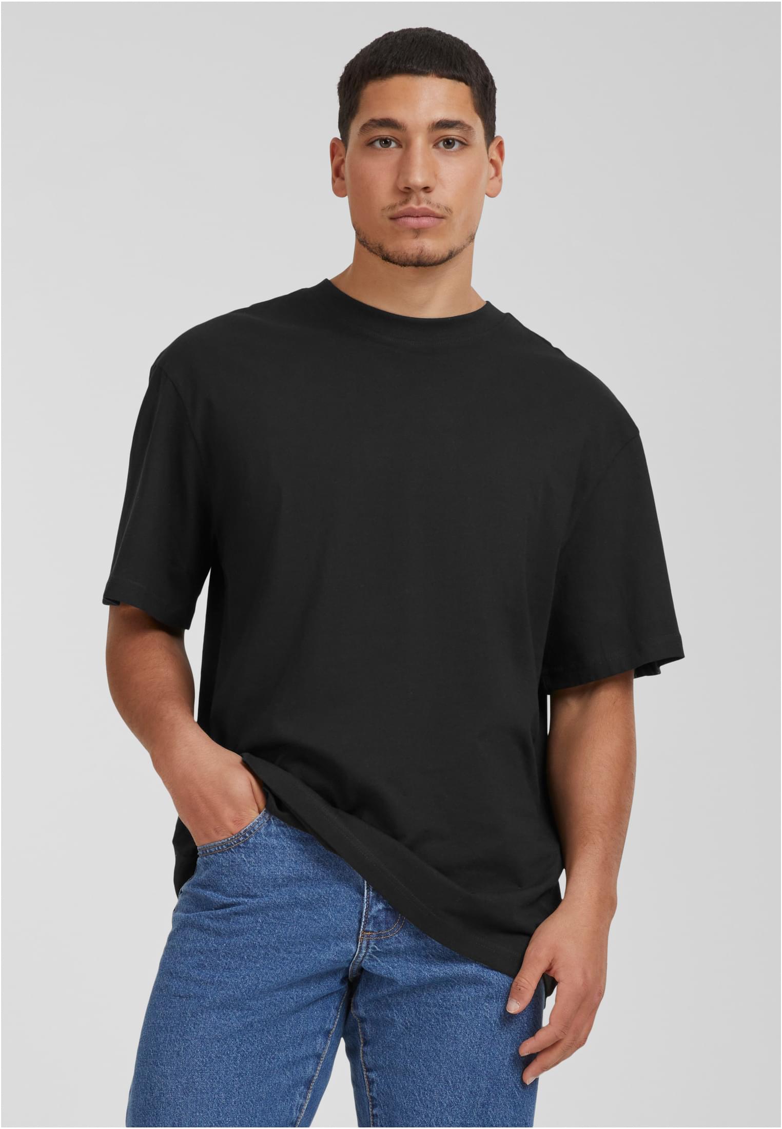
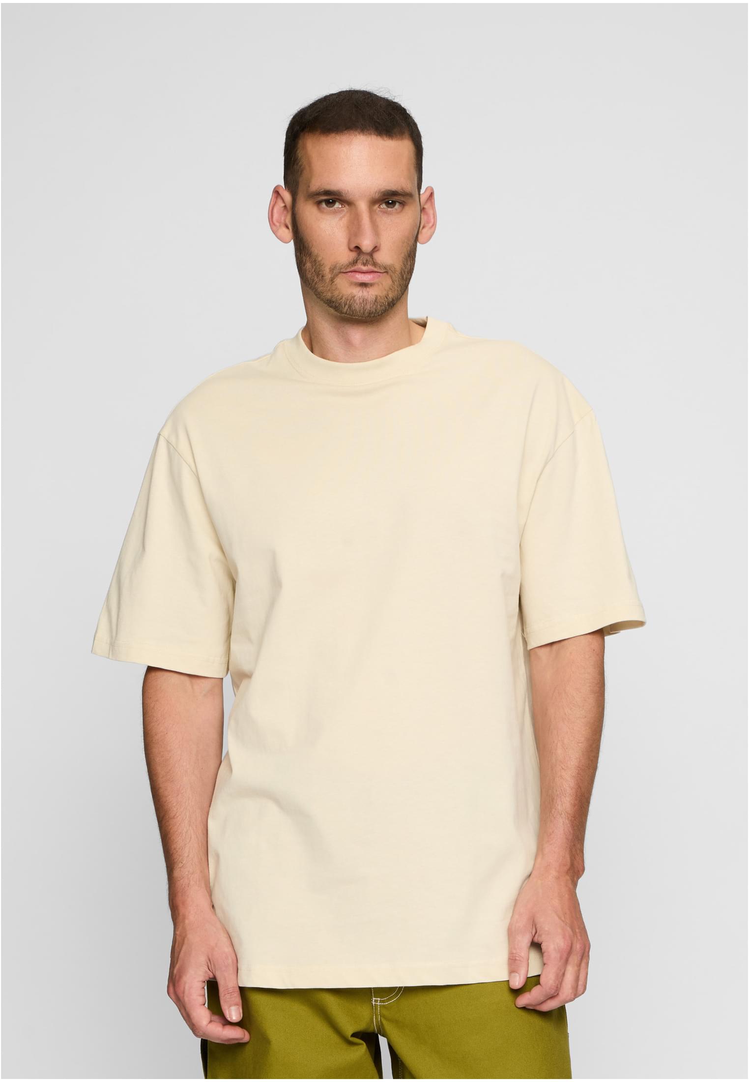
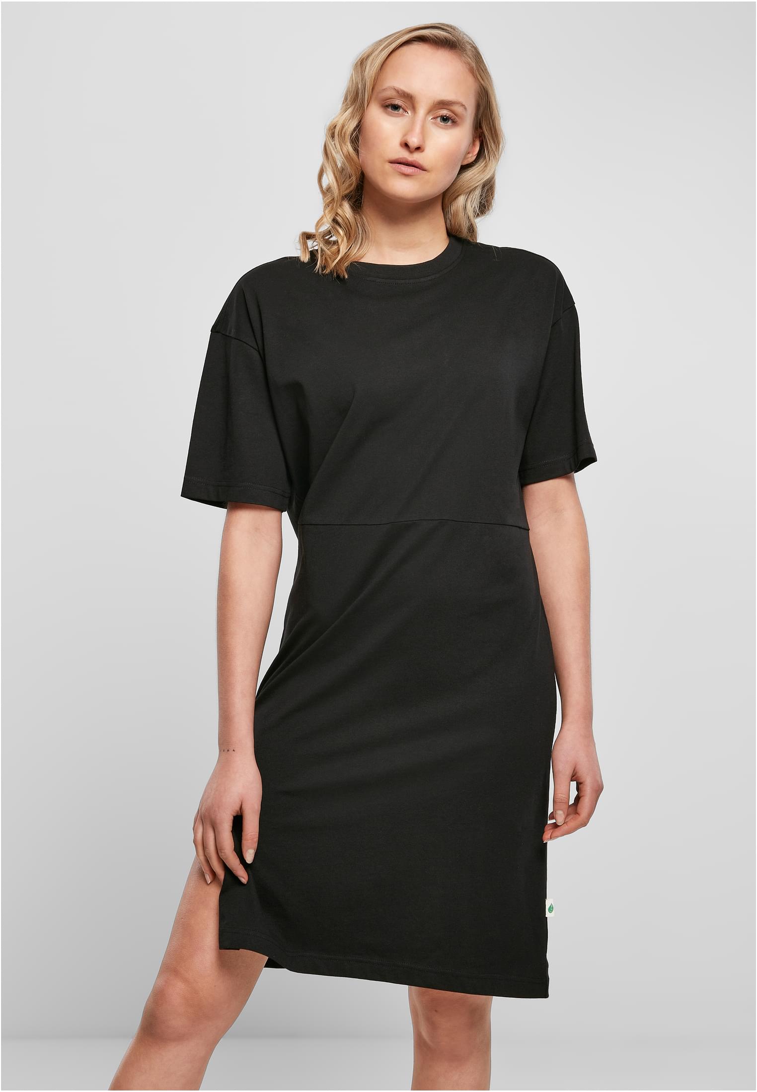
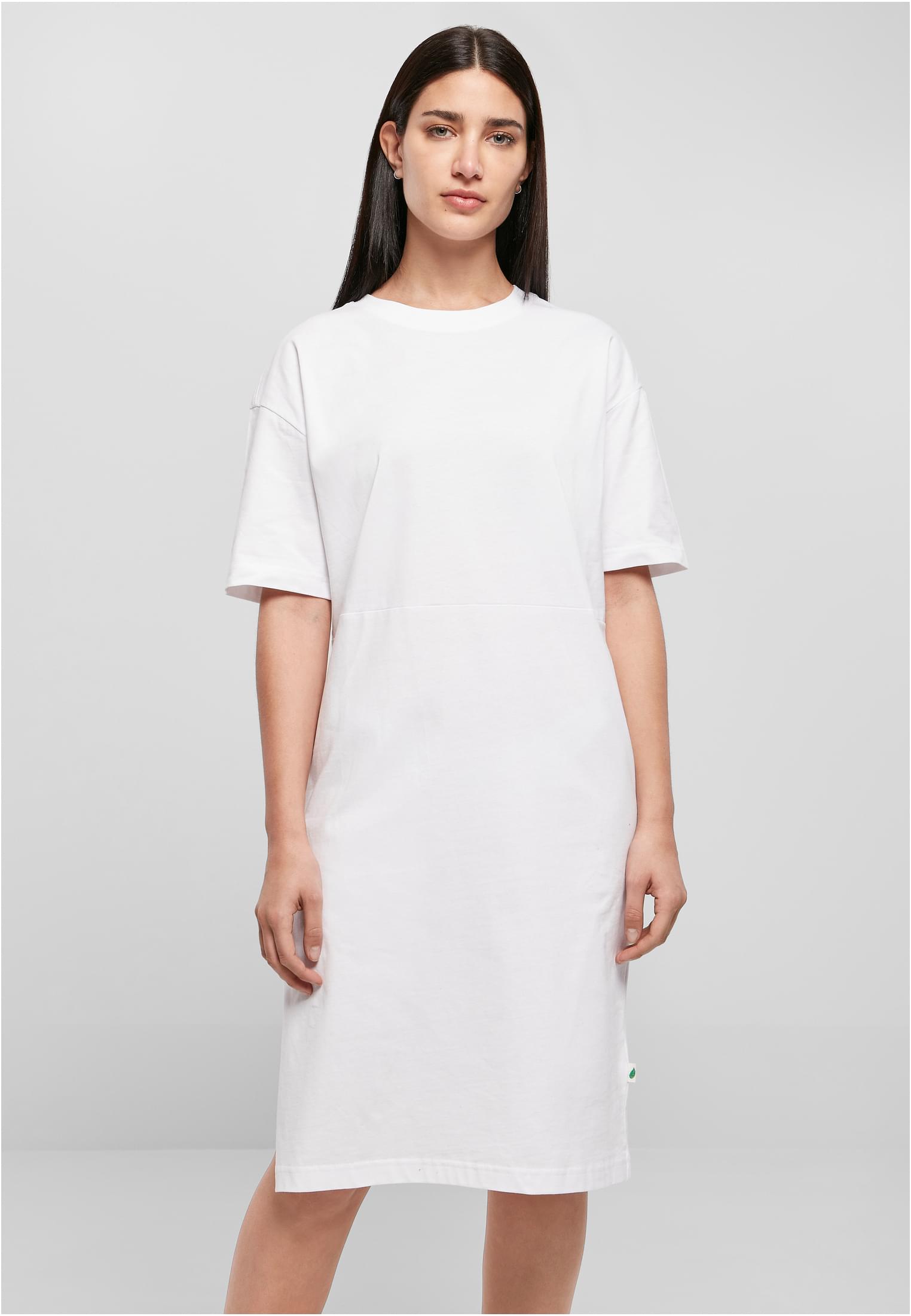
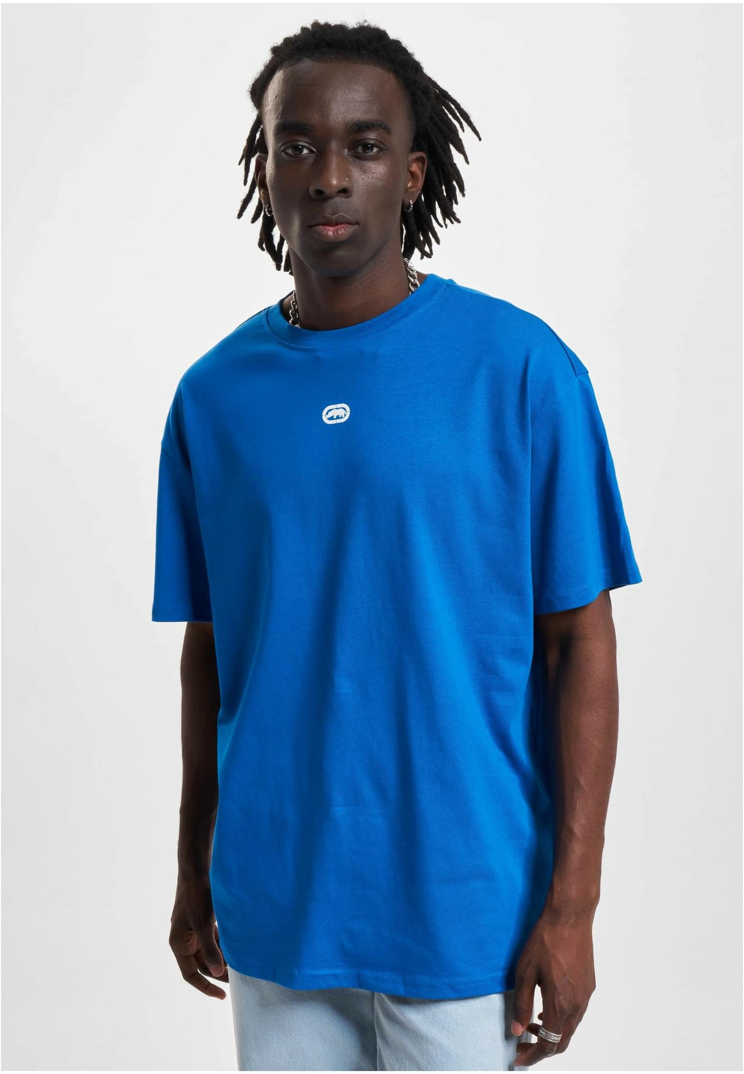
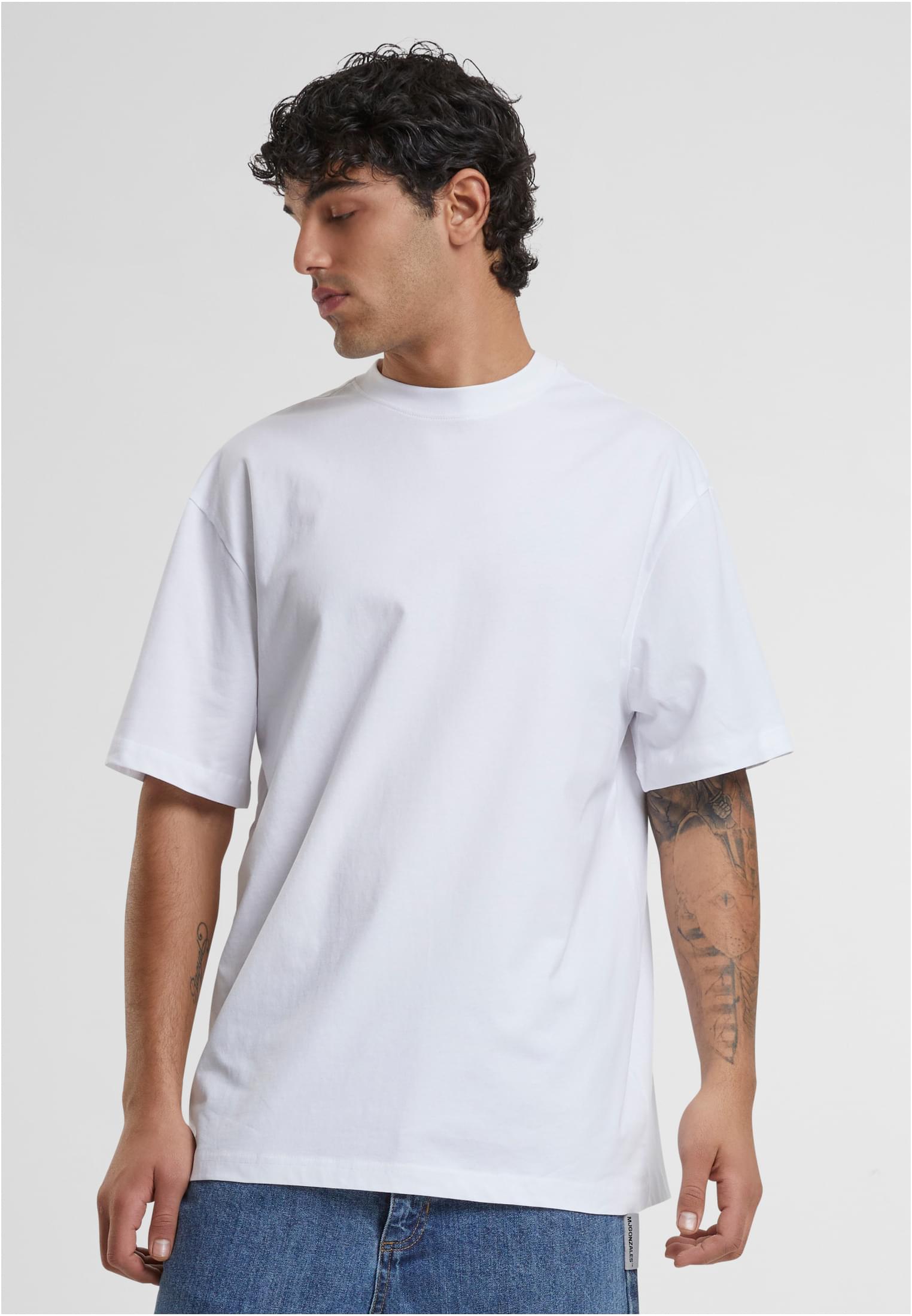
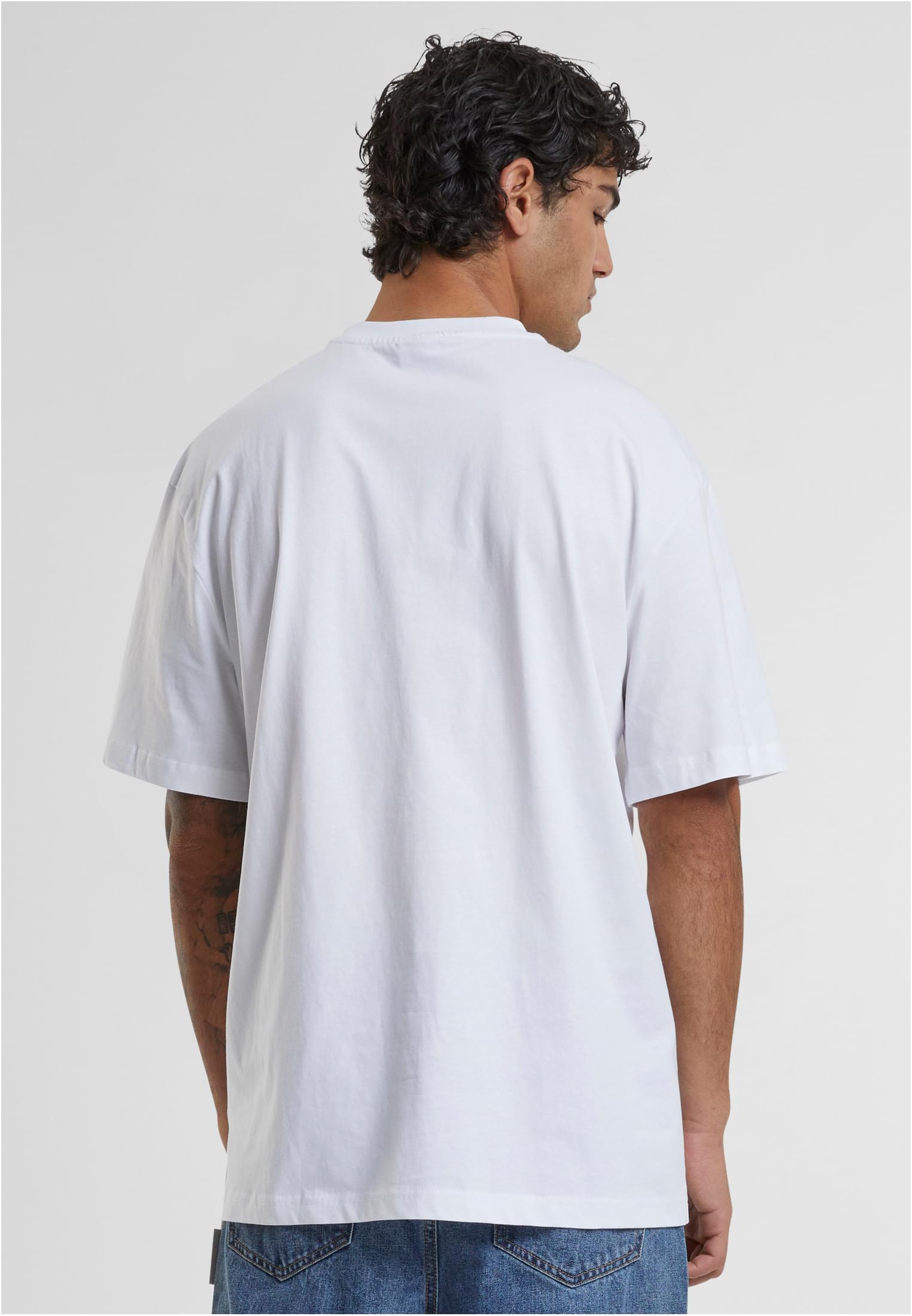
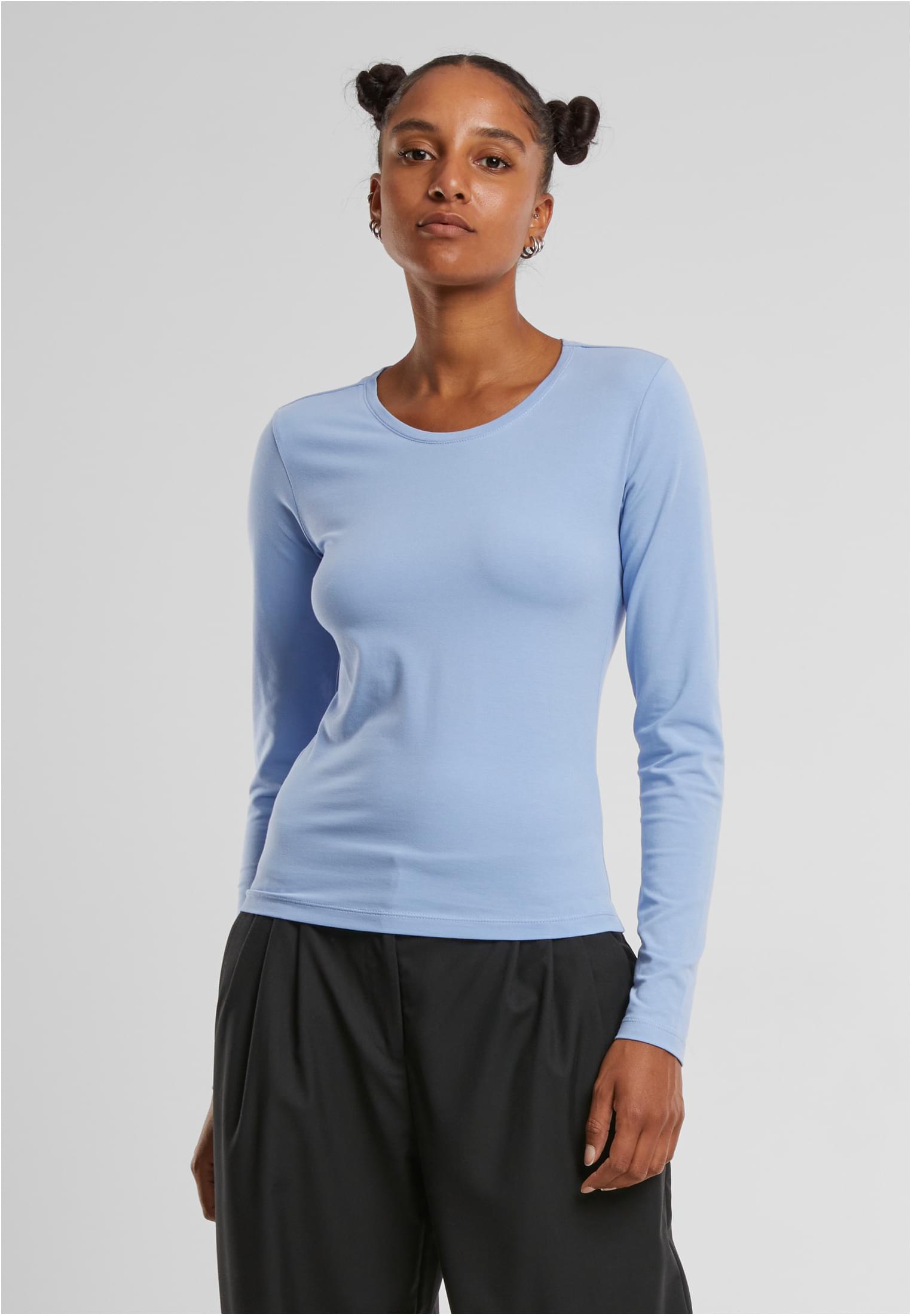
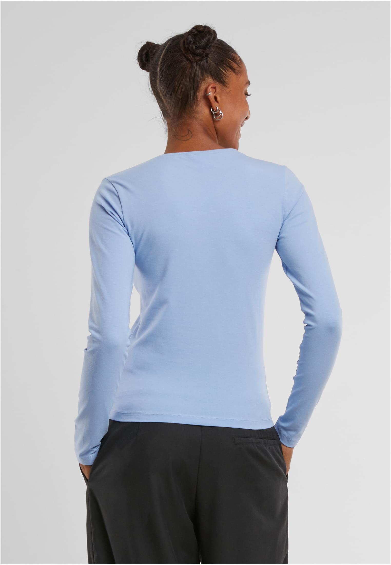
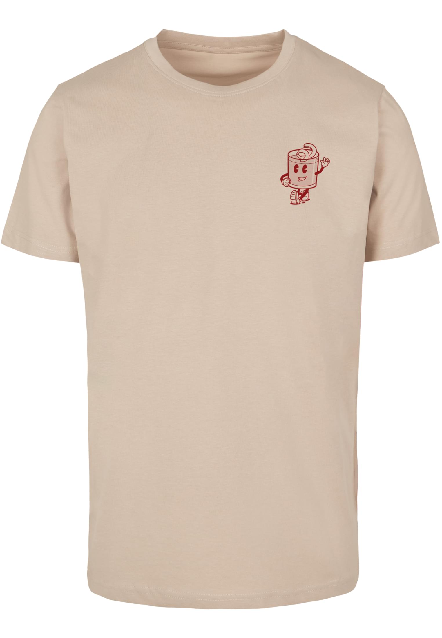
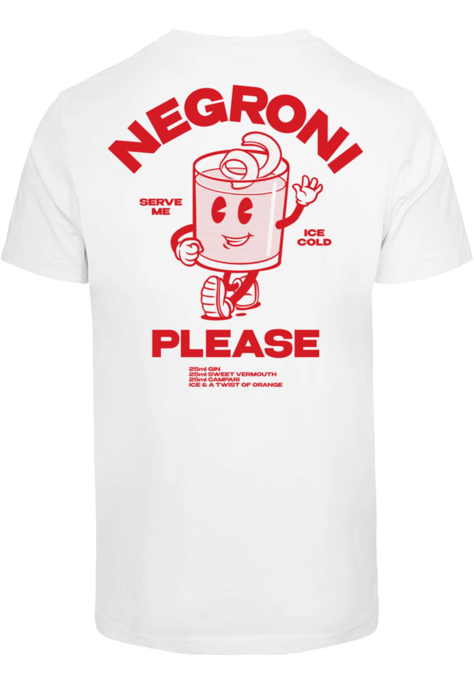
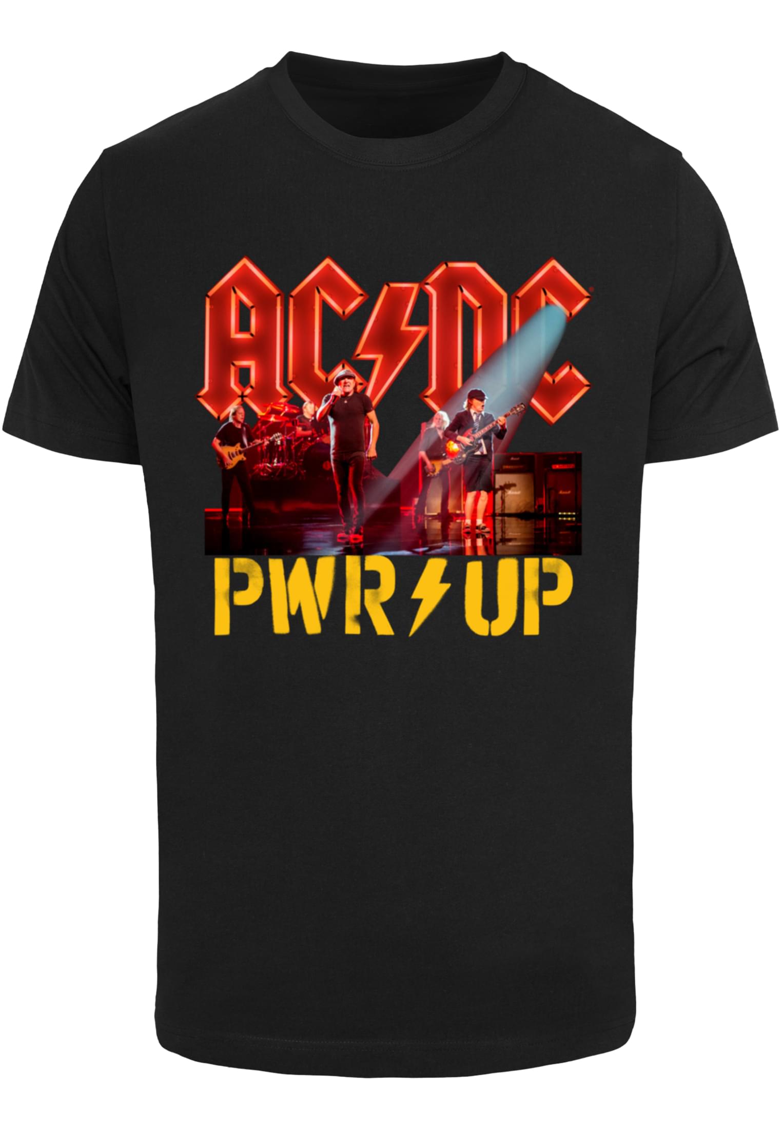
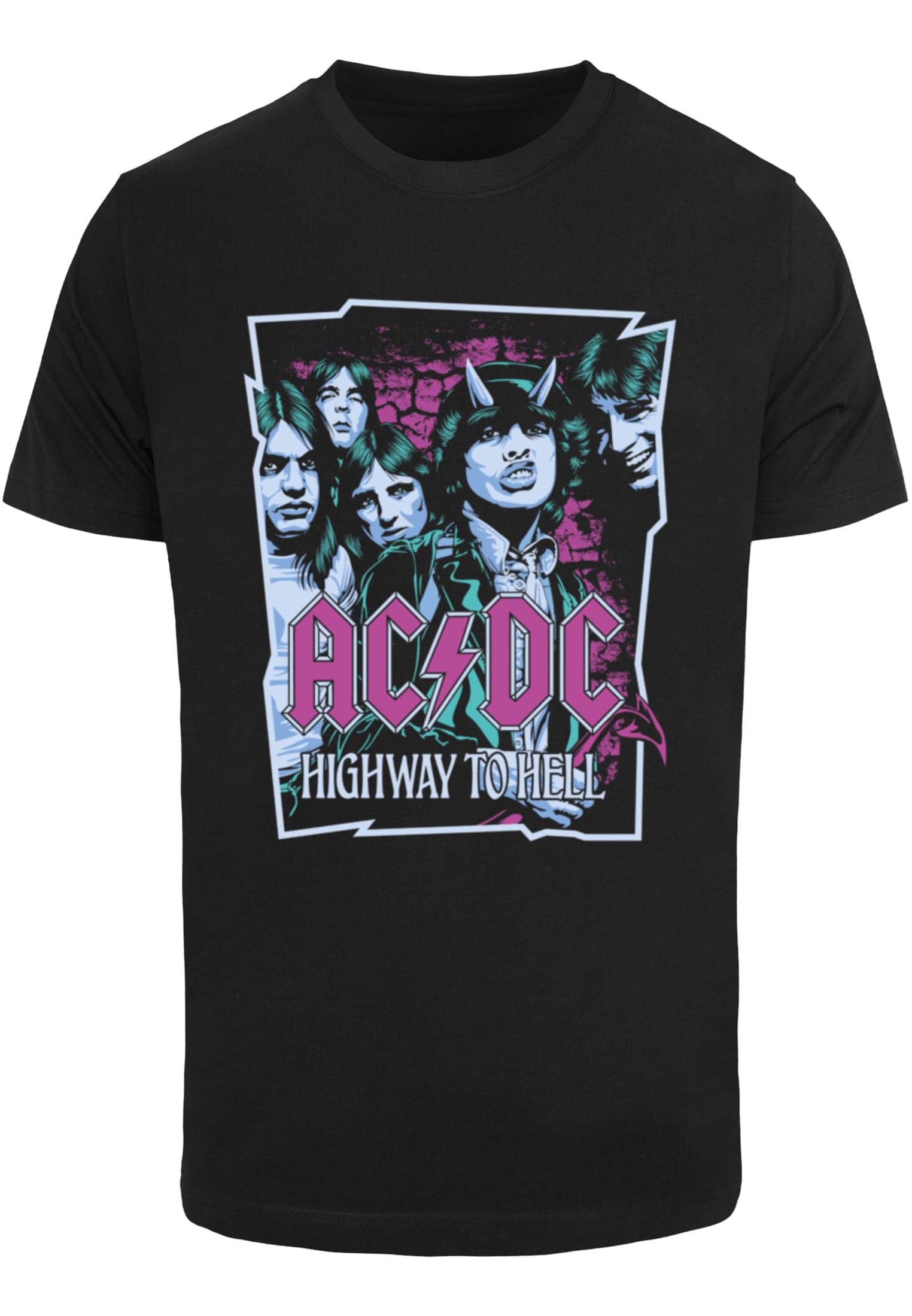
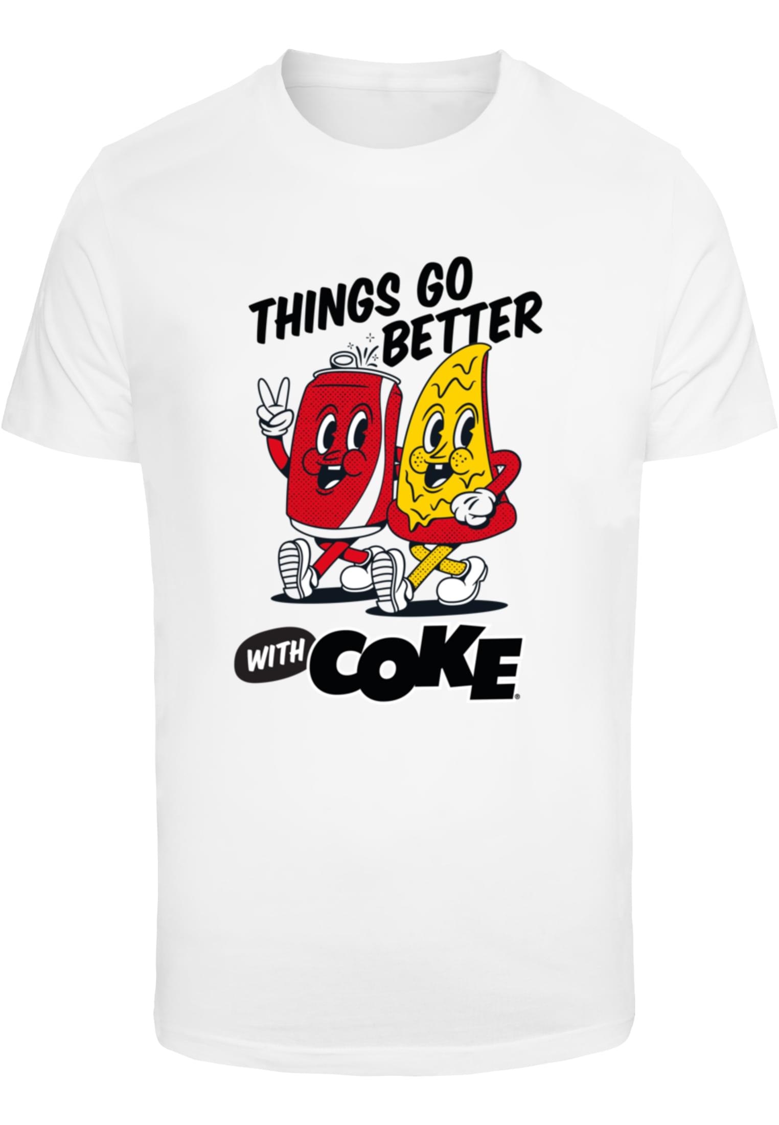
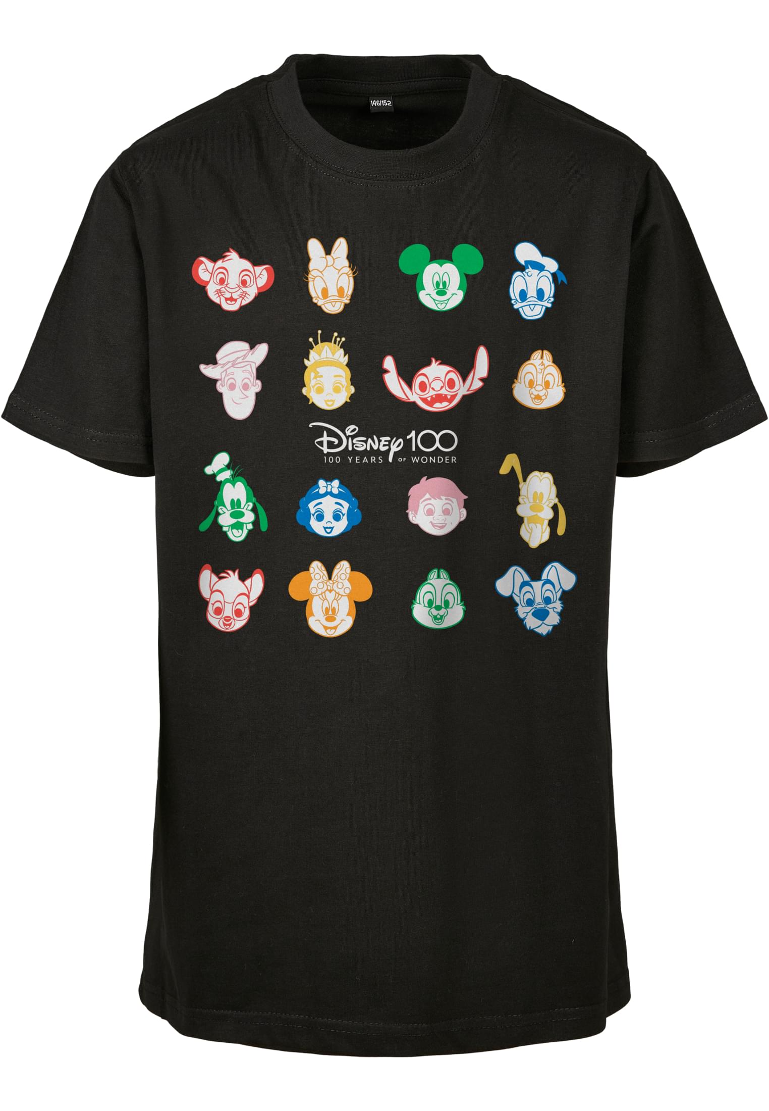
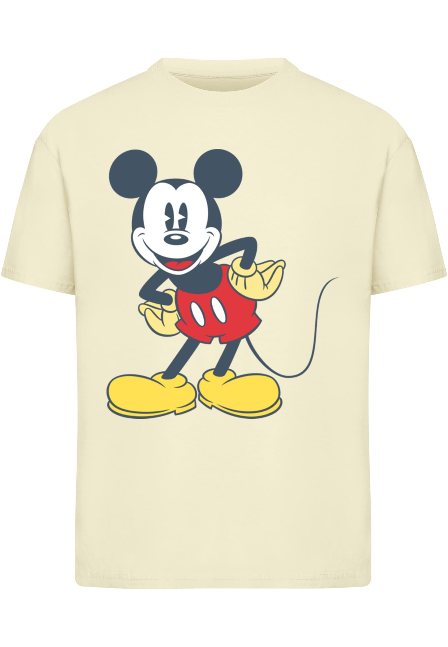
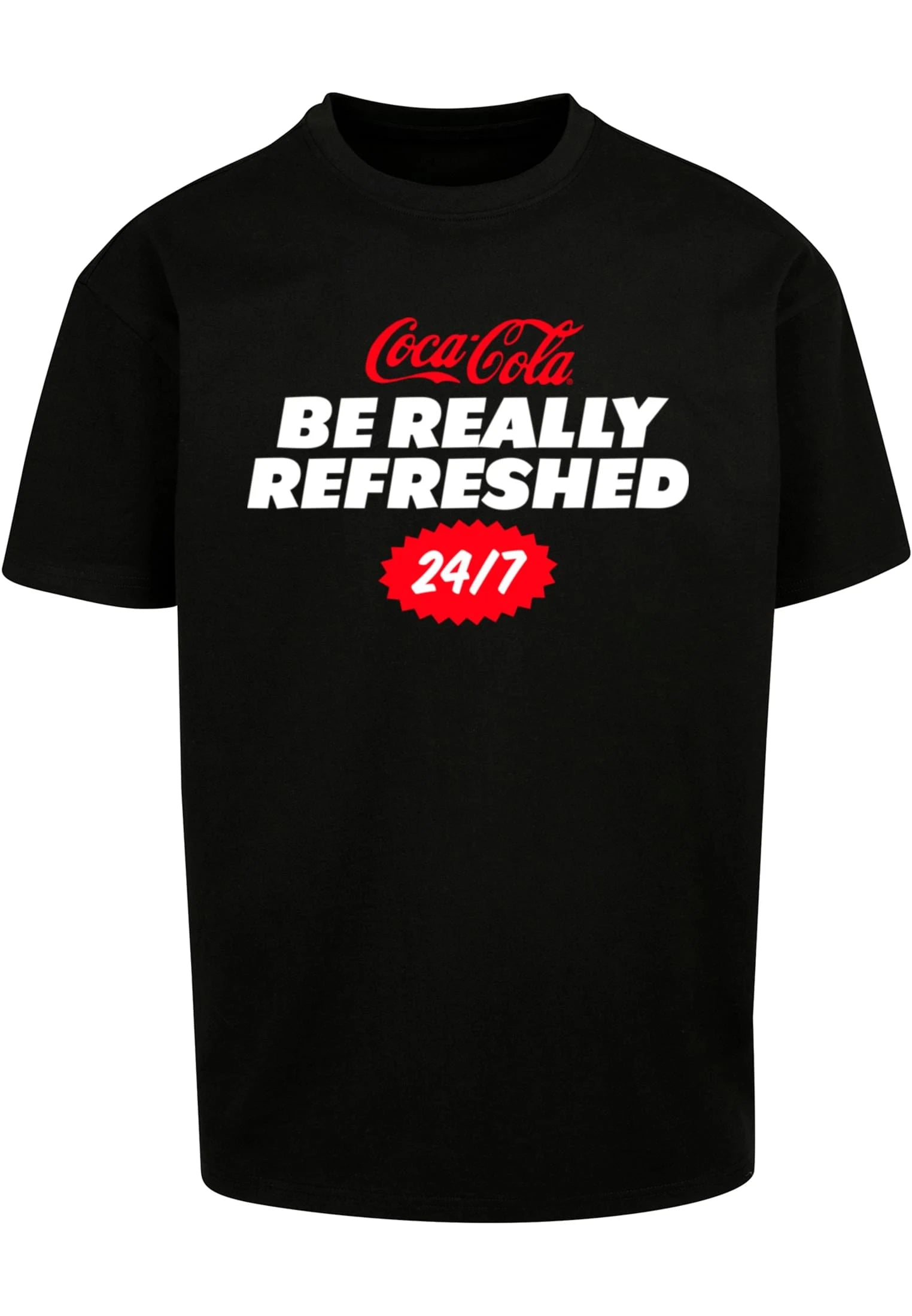
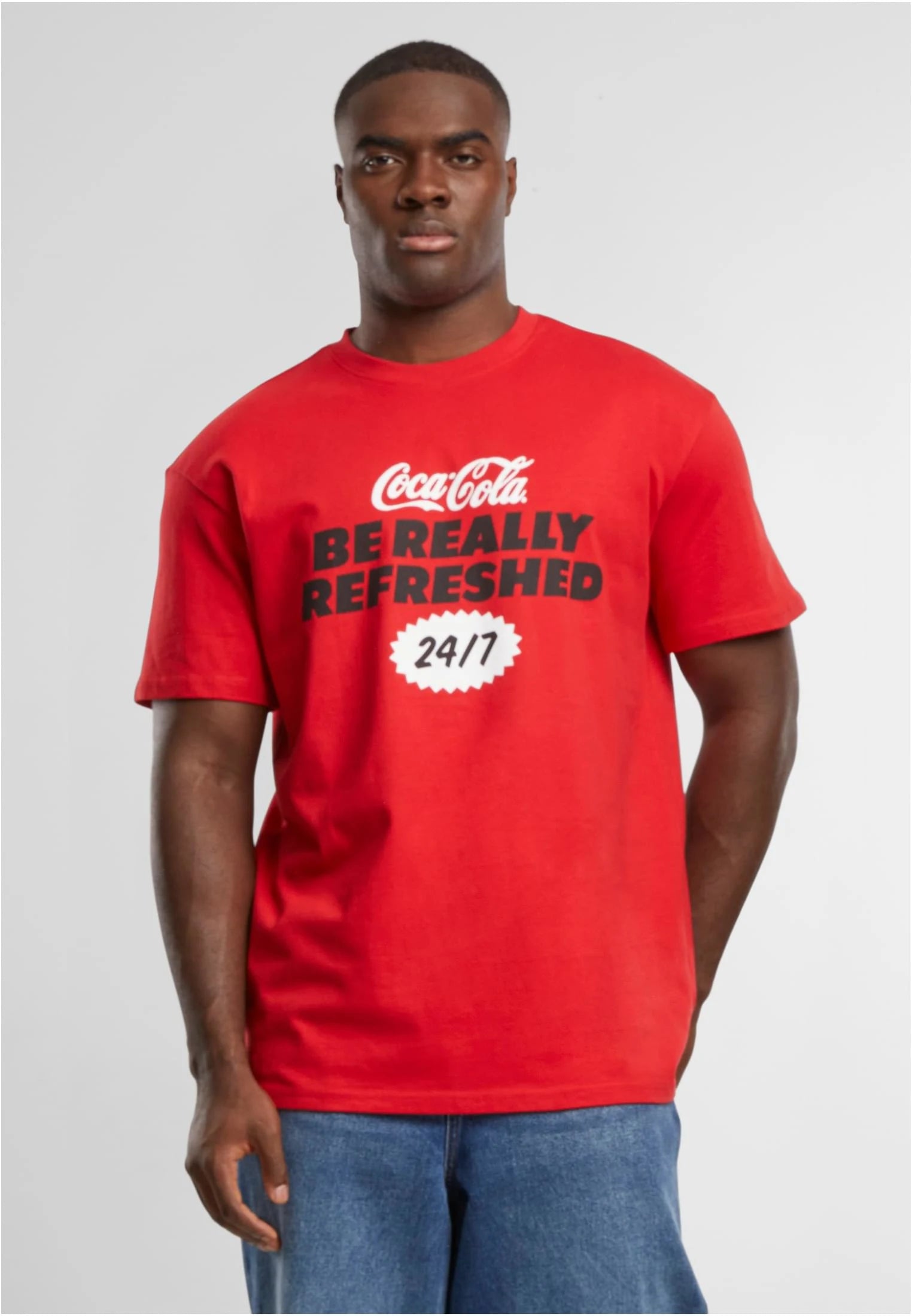
Snygga t-shirts
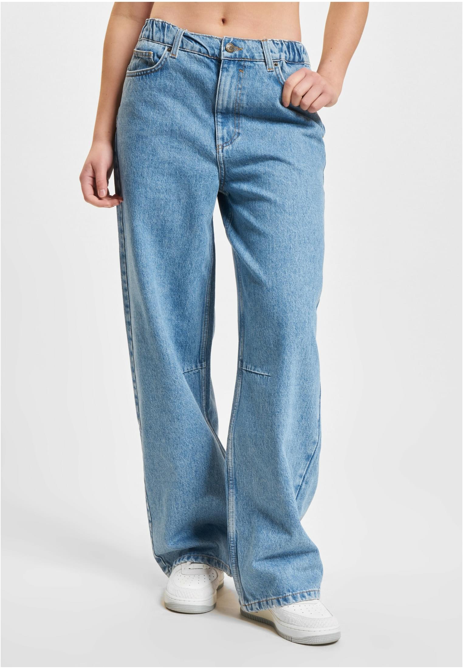
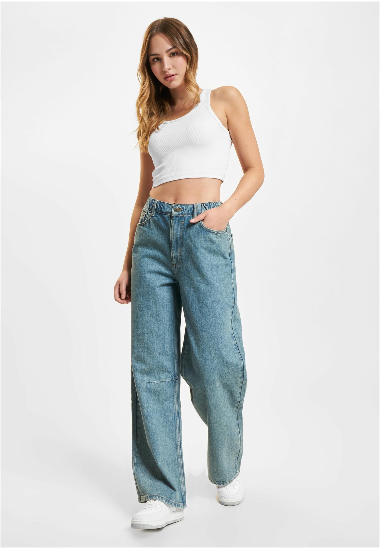
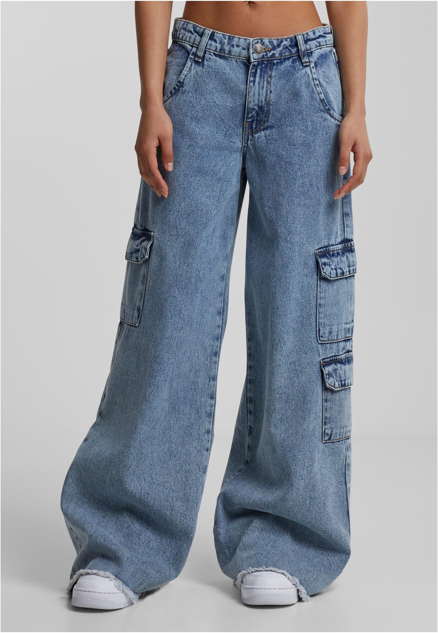
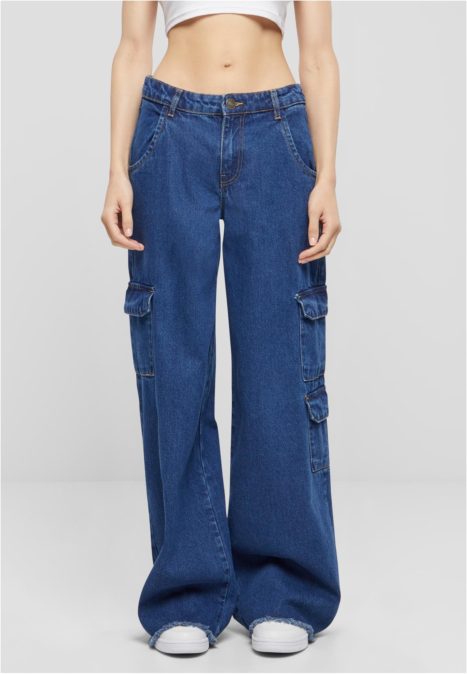
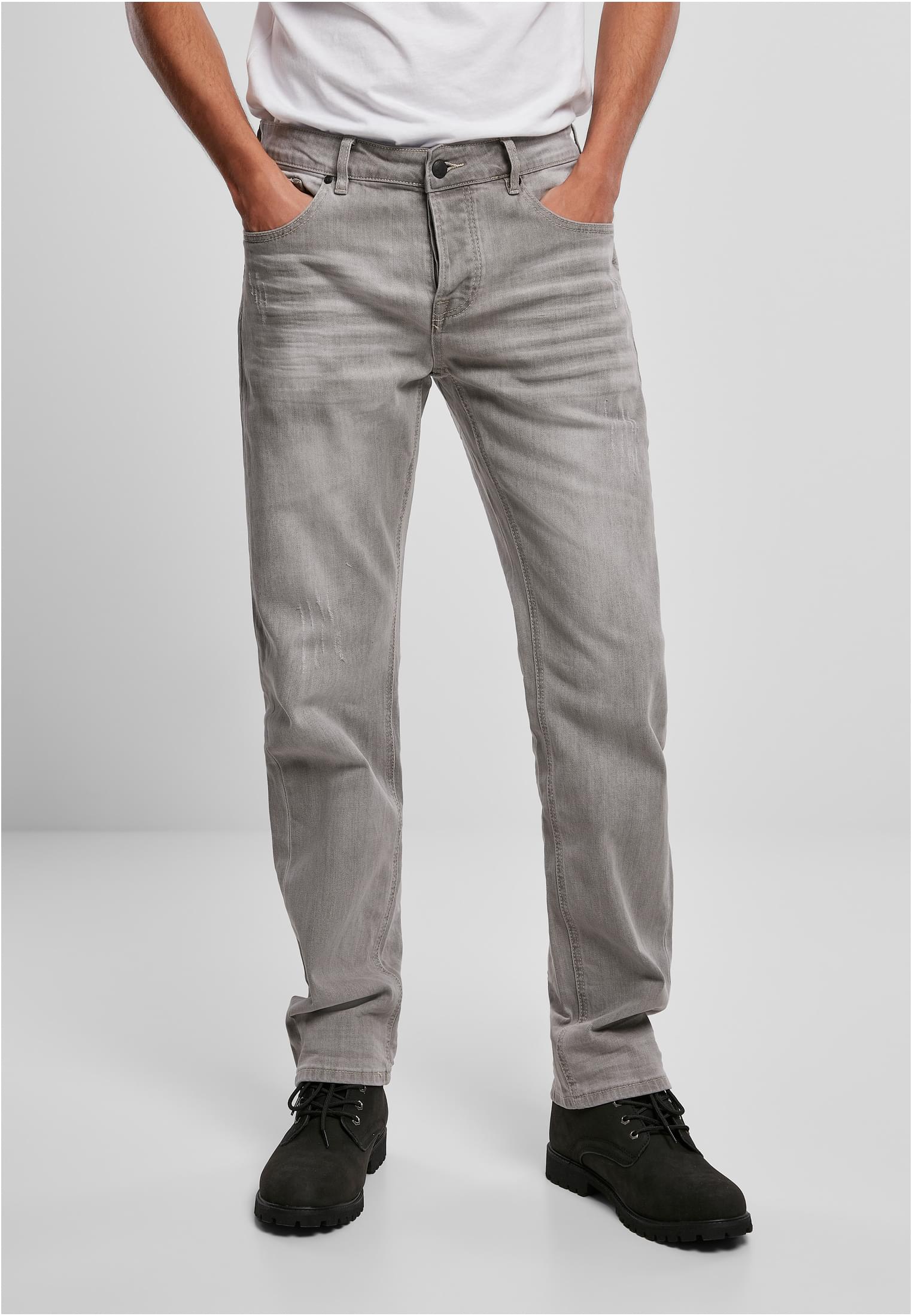
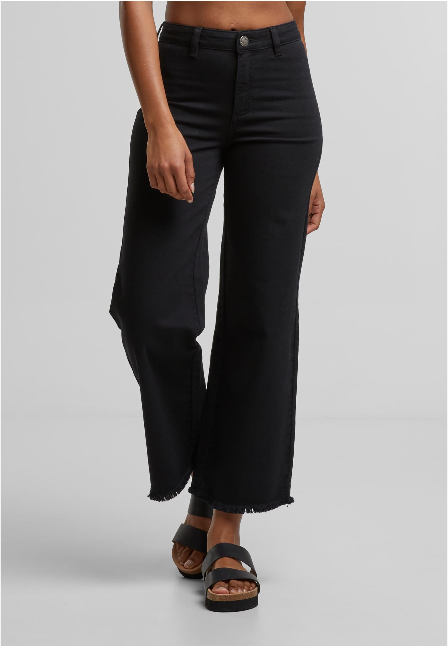
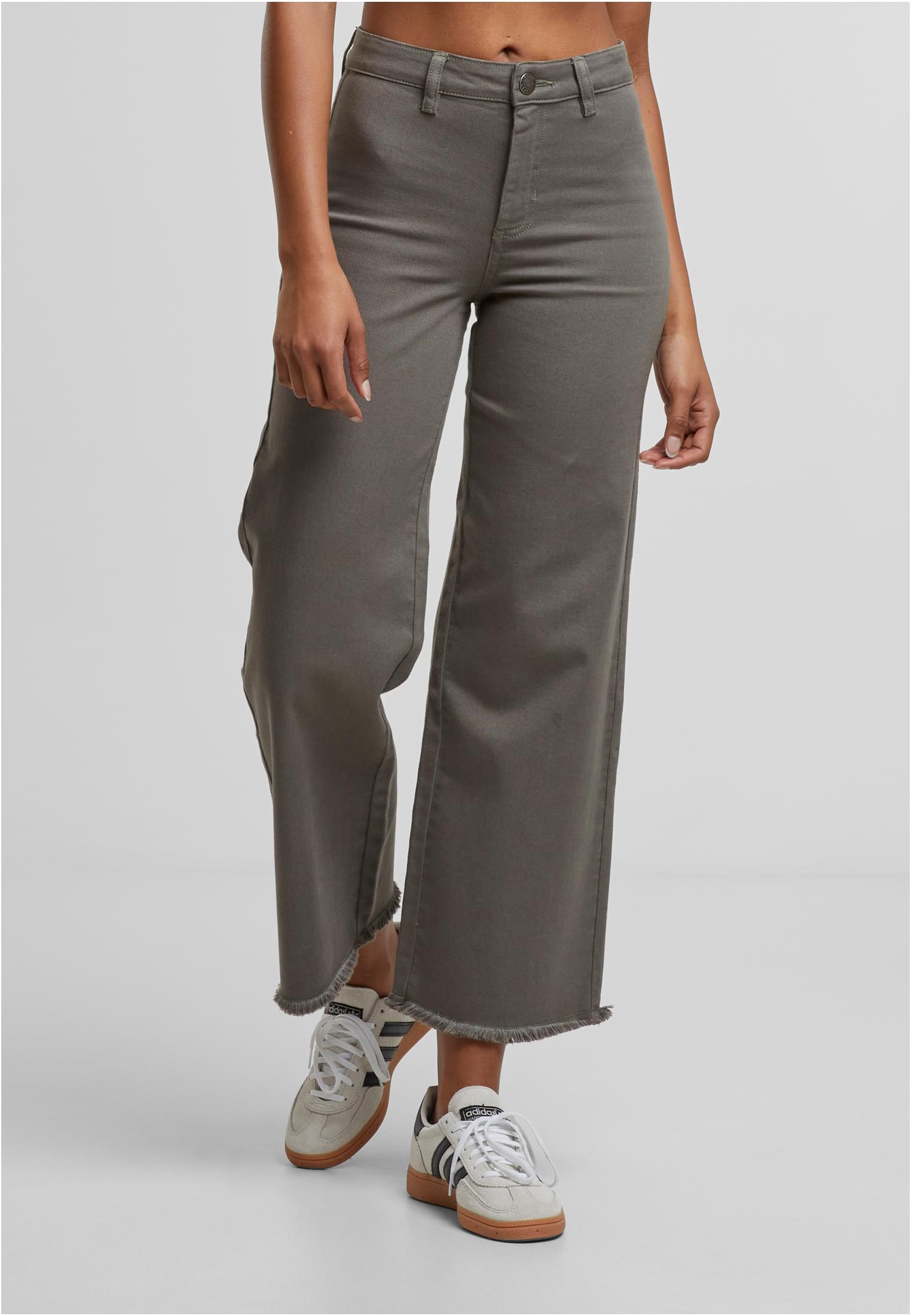
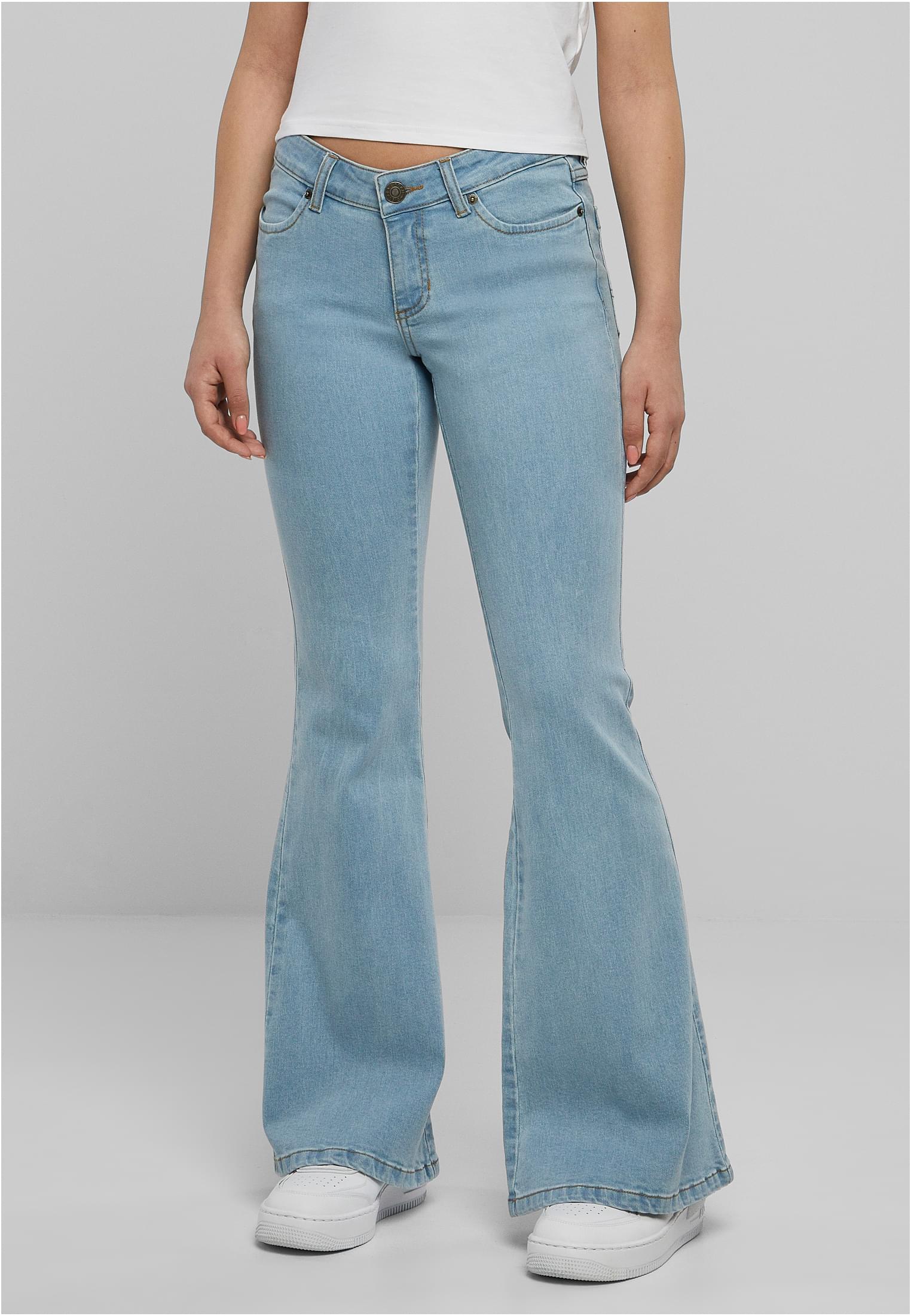
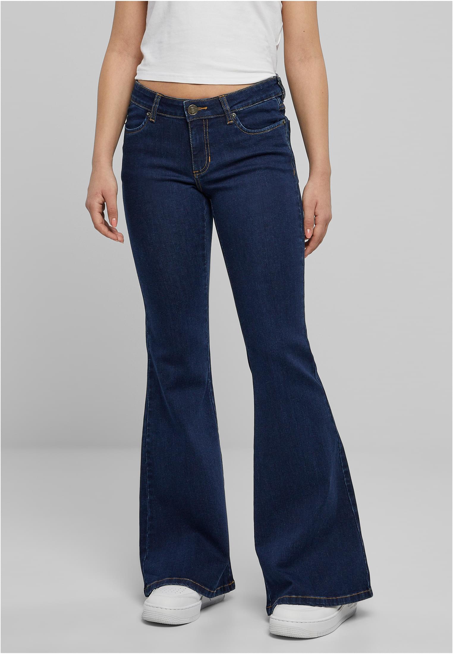
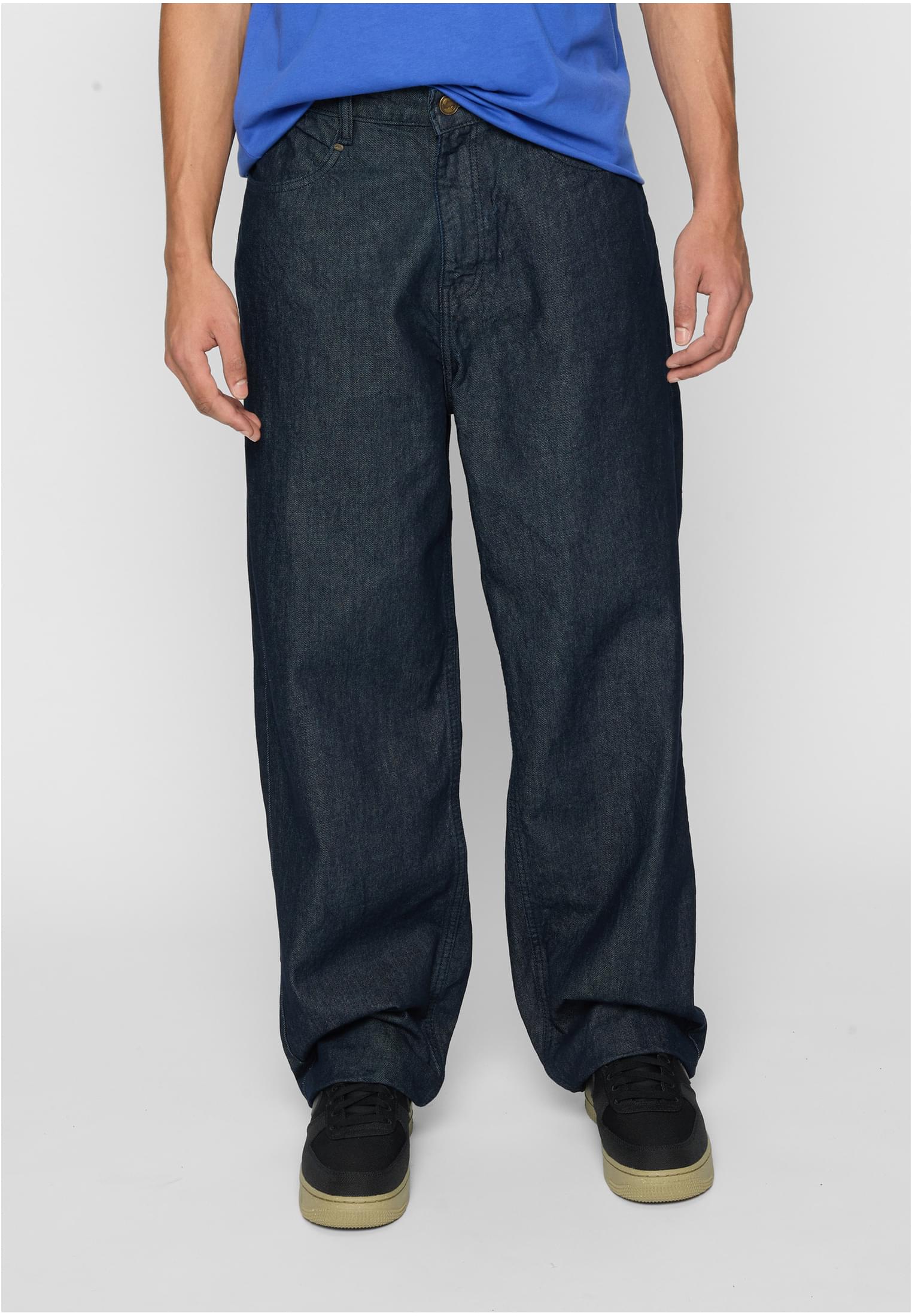
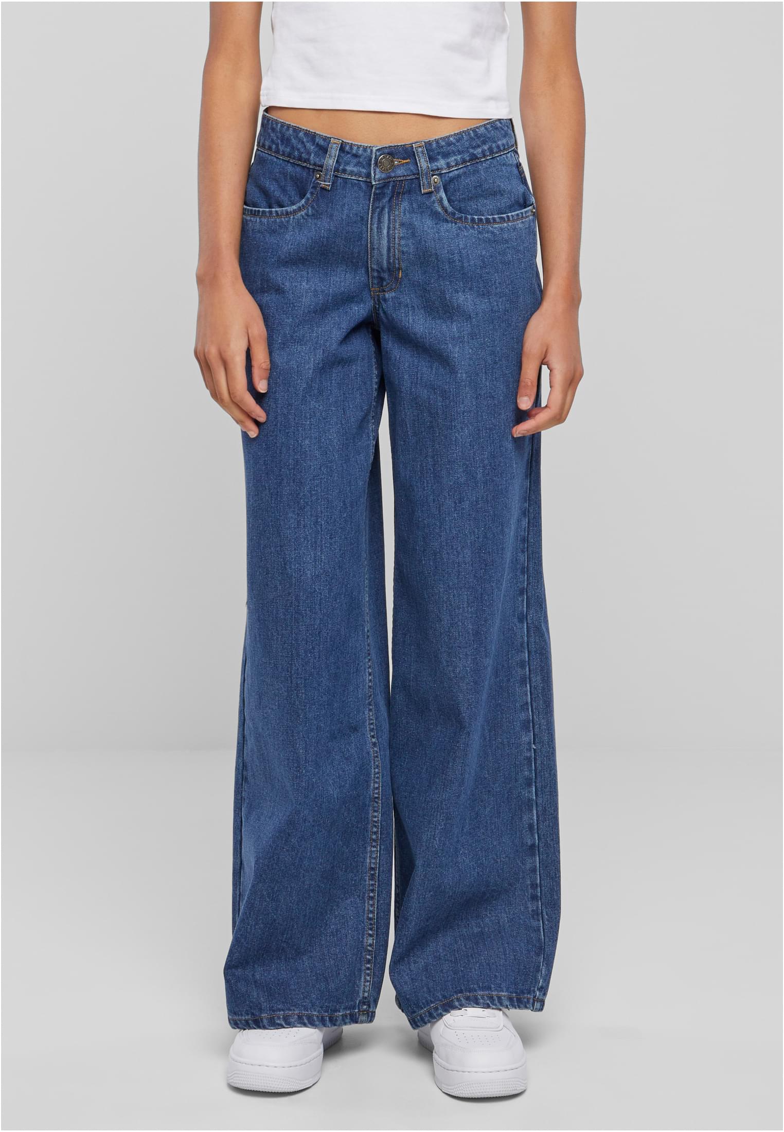
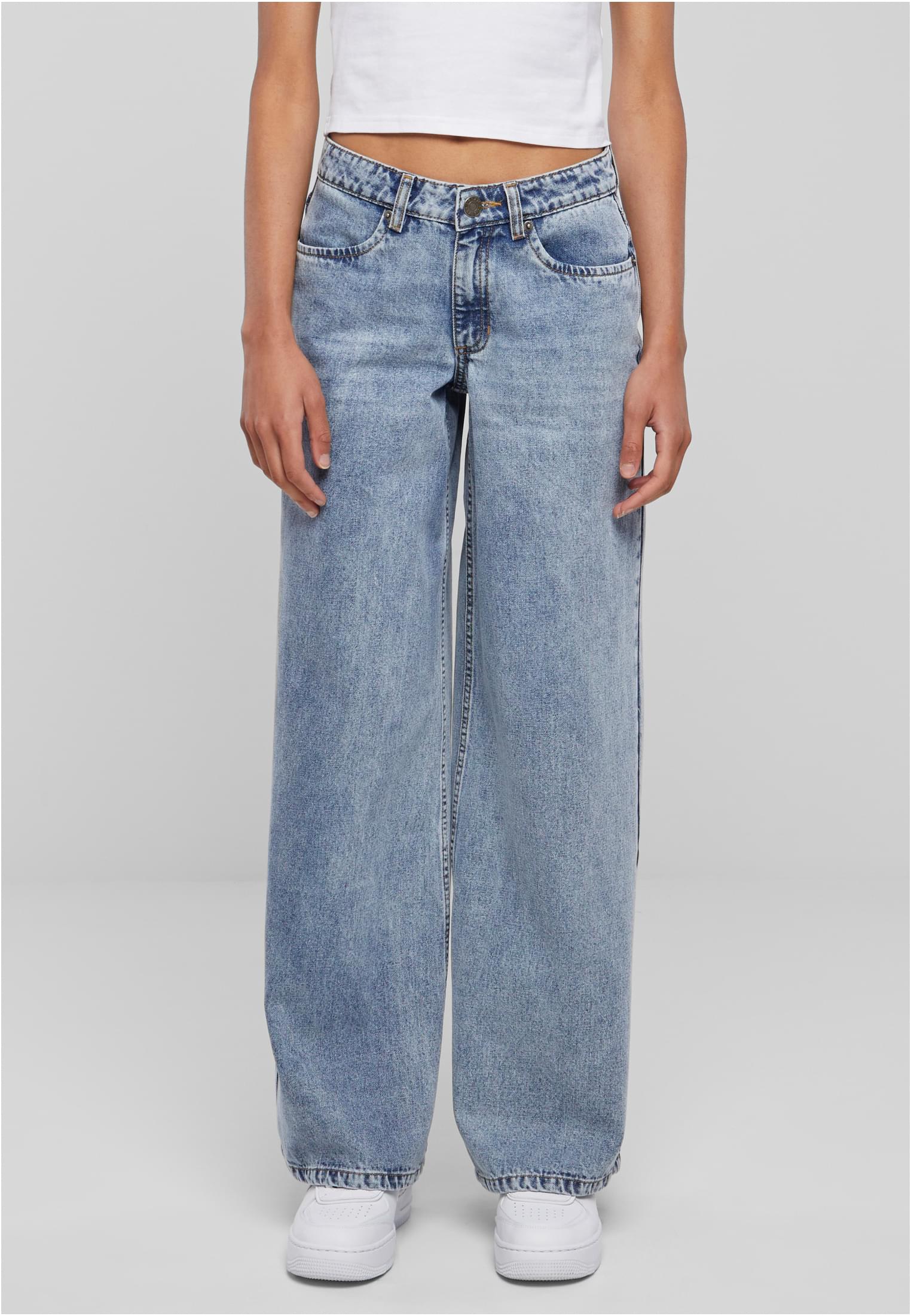
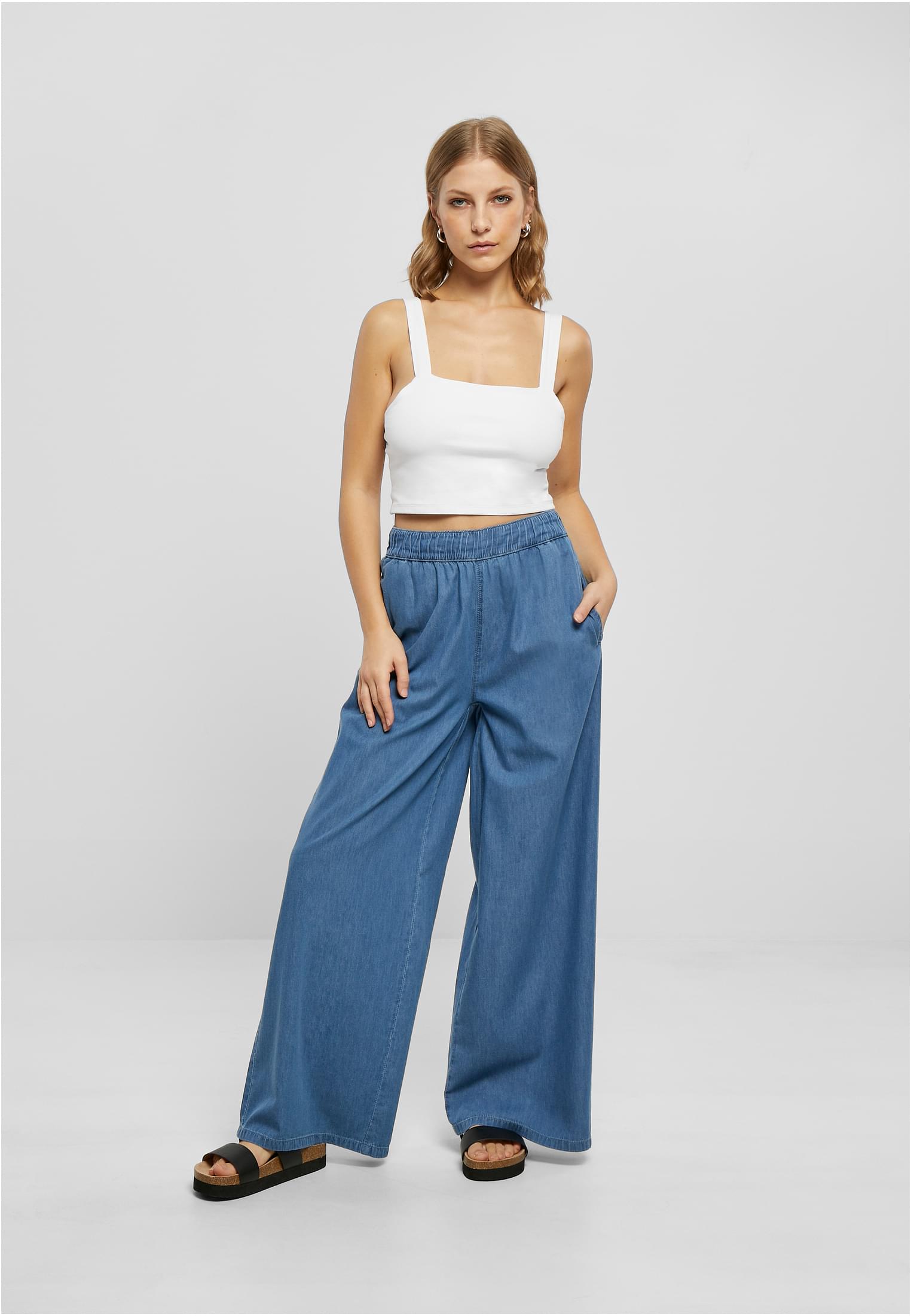
Jeans för alla tillfällen


Vad våra kunder säger om oss
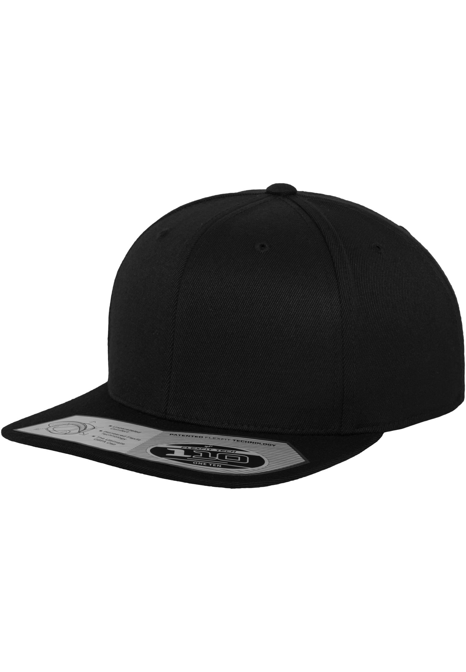
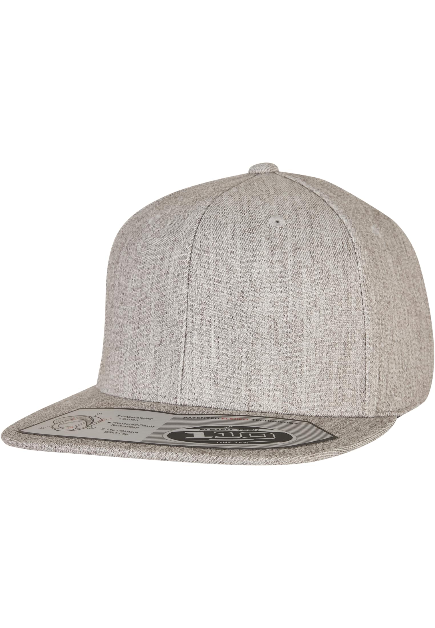
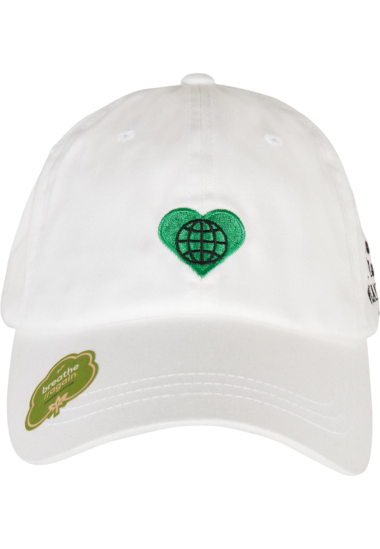
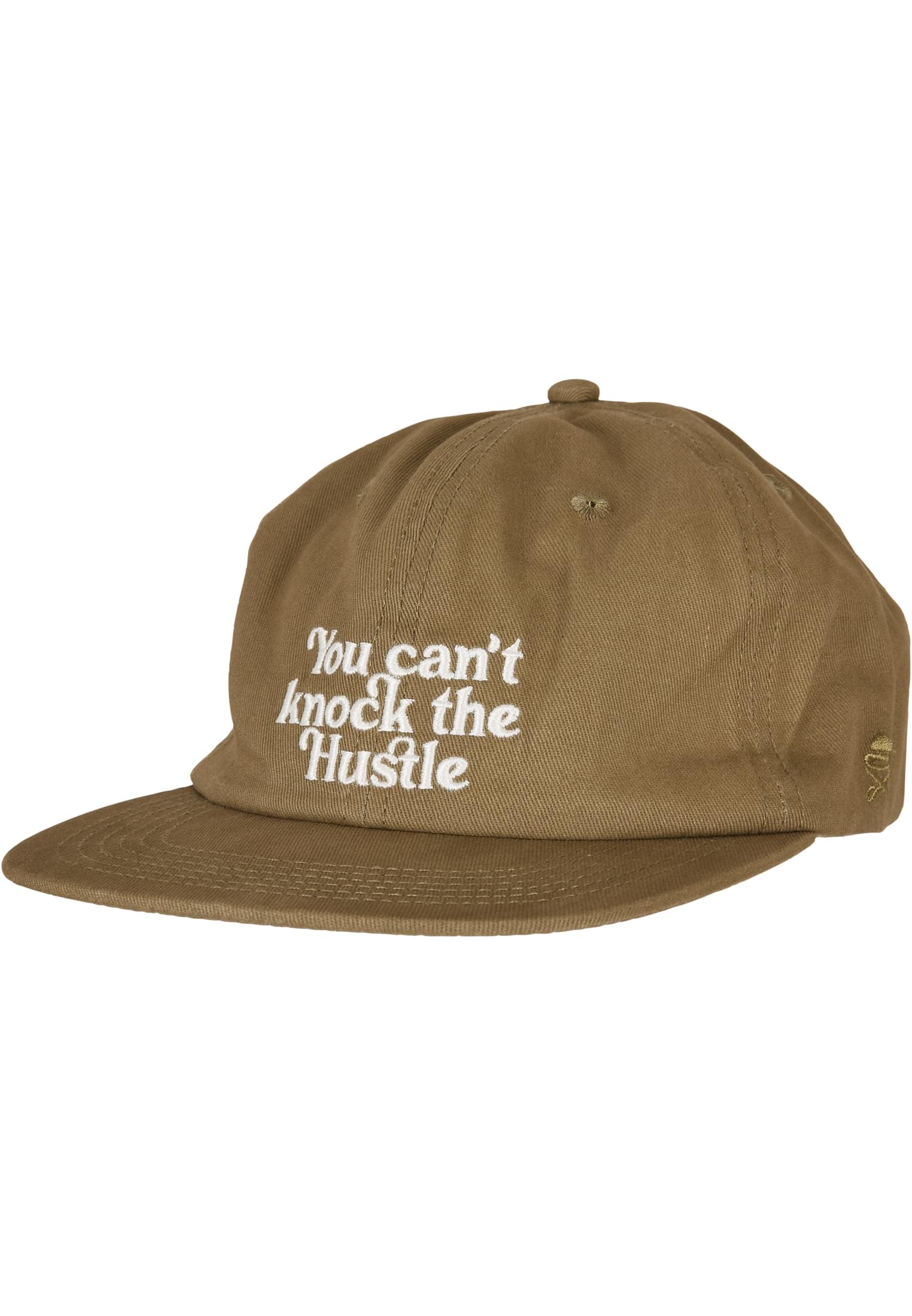
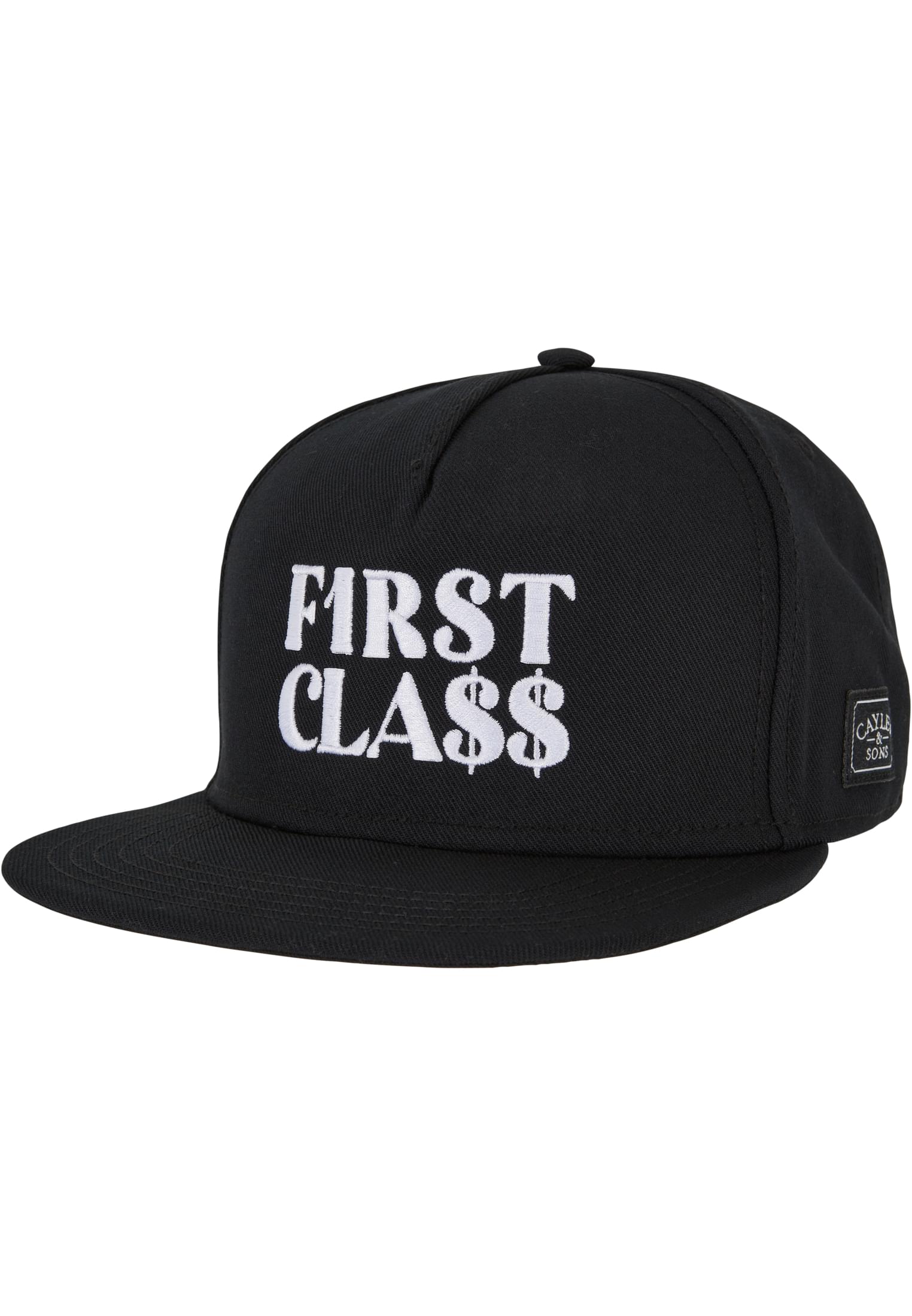
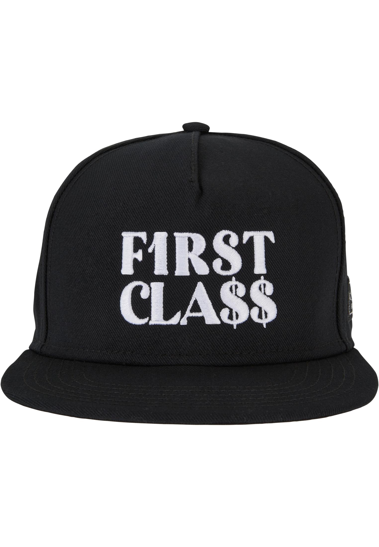
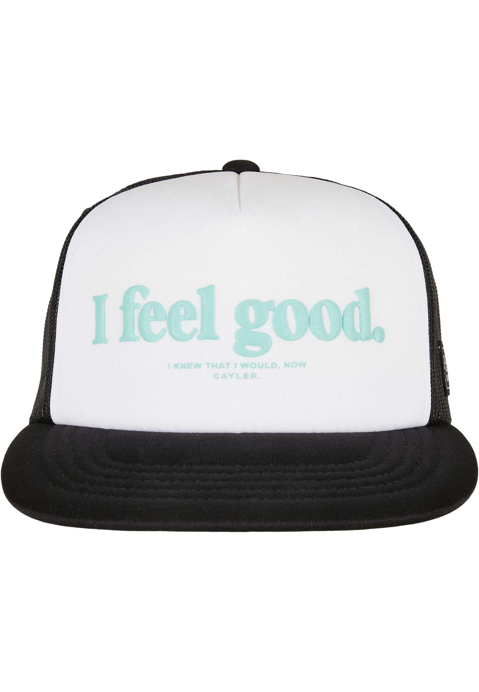
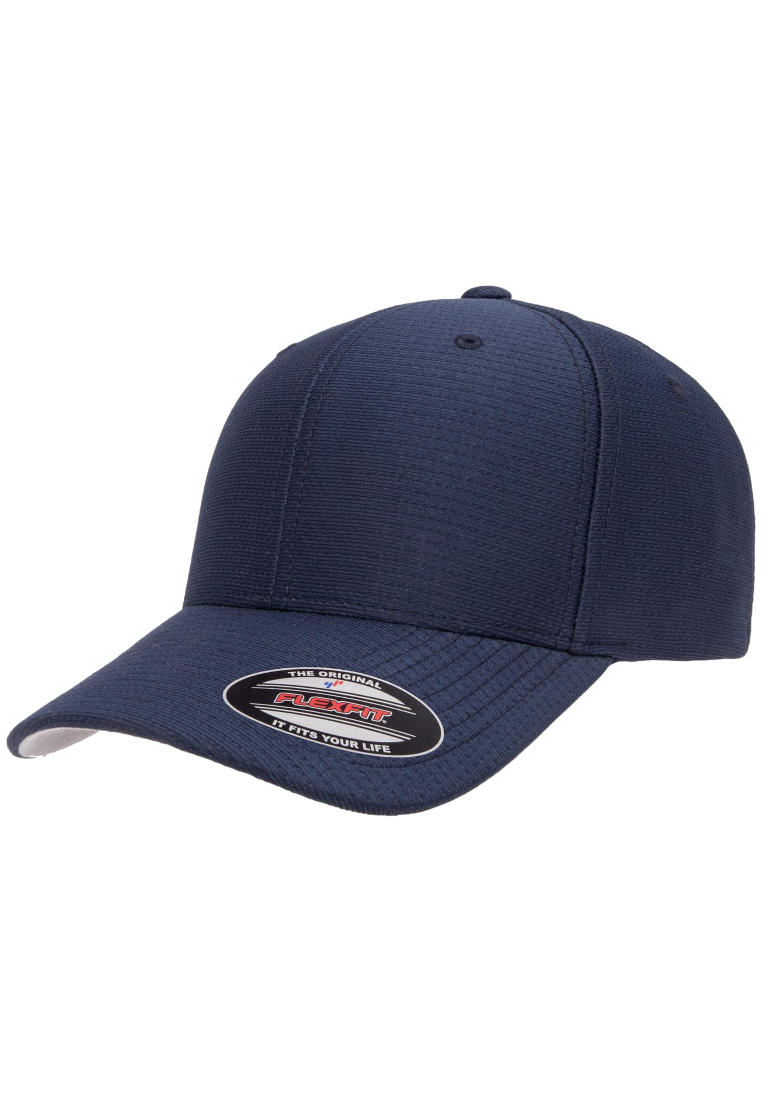
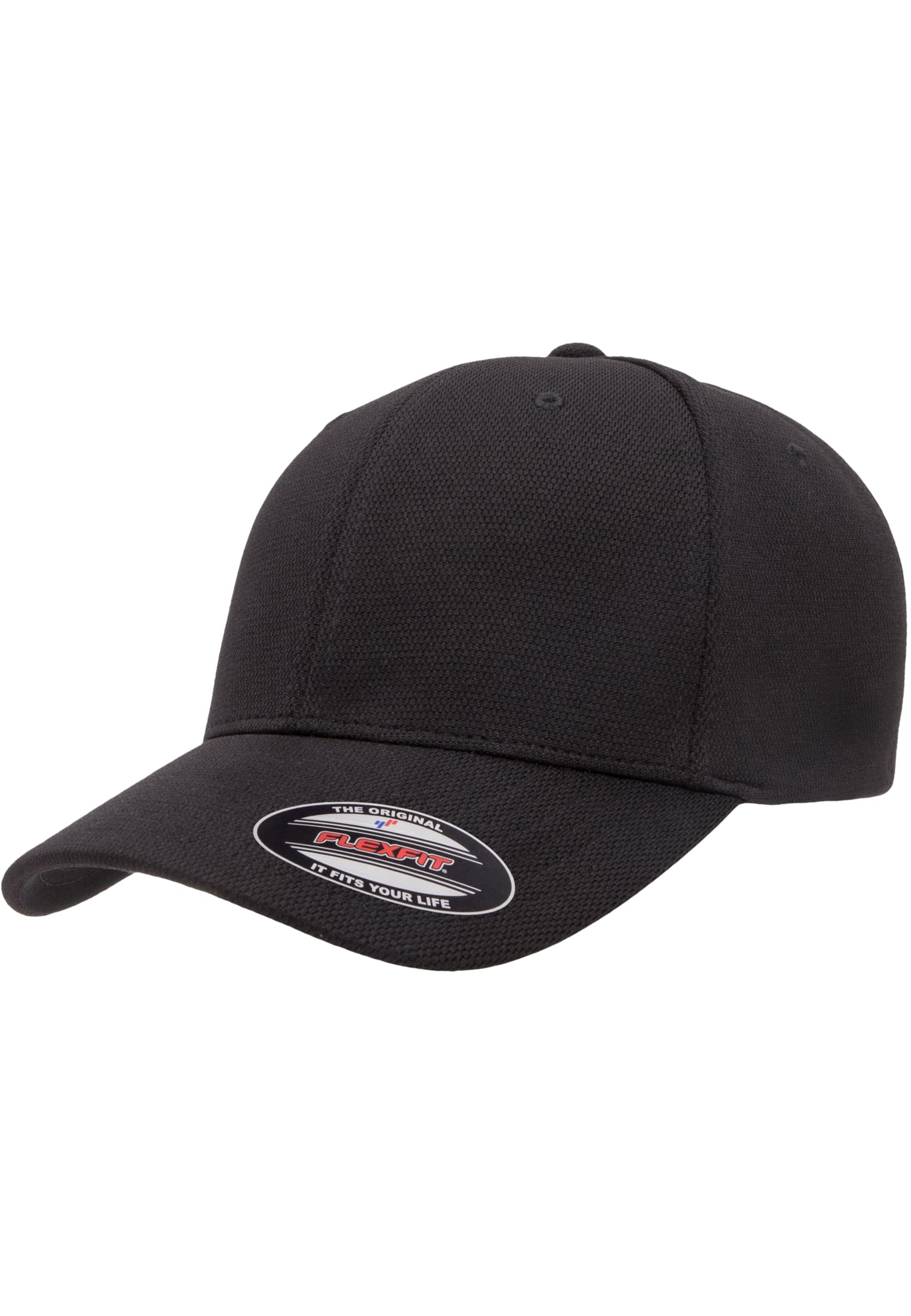
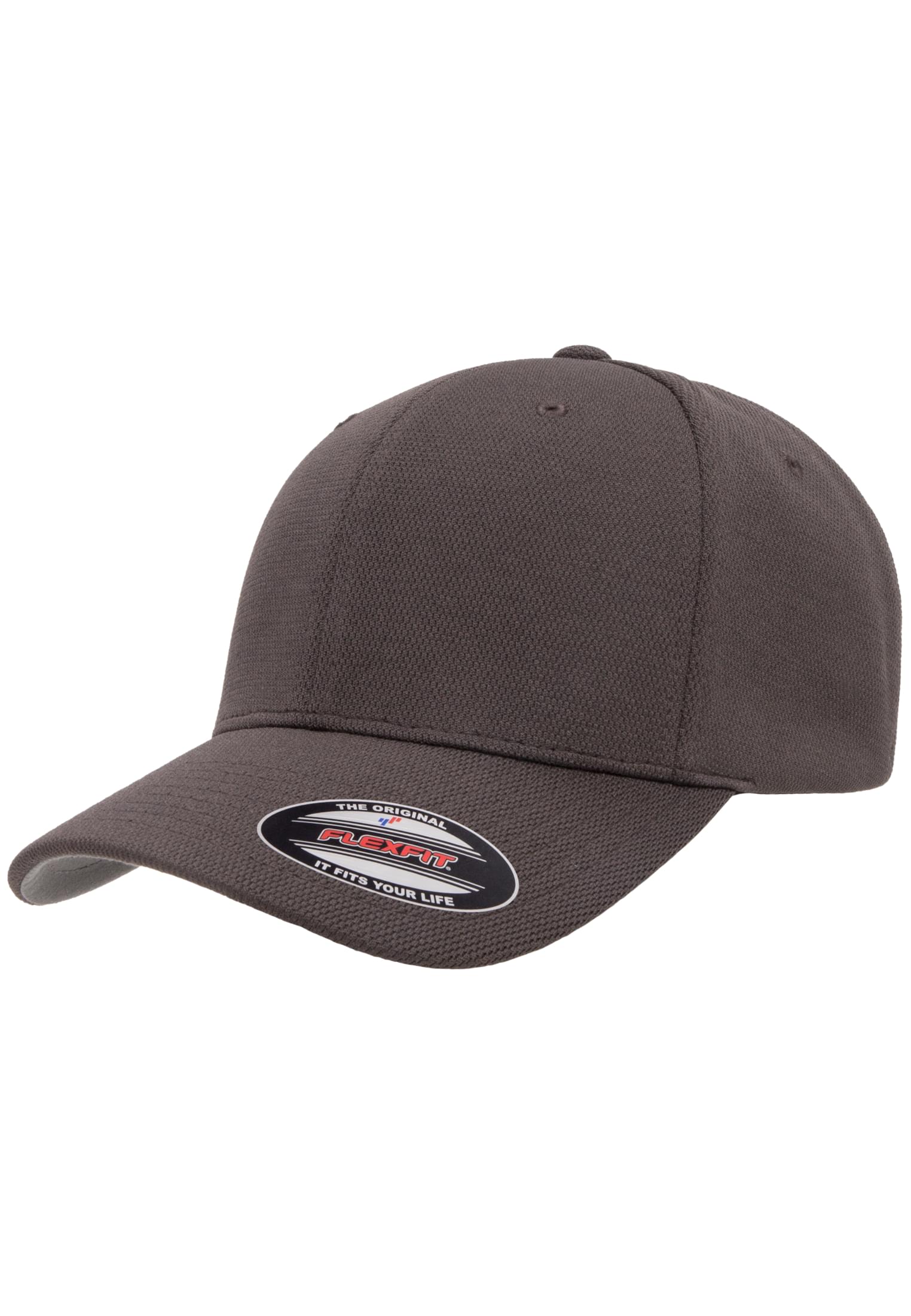
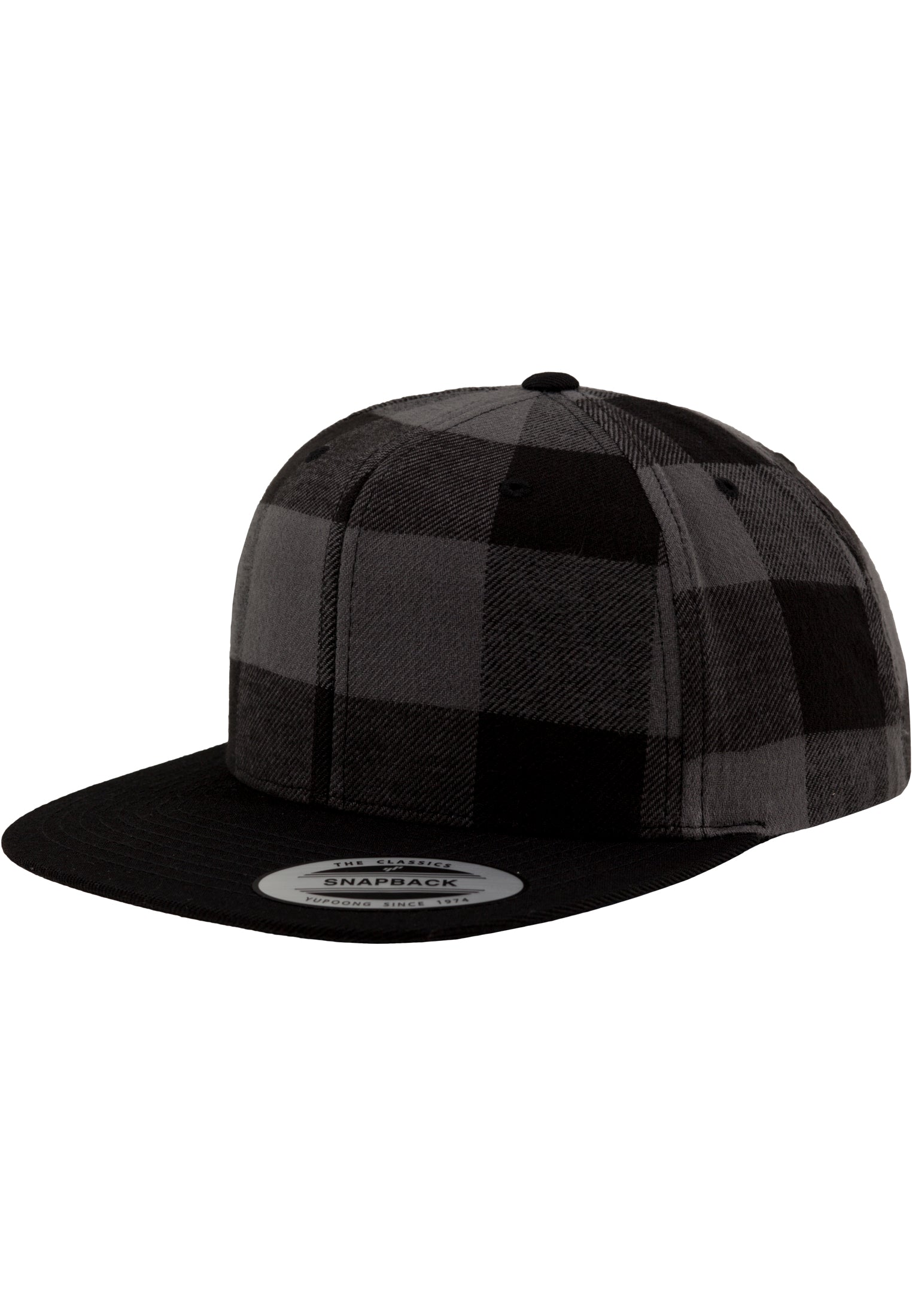
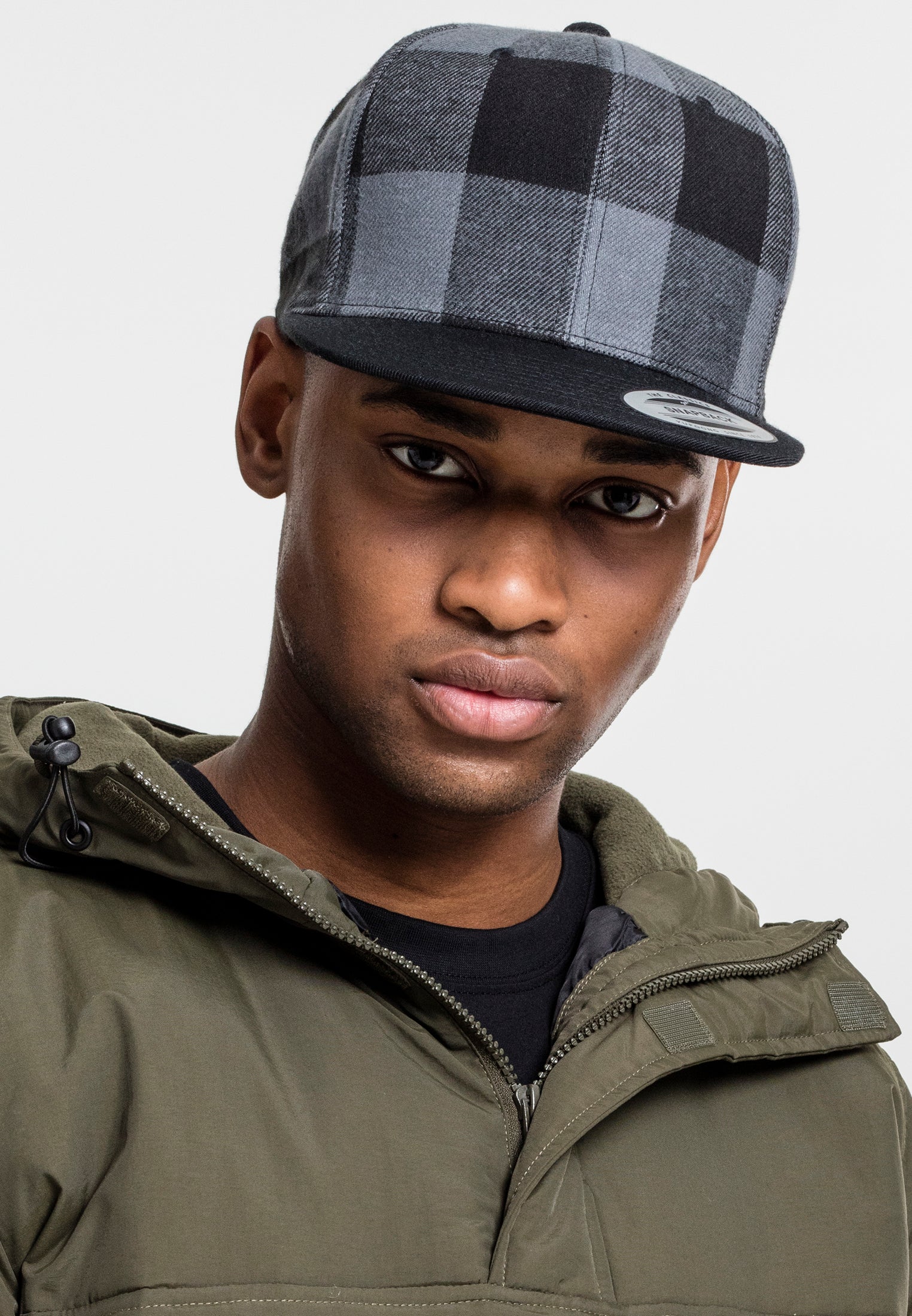
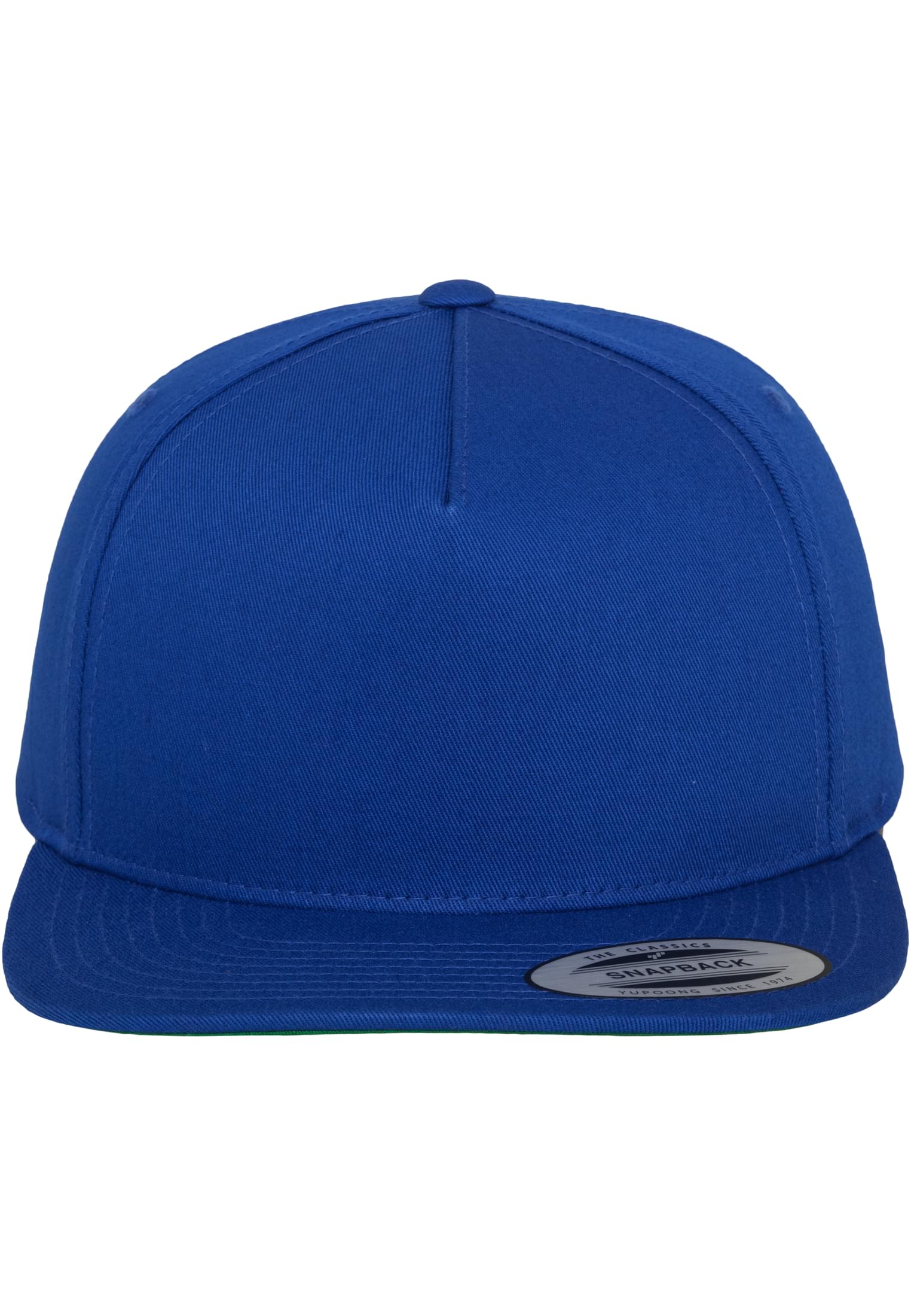
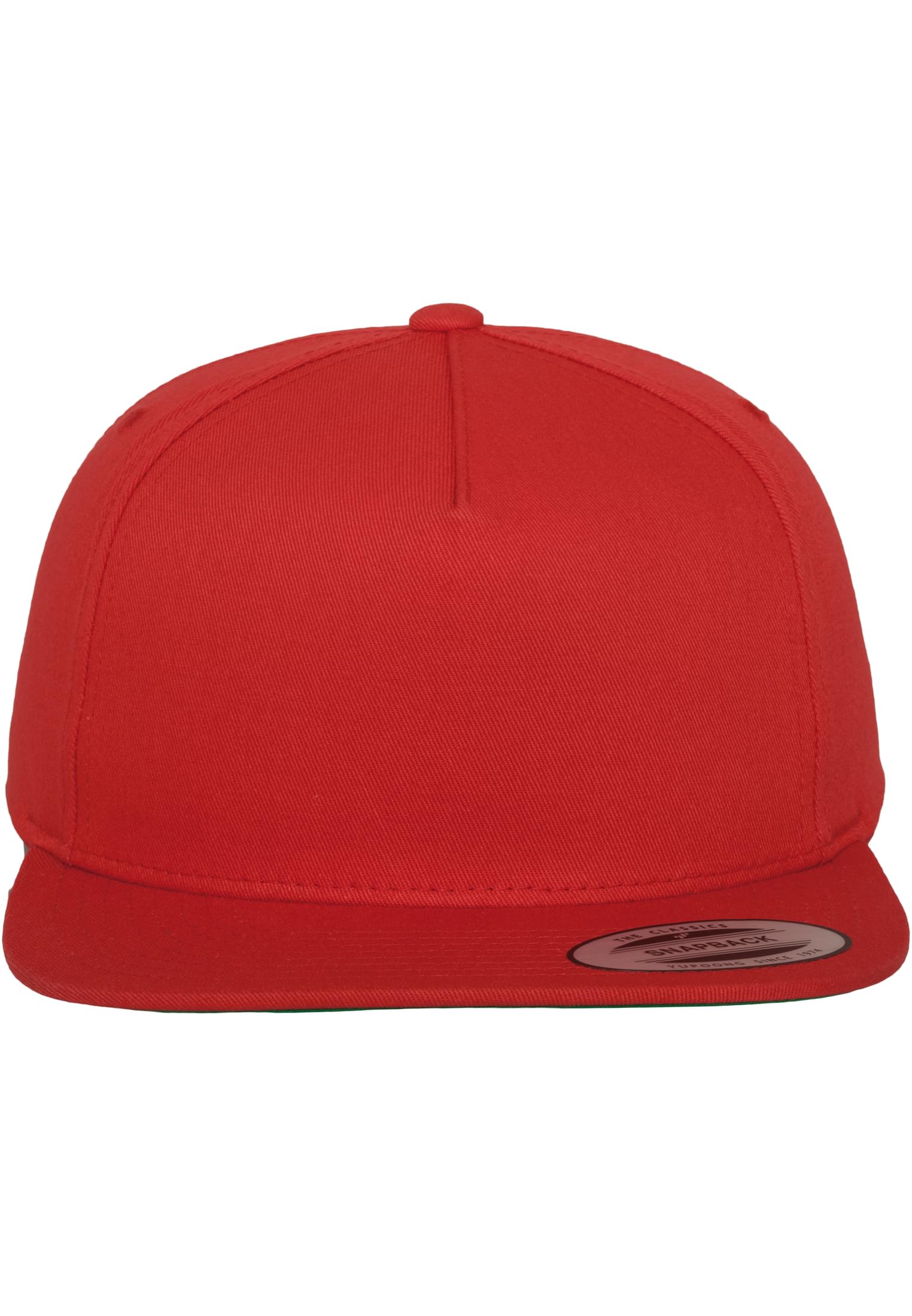
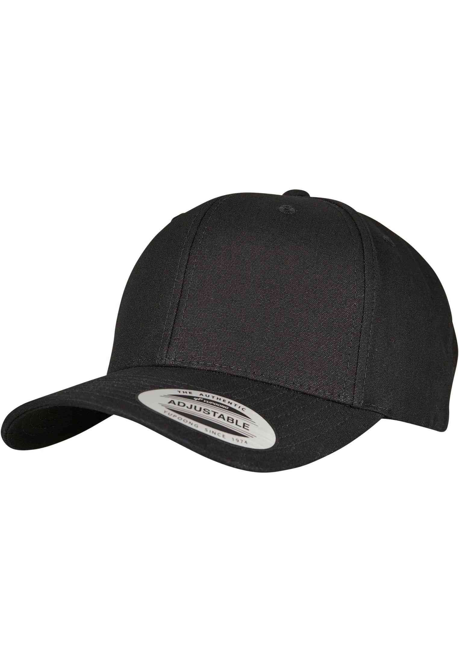
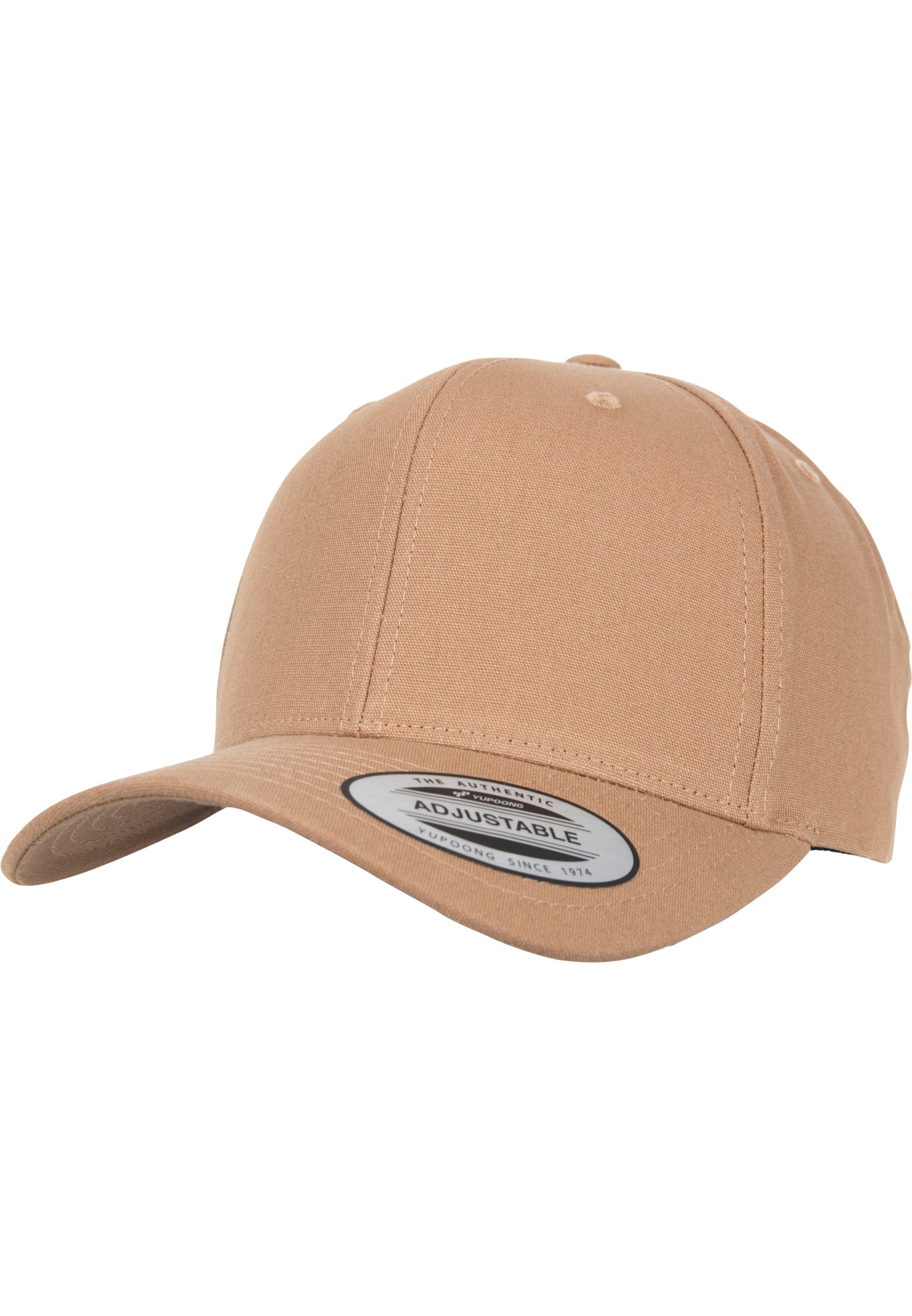
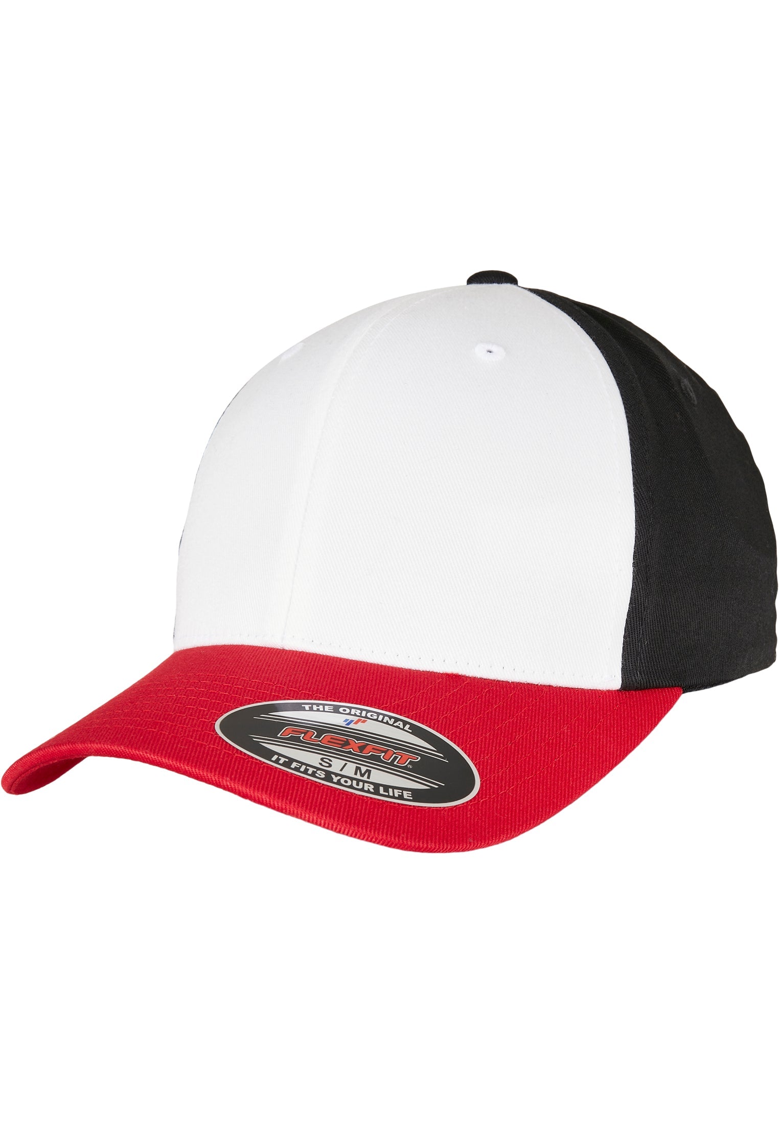
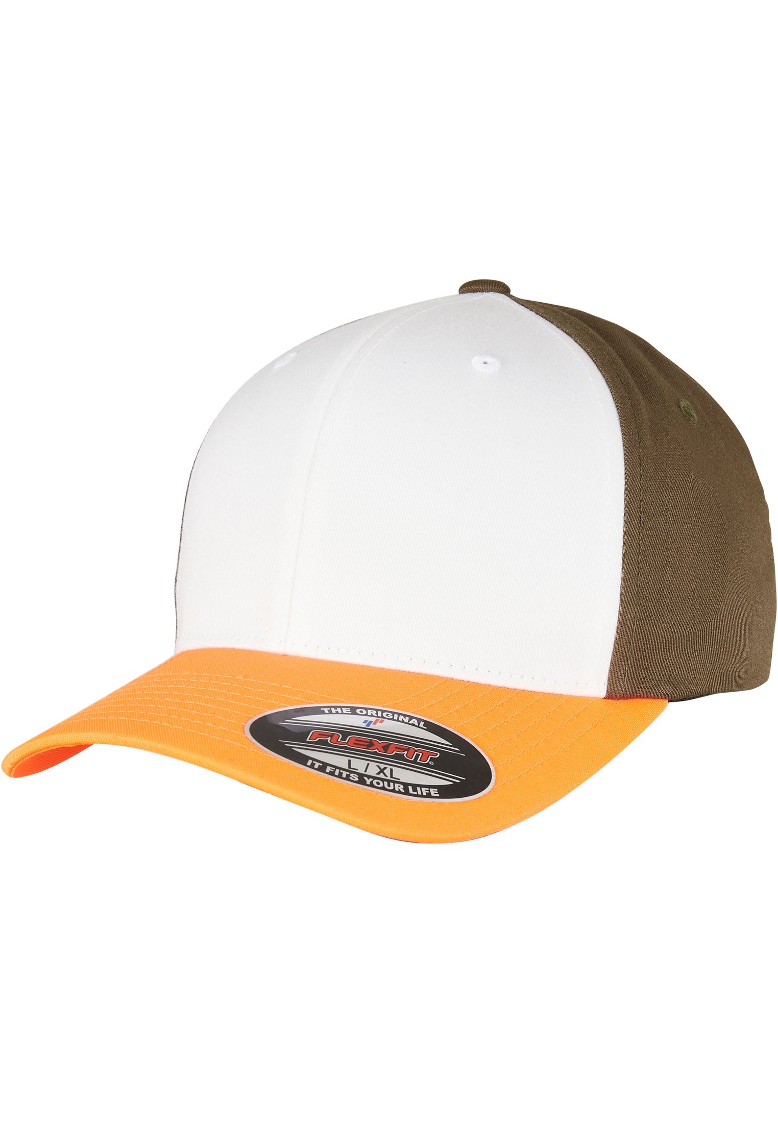
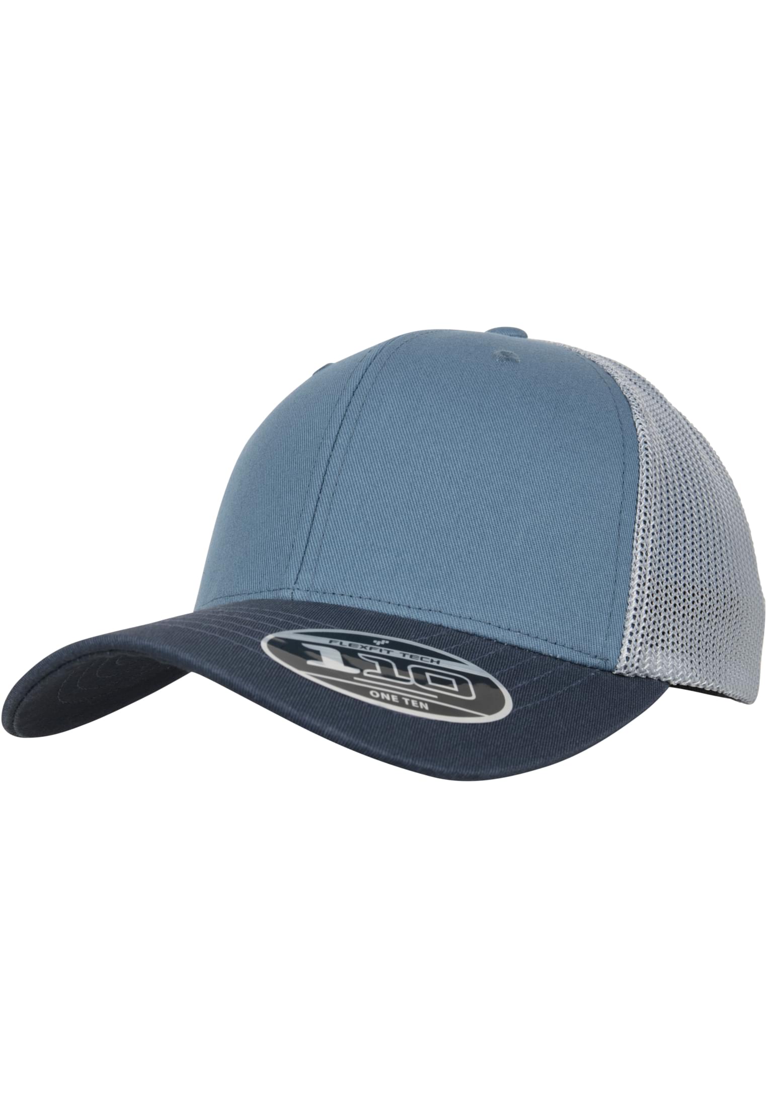
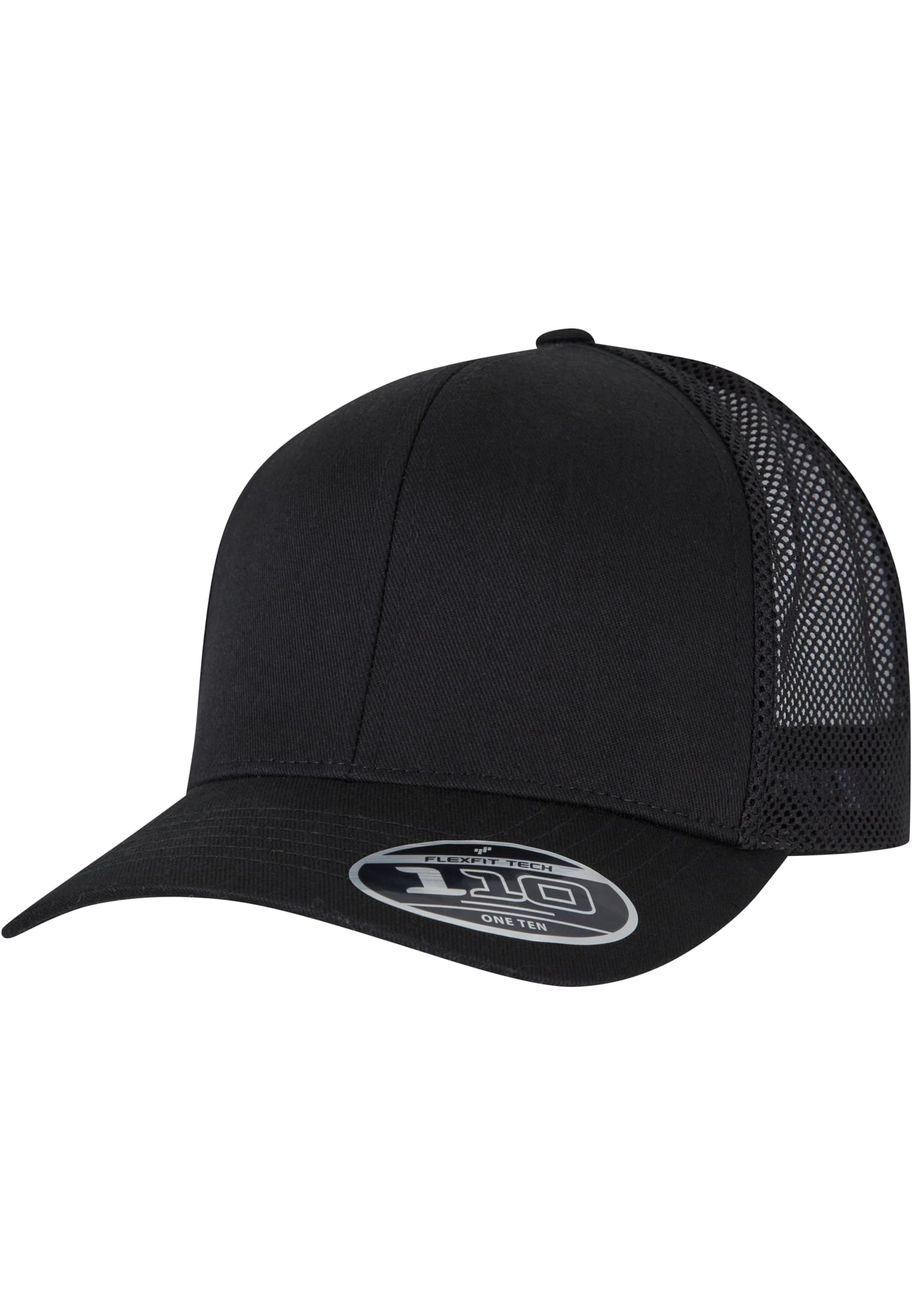
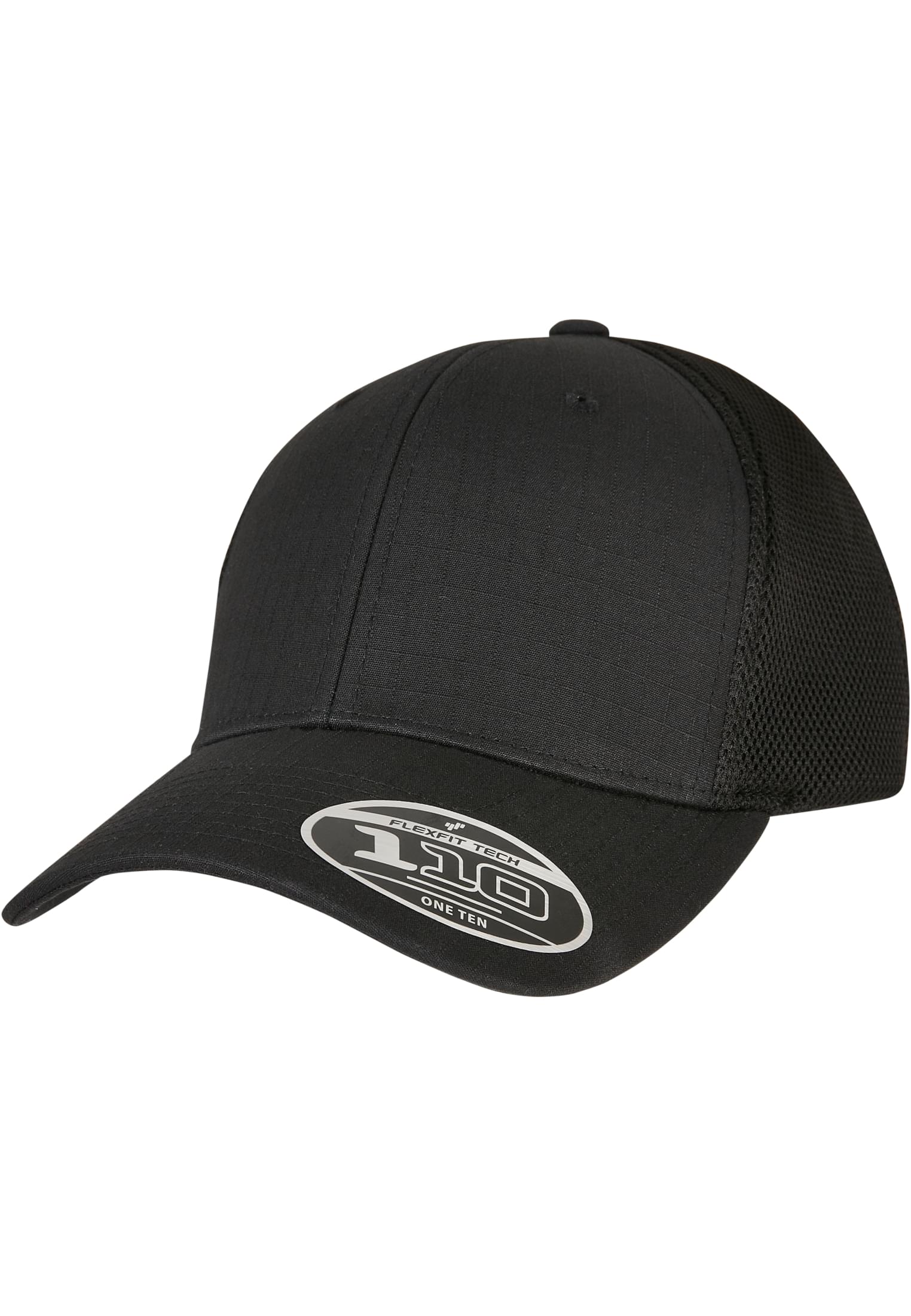
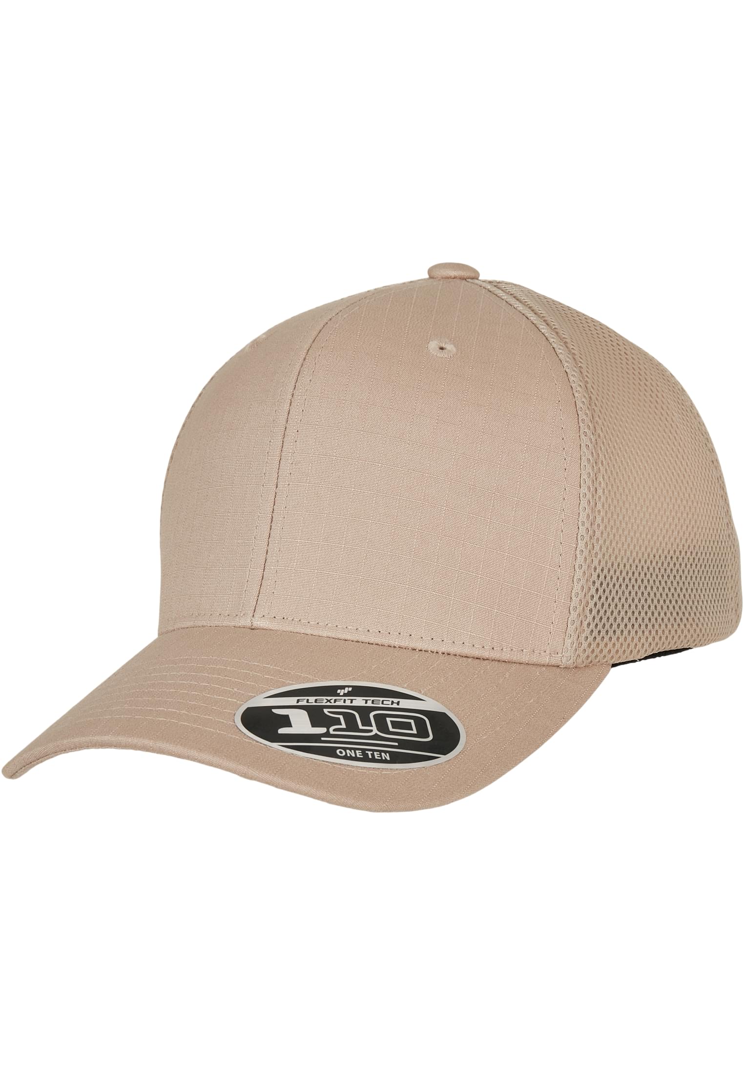
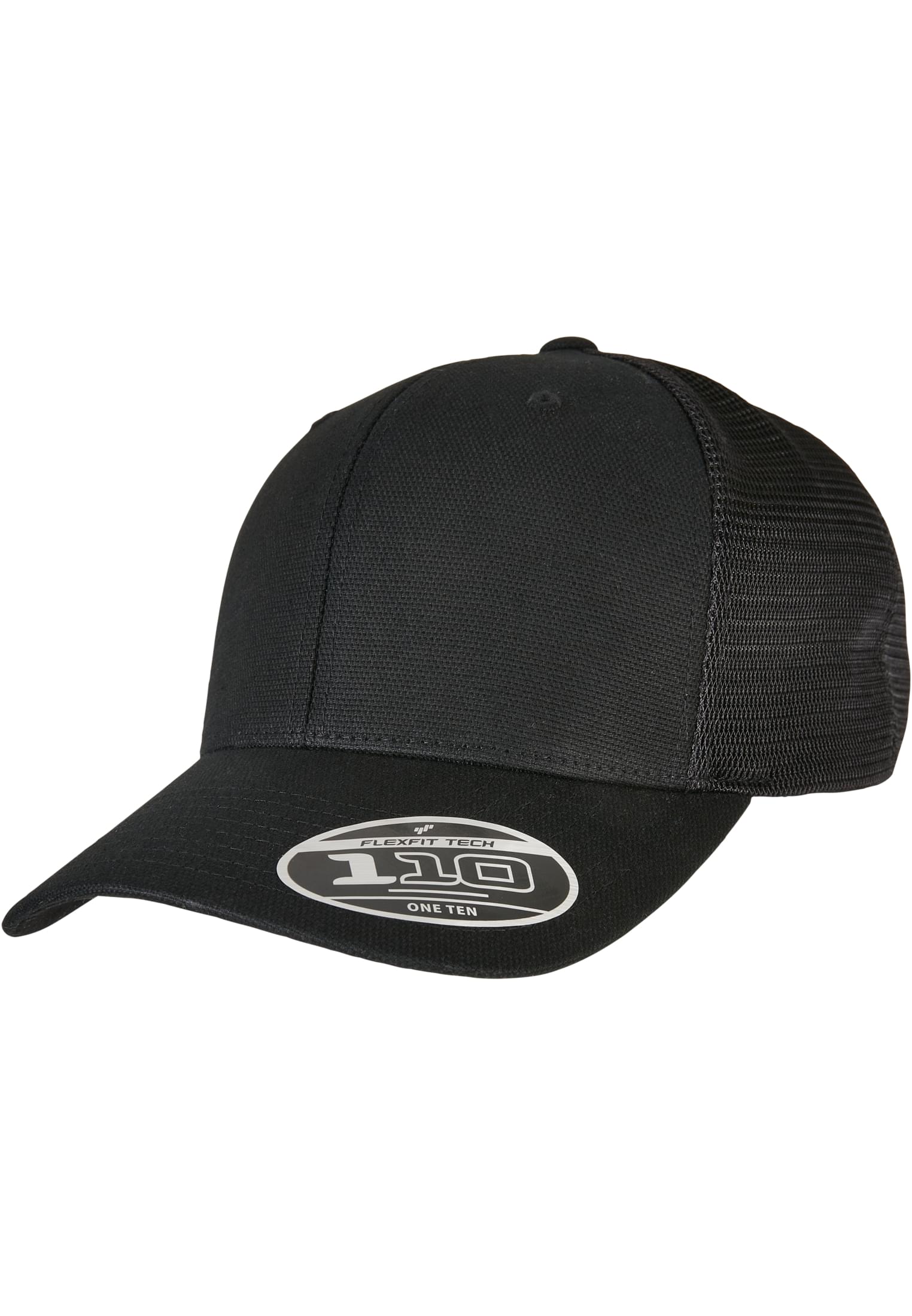
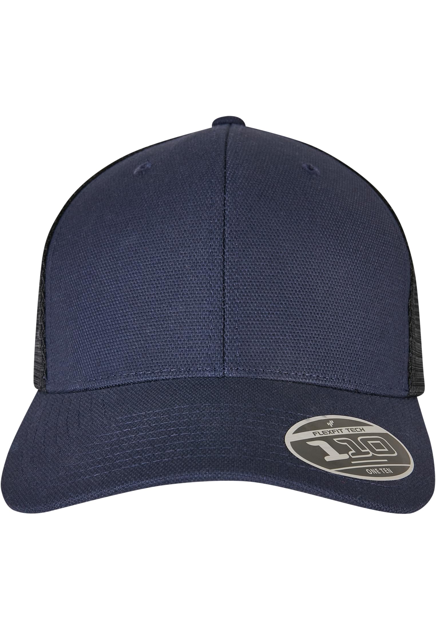
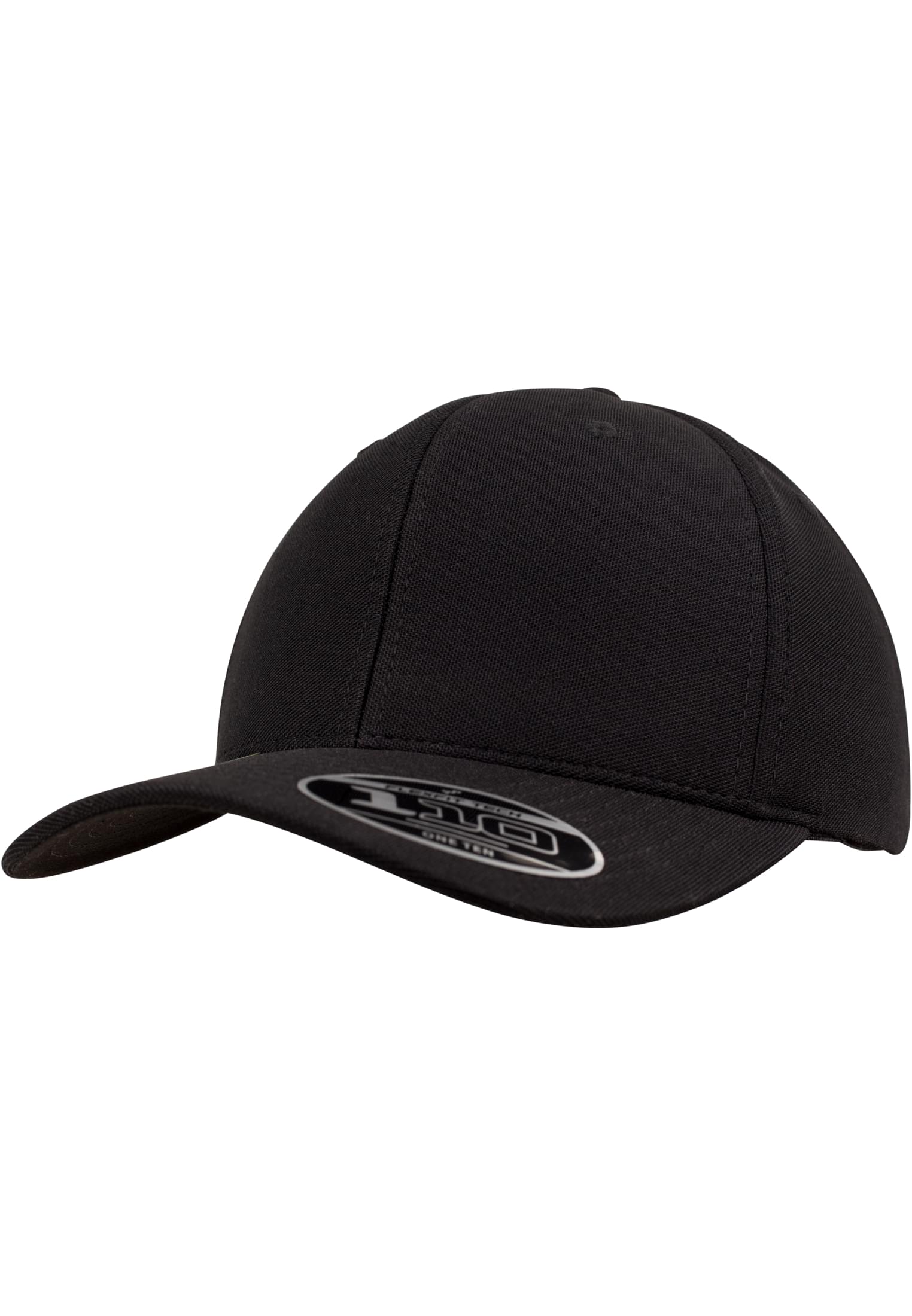
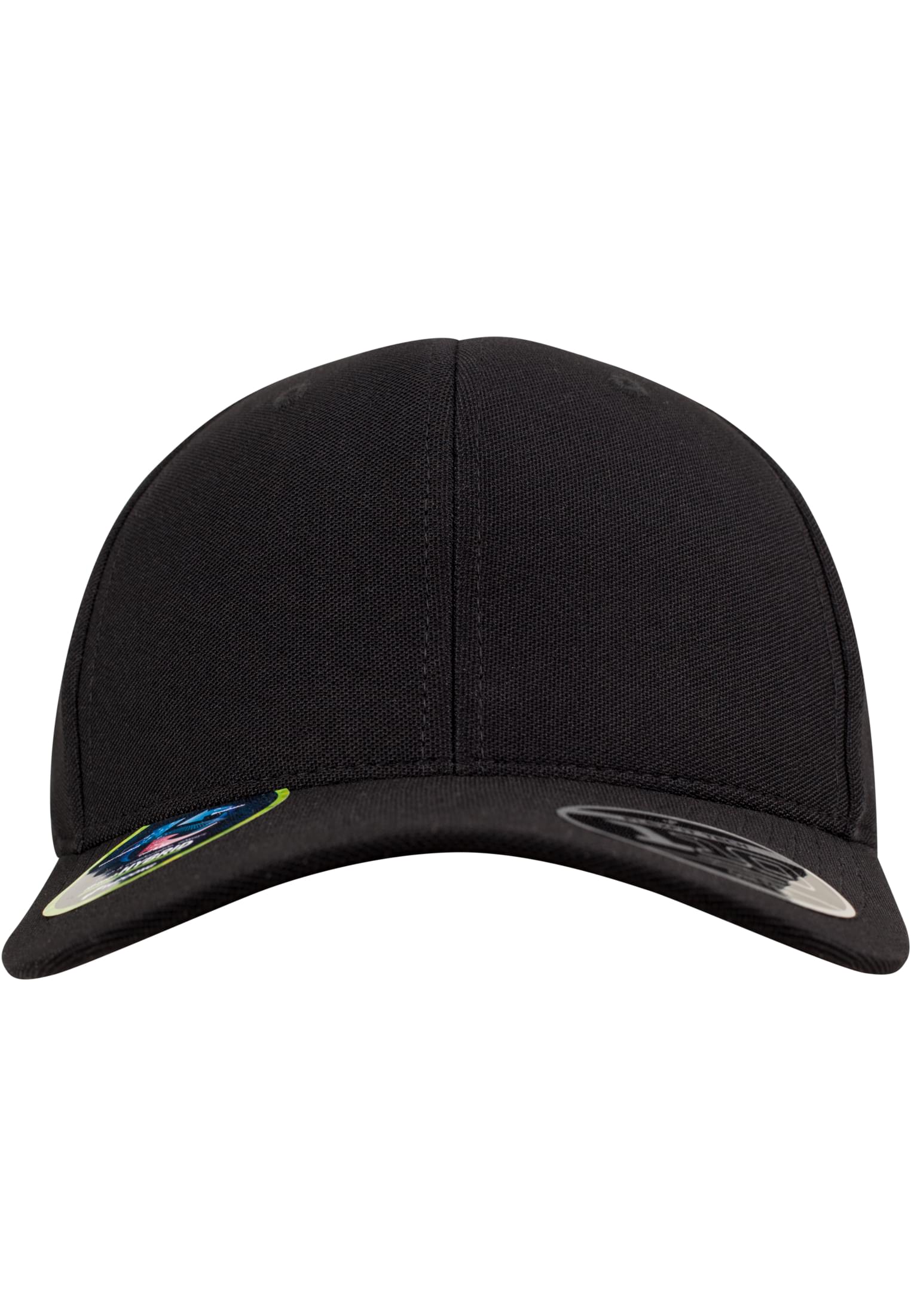
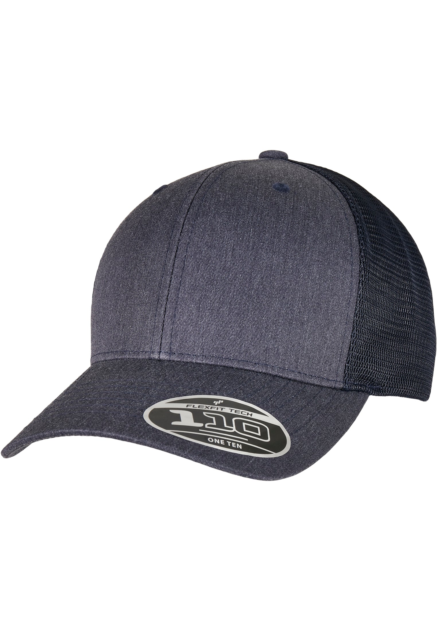
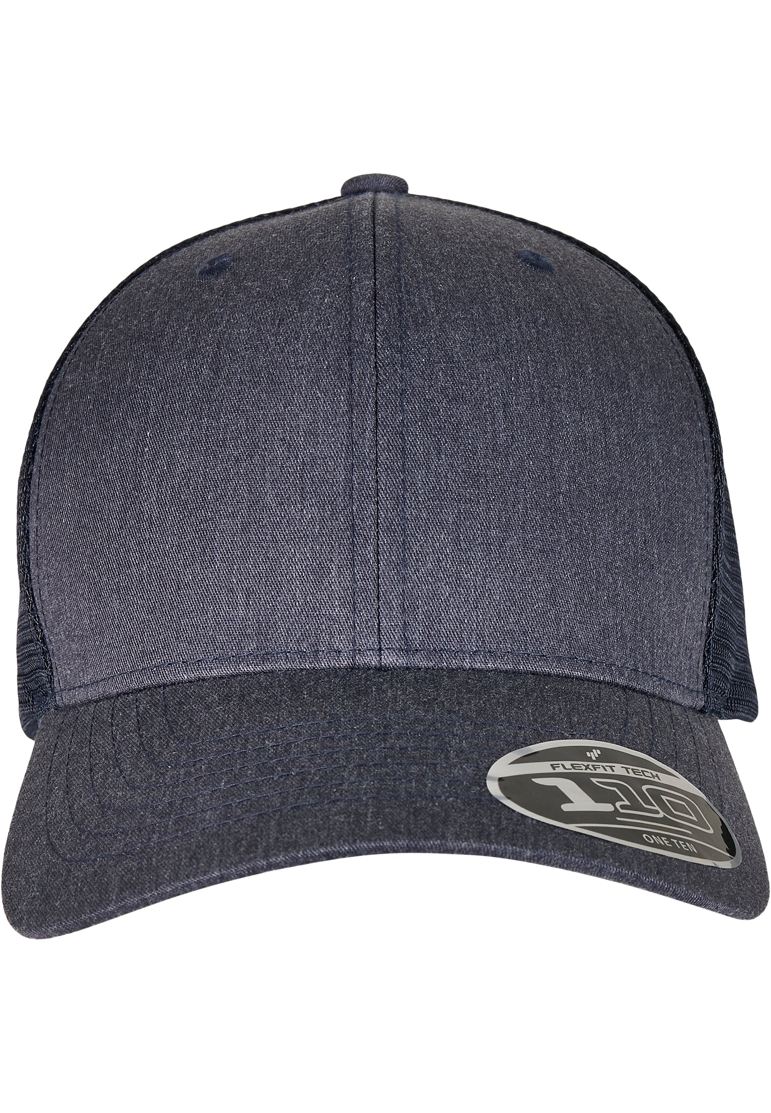
Sommarens kepsar


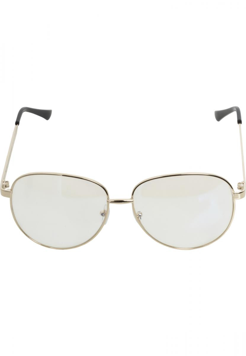
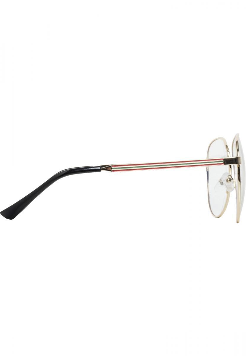
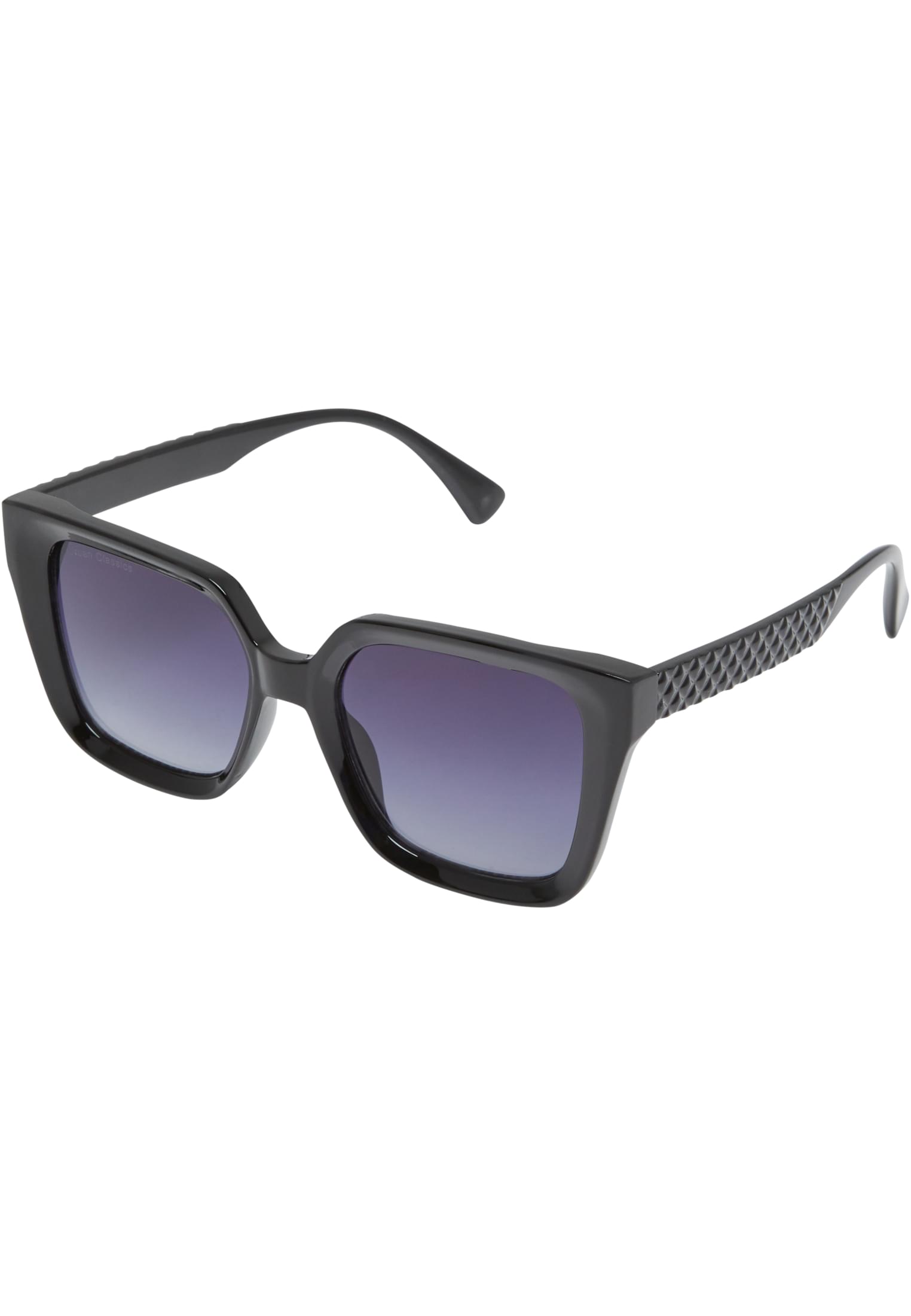
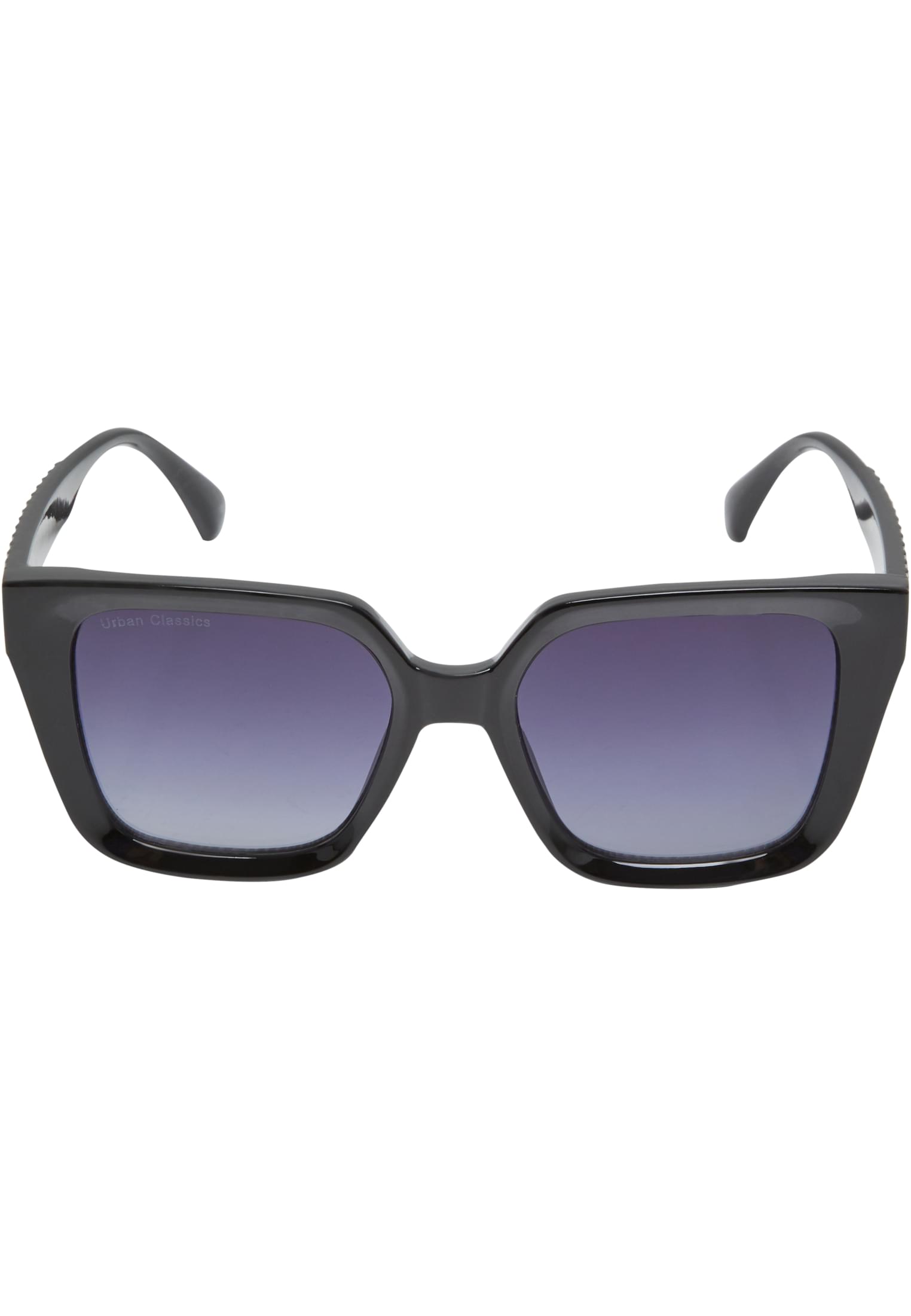
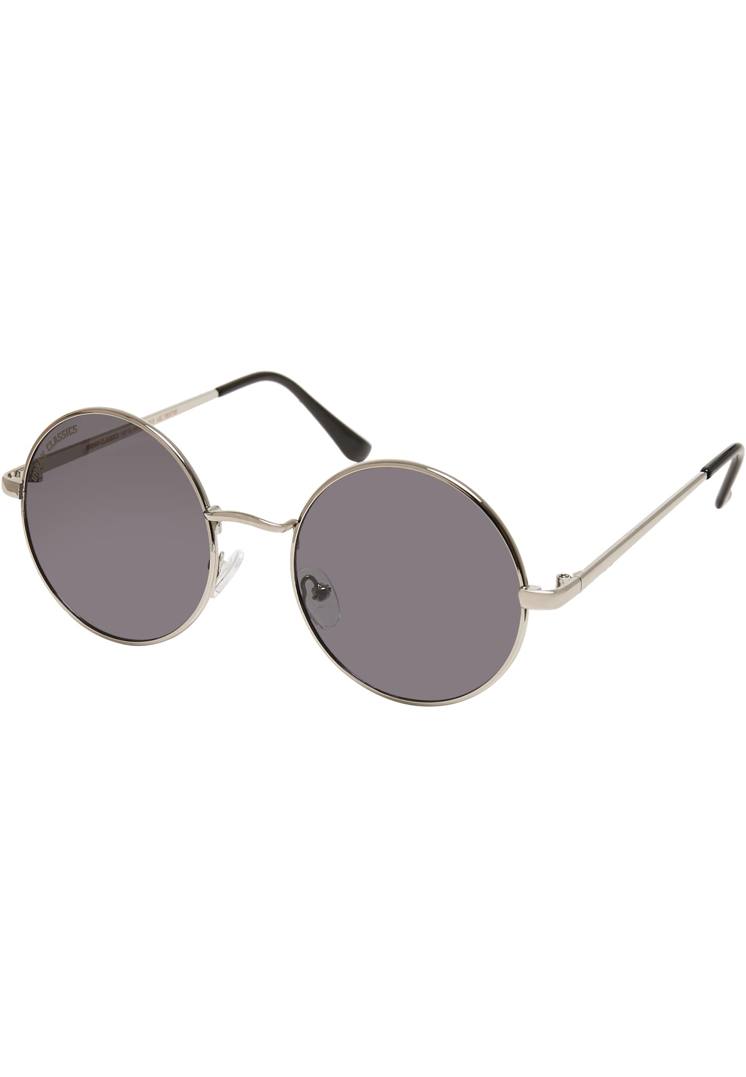
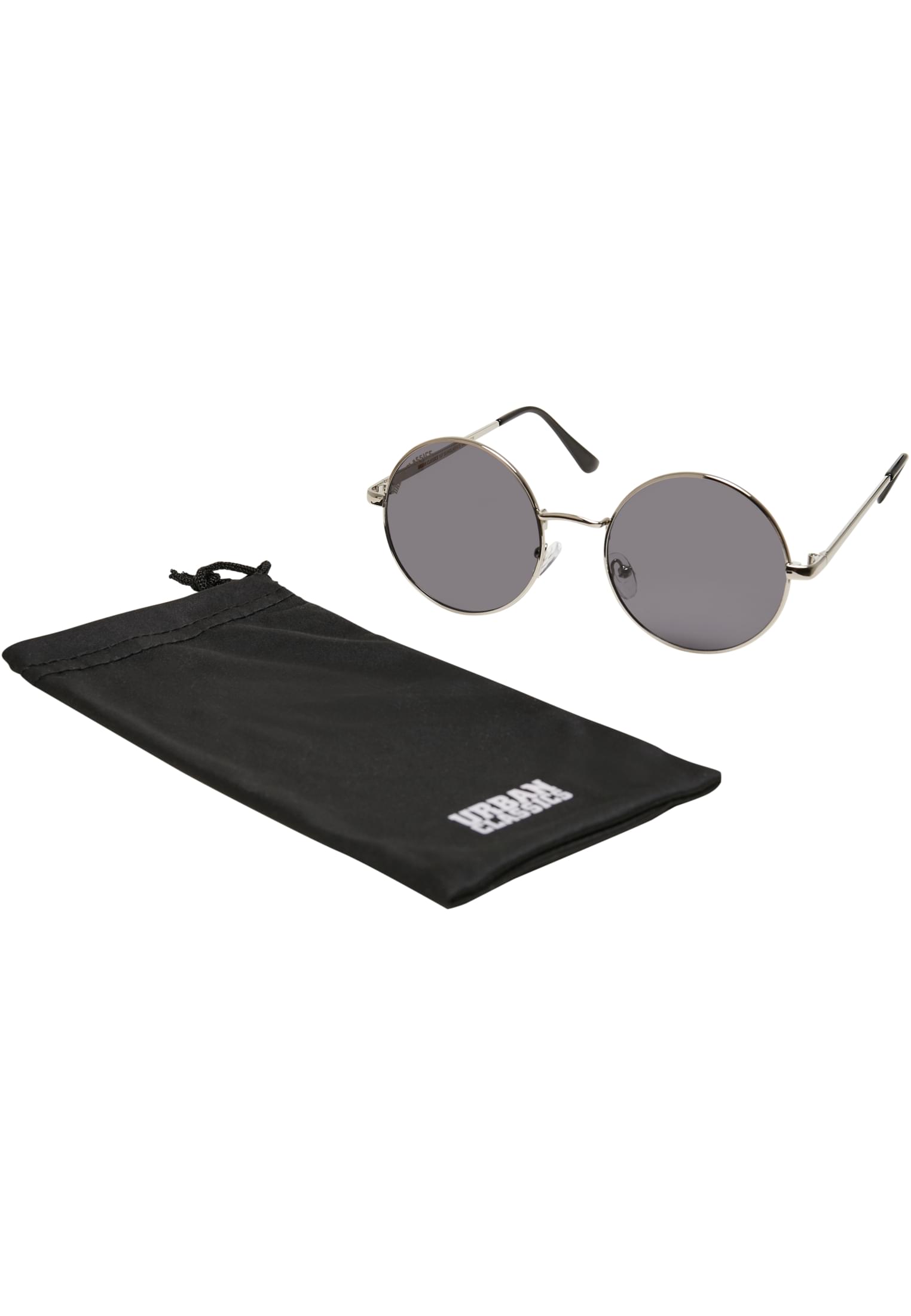
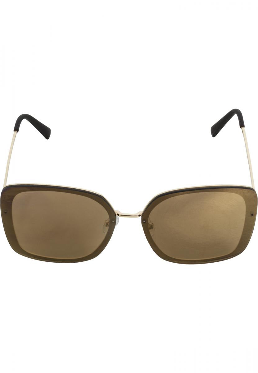
Trendiga solglasögon


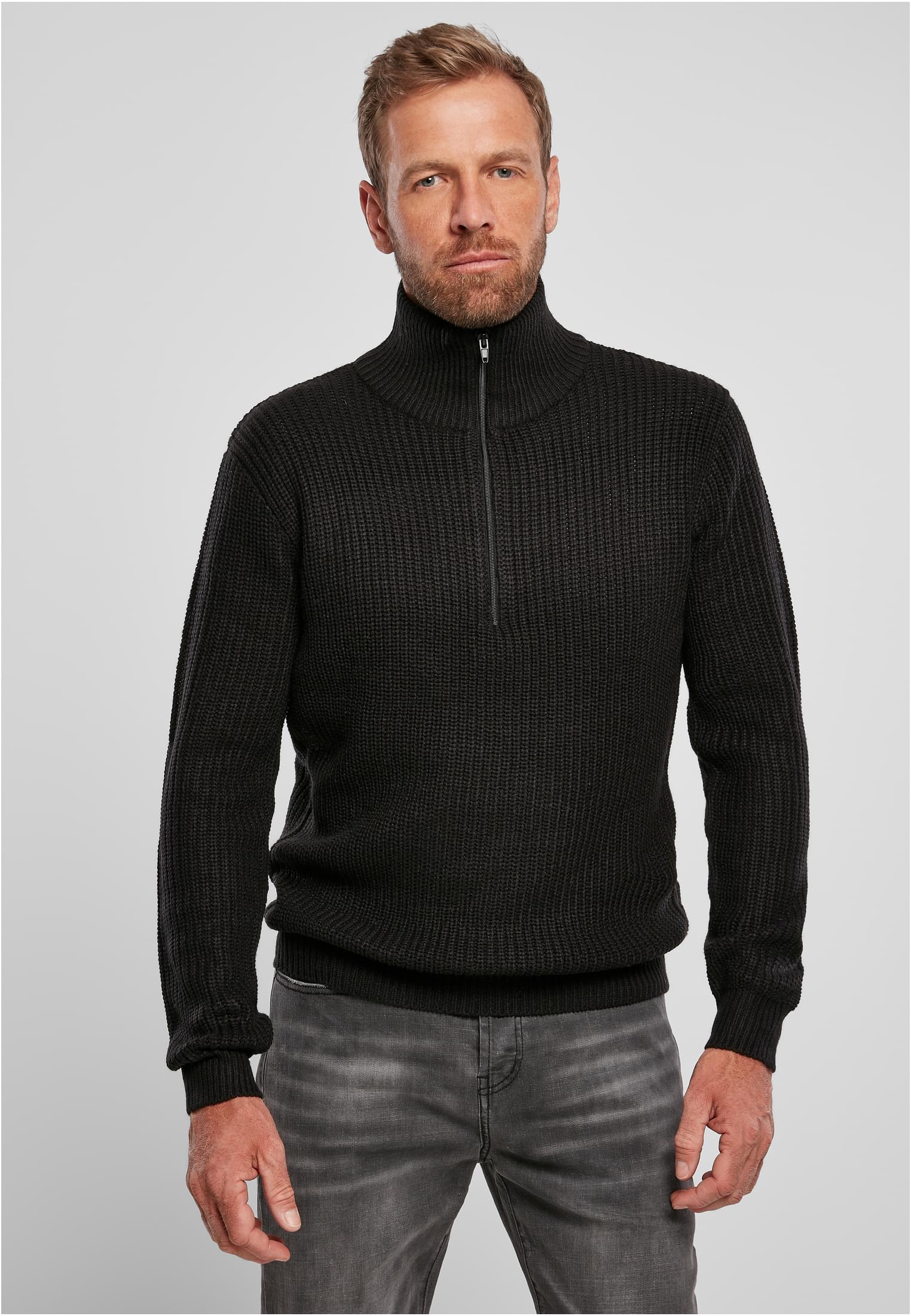
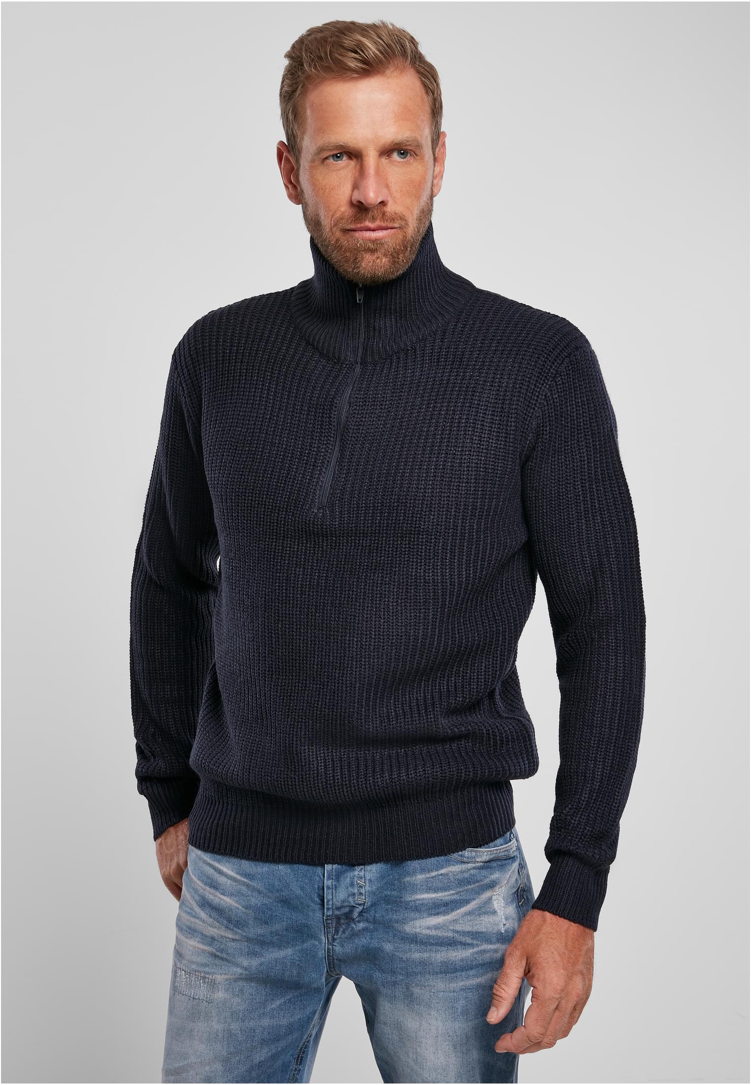
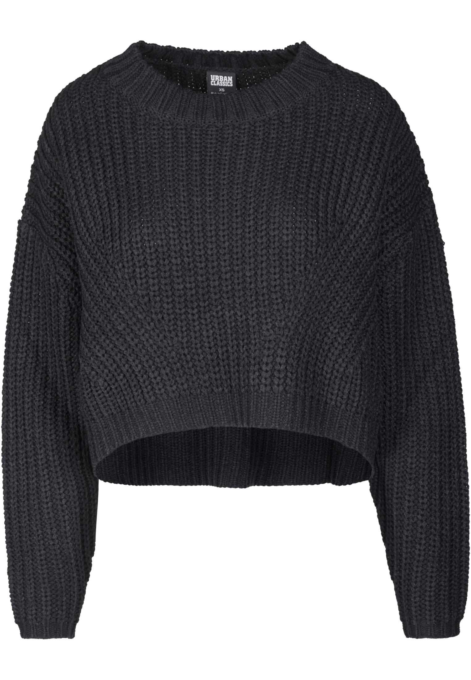
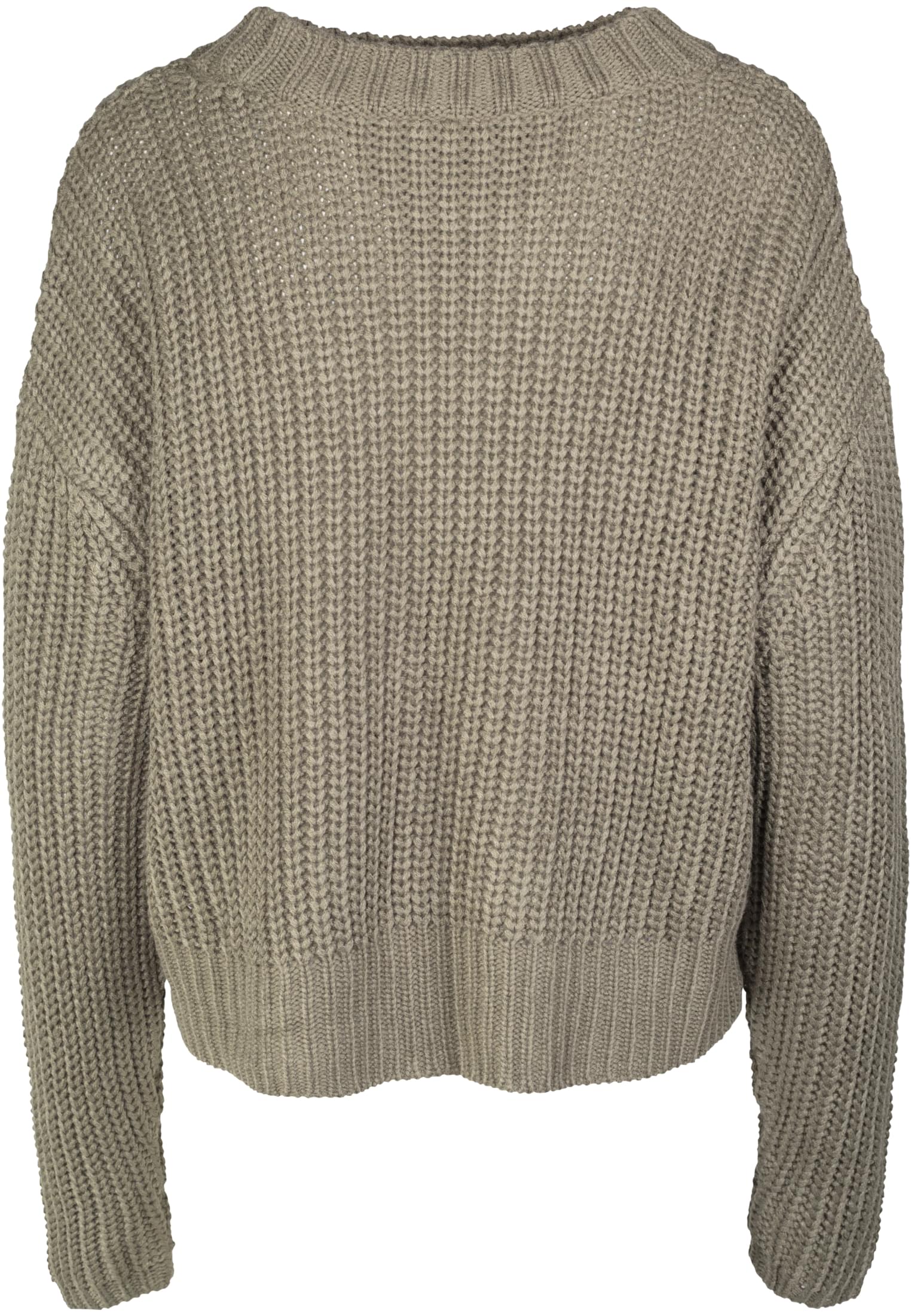
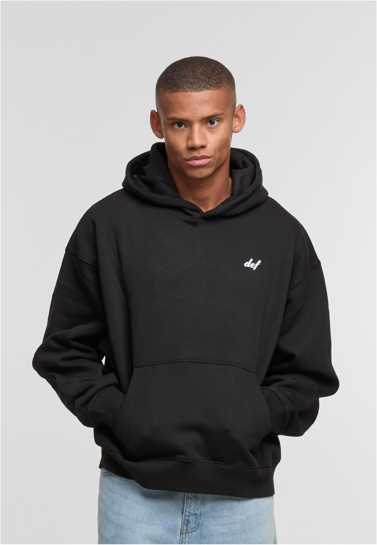
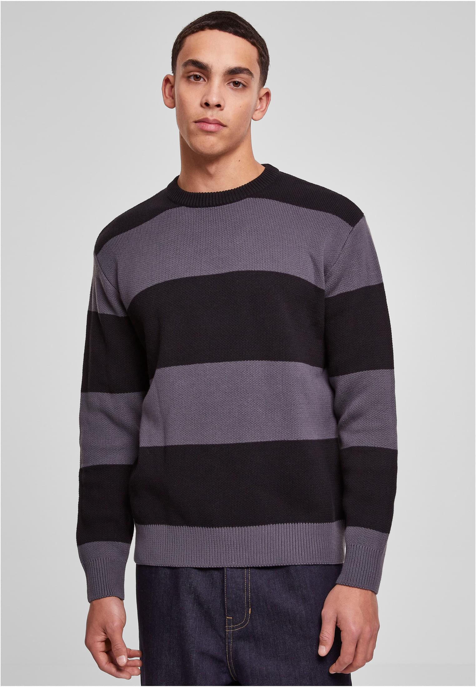
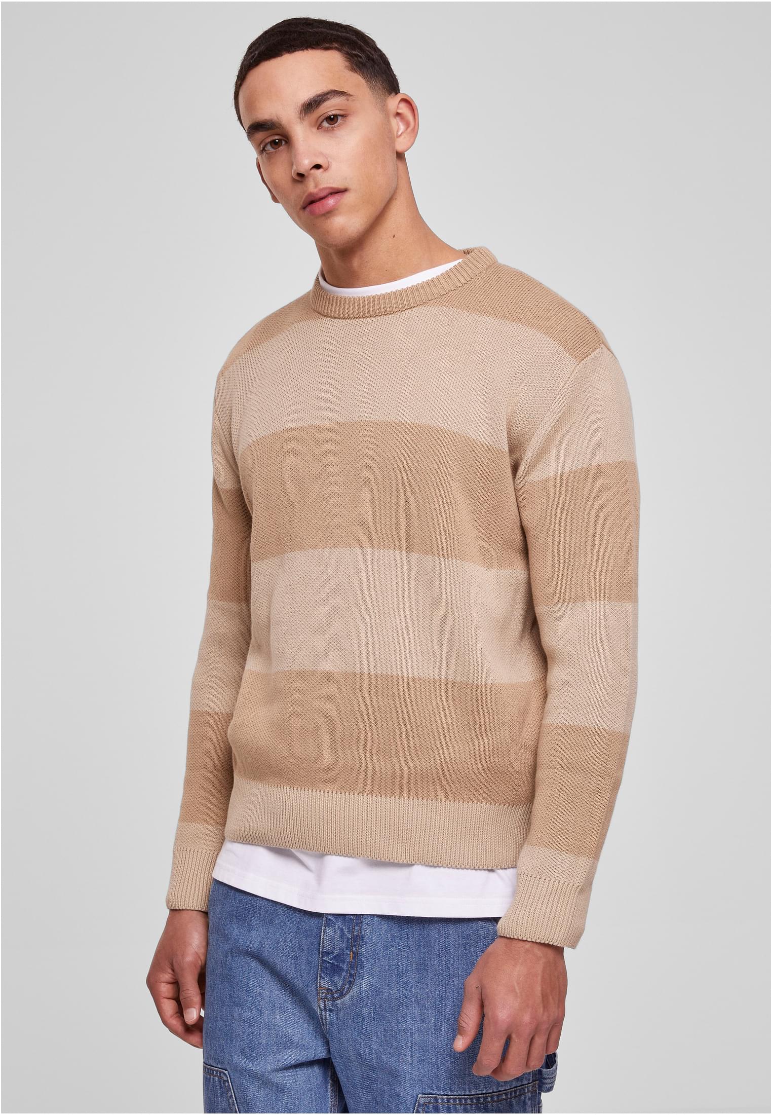
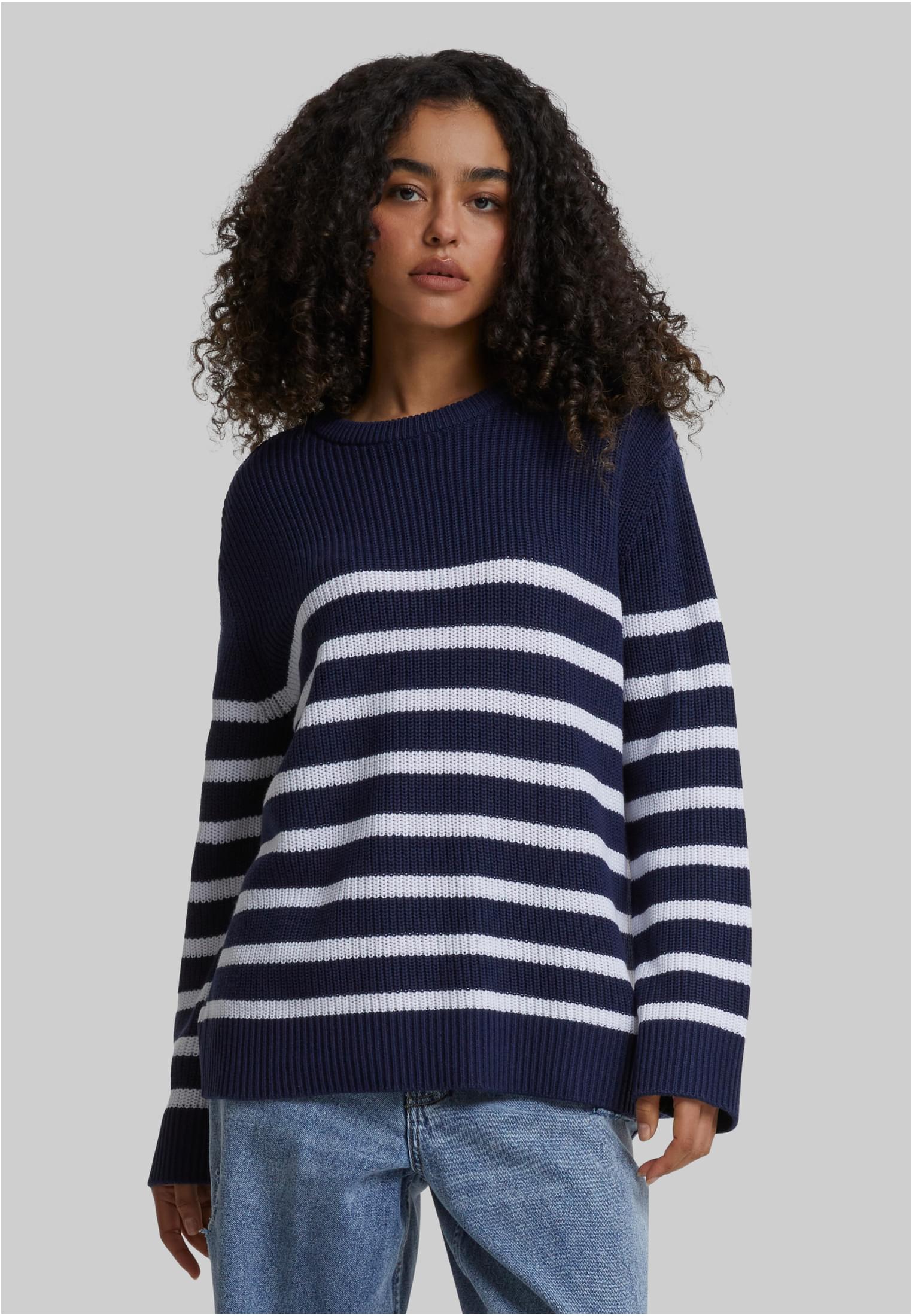
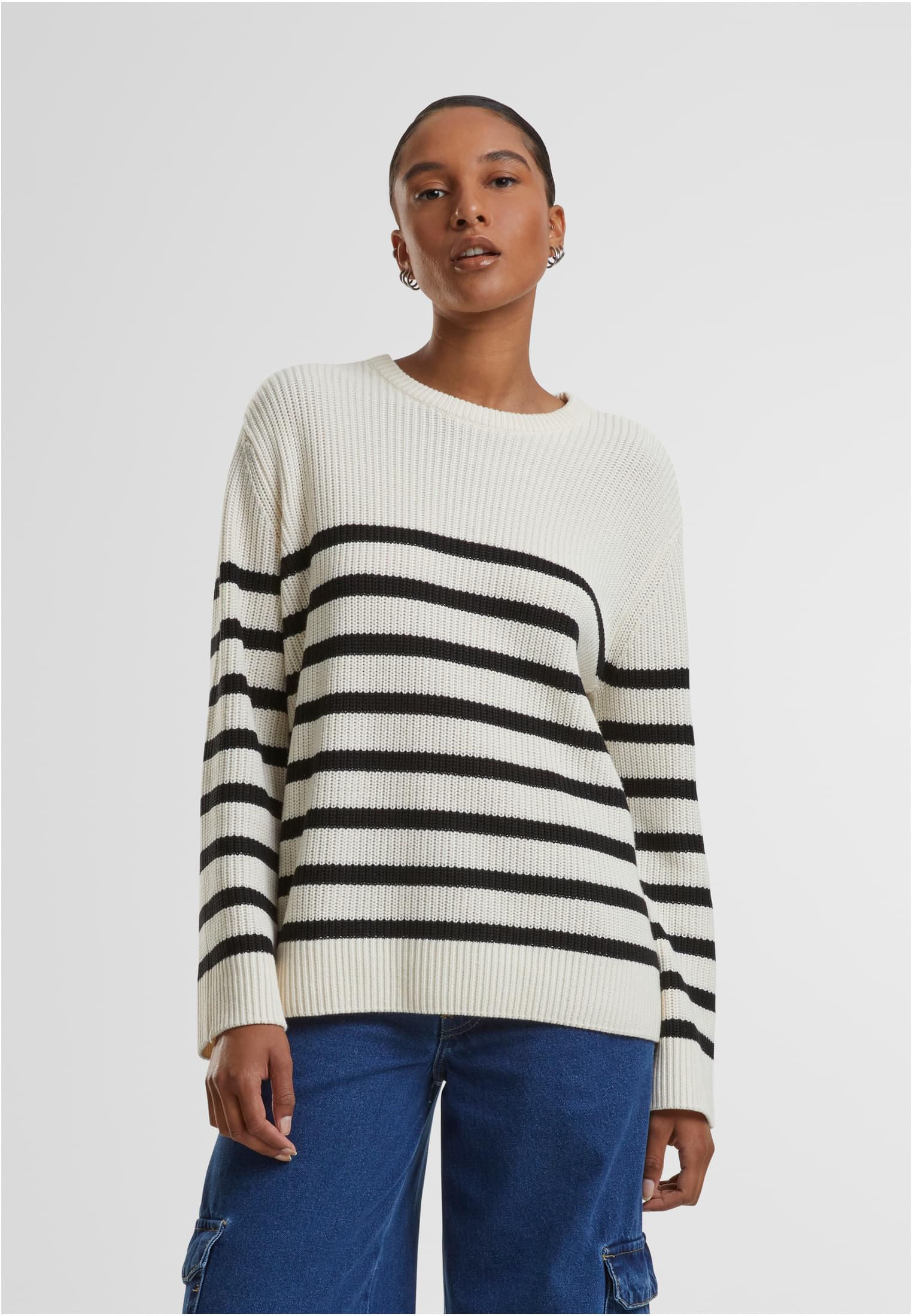
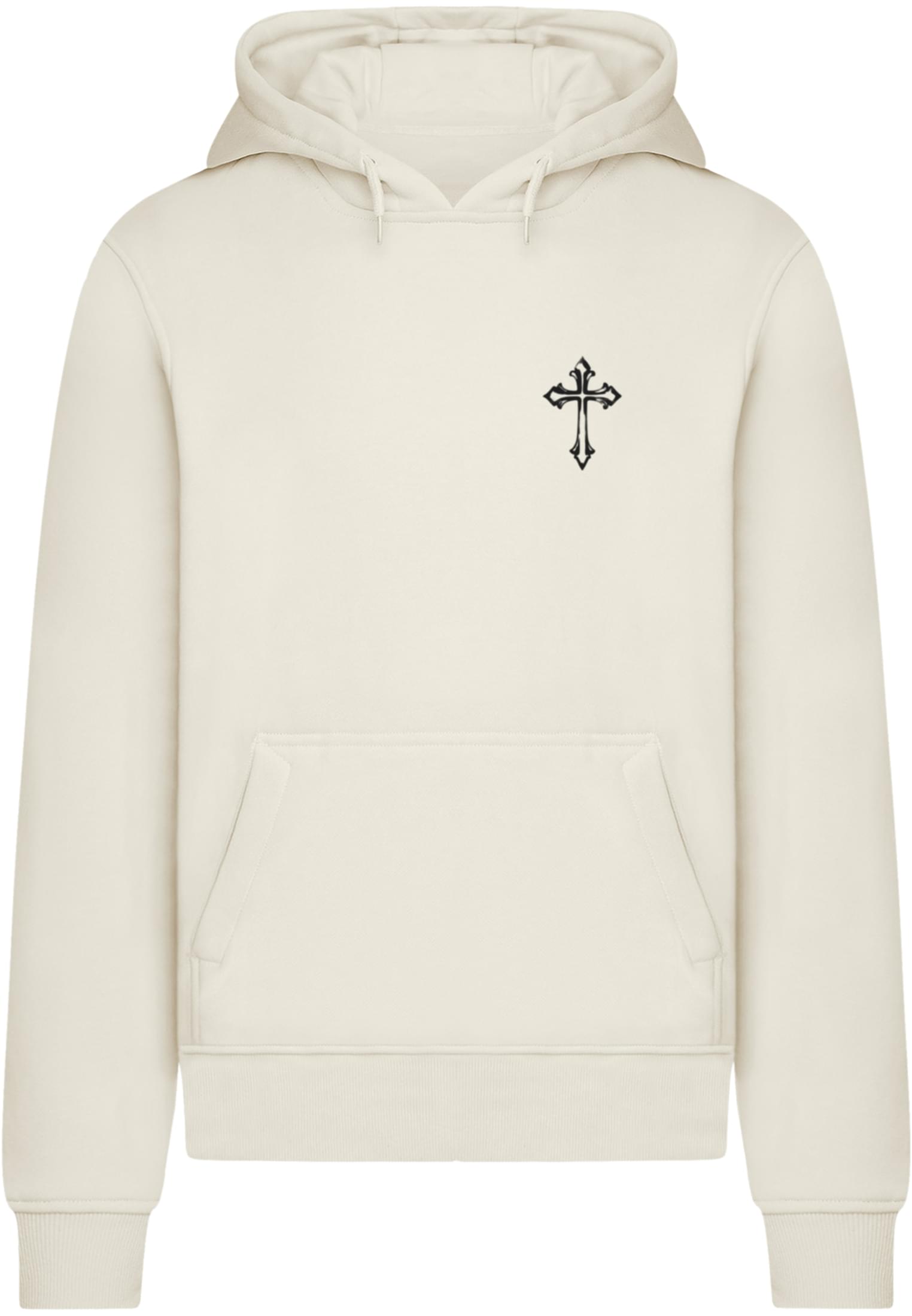
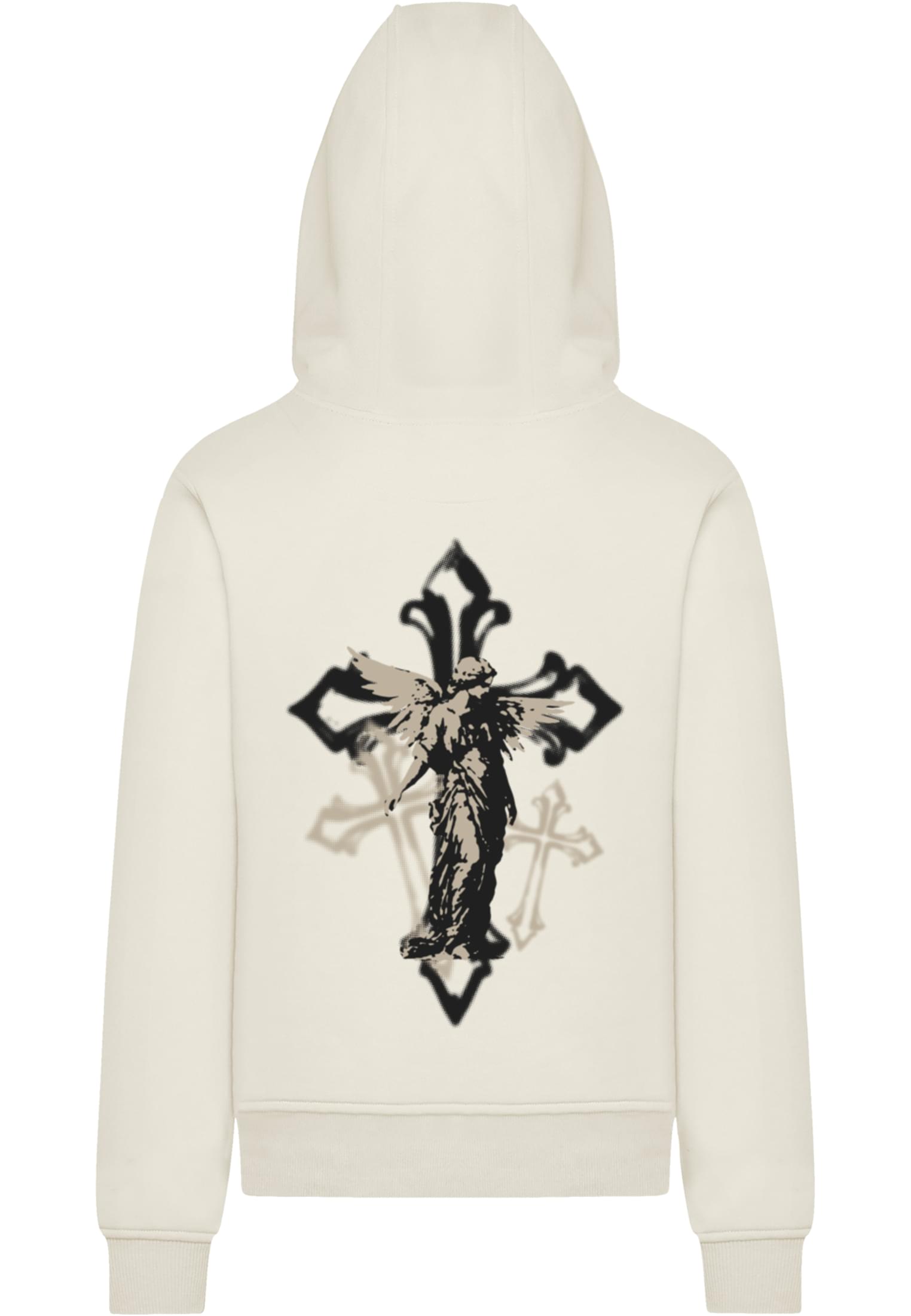
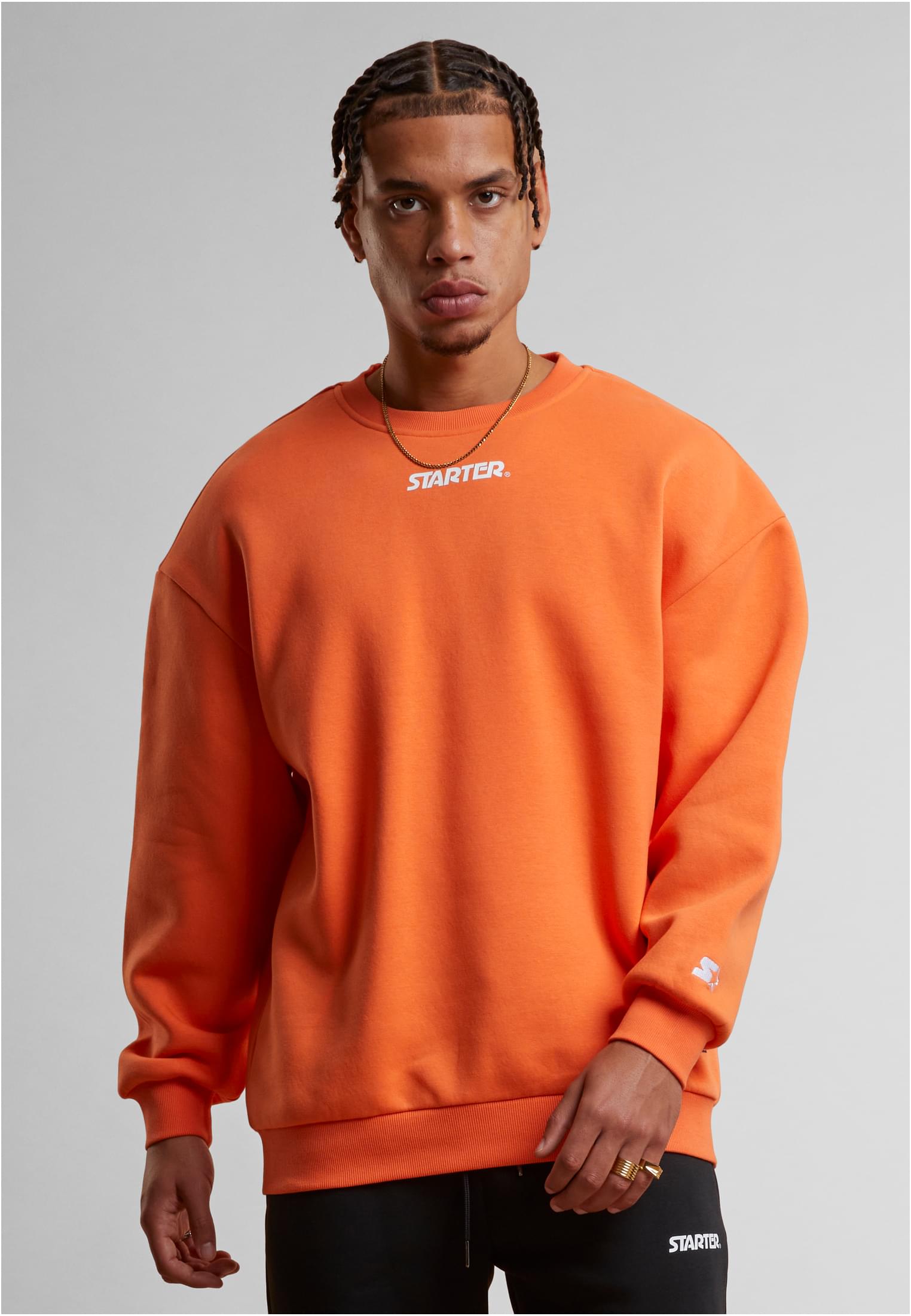
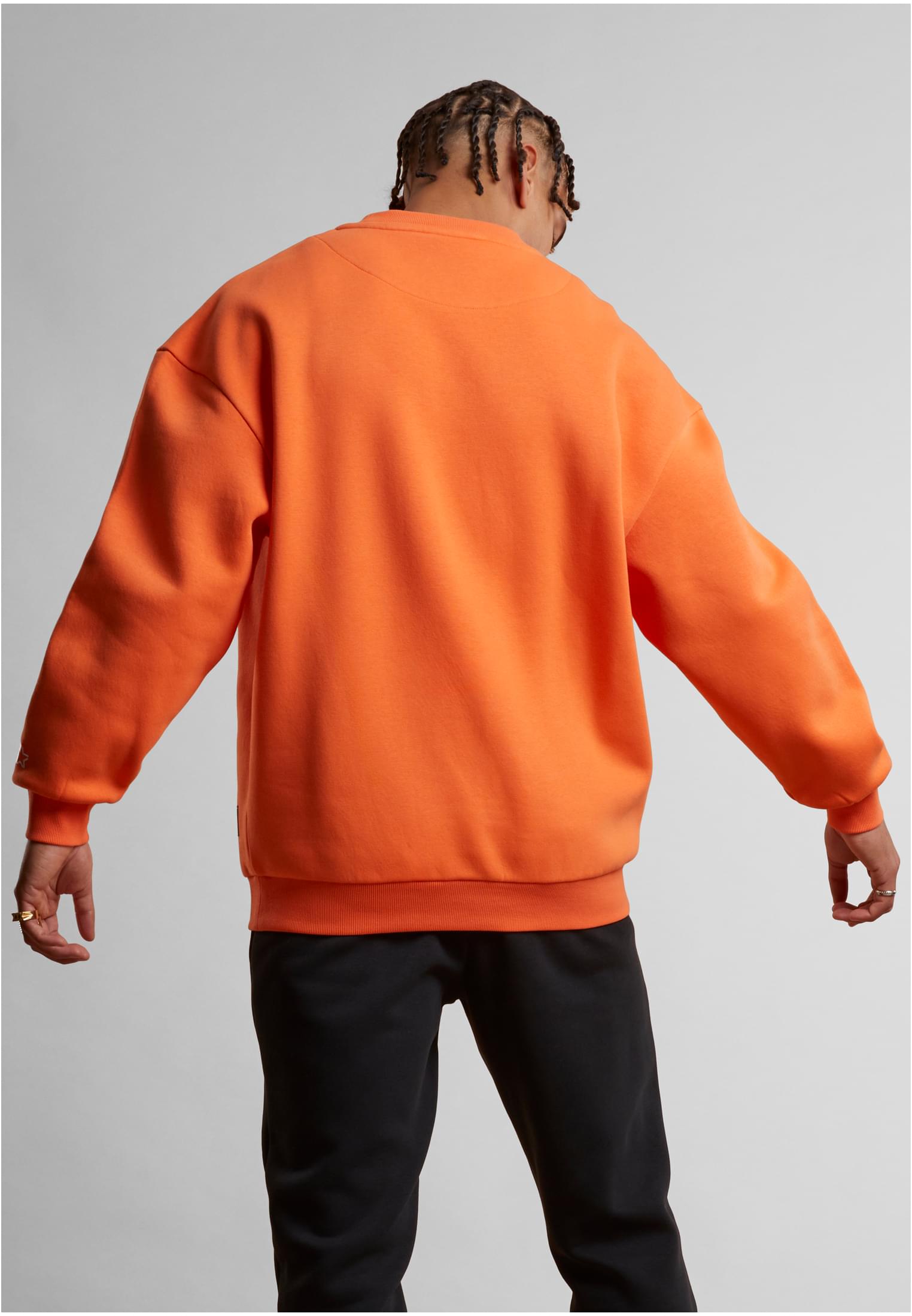
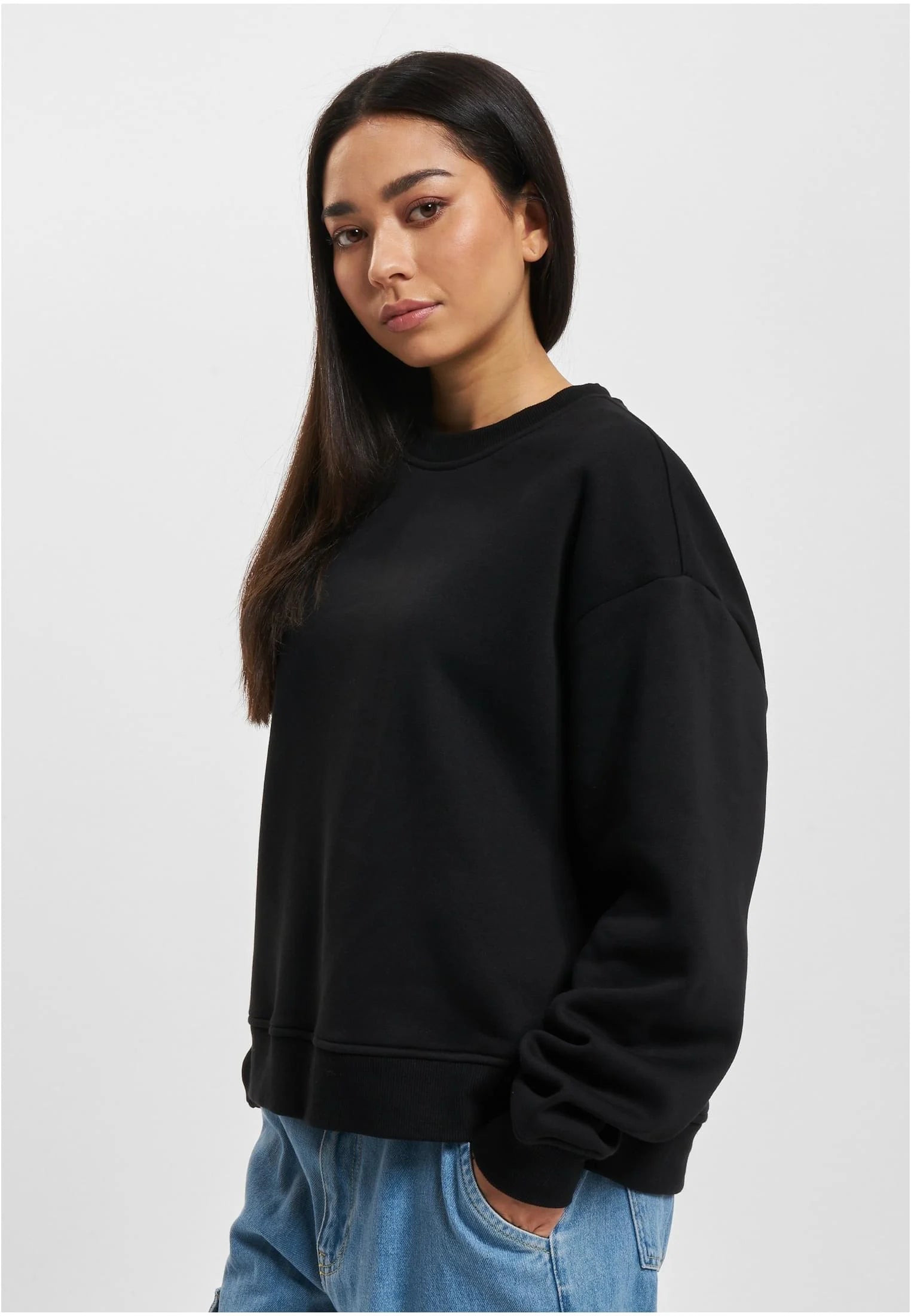
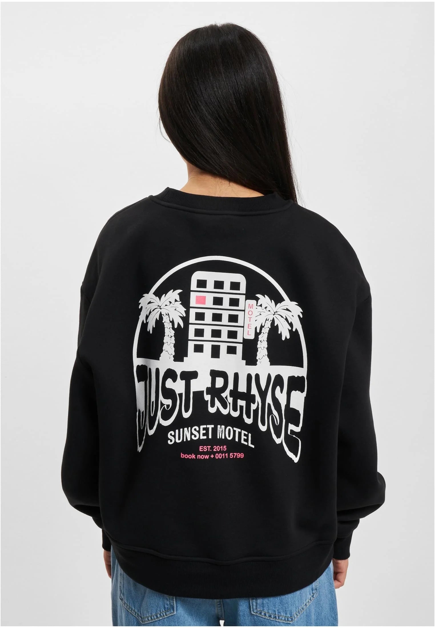
Tröjor för alla tillfällen
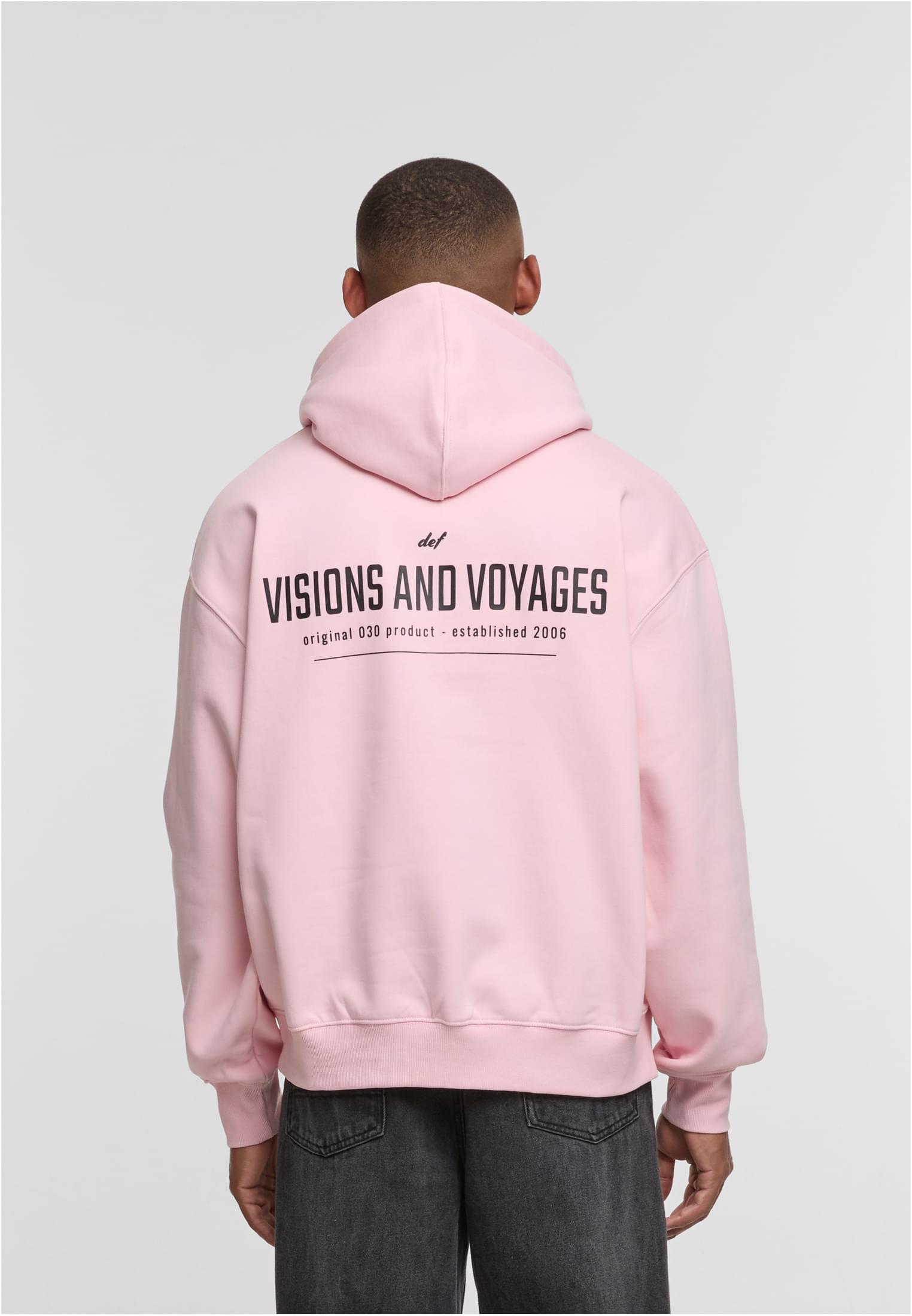
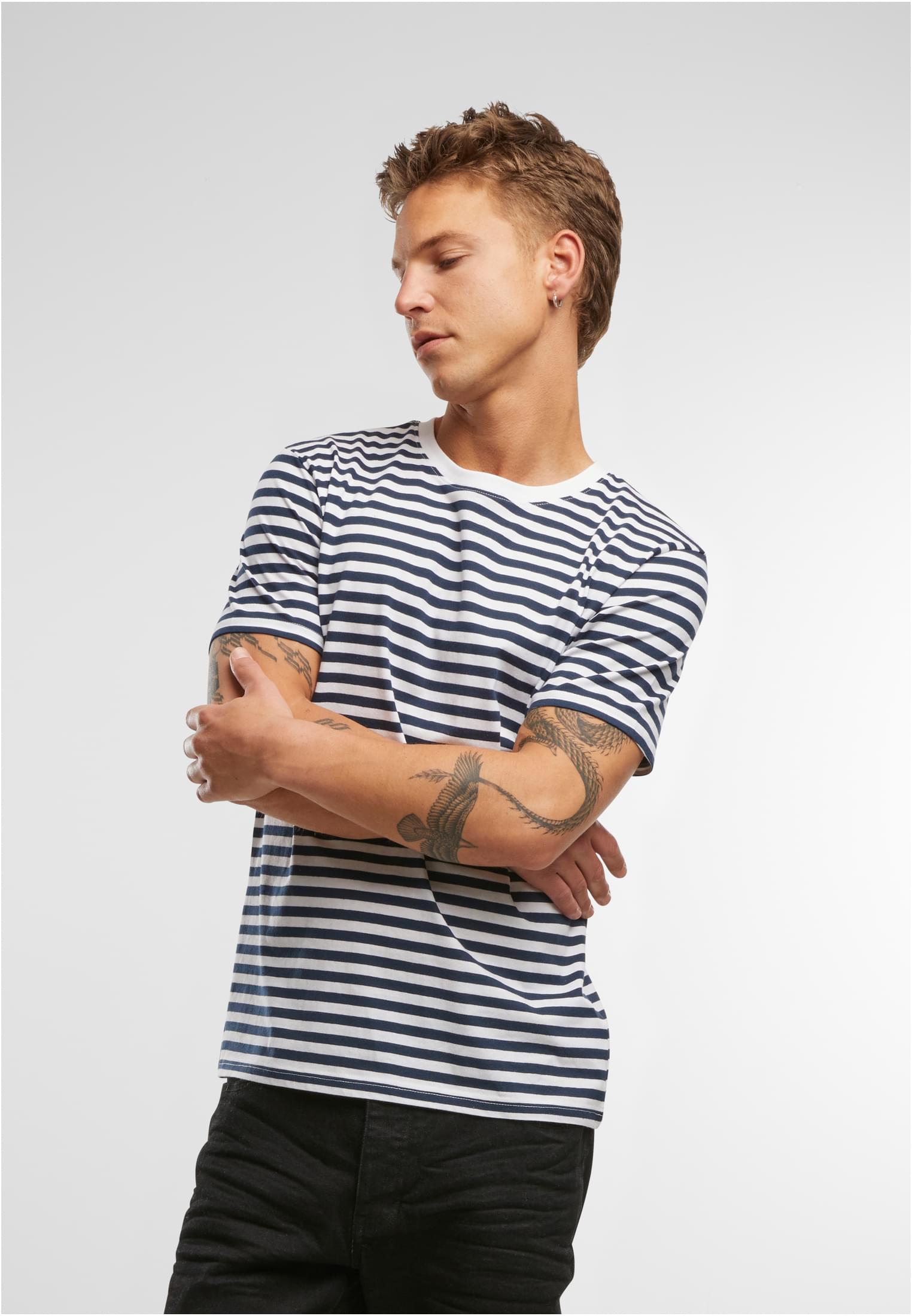
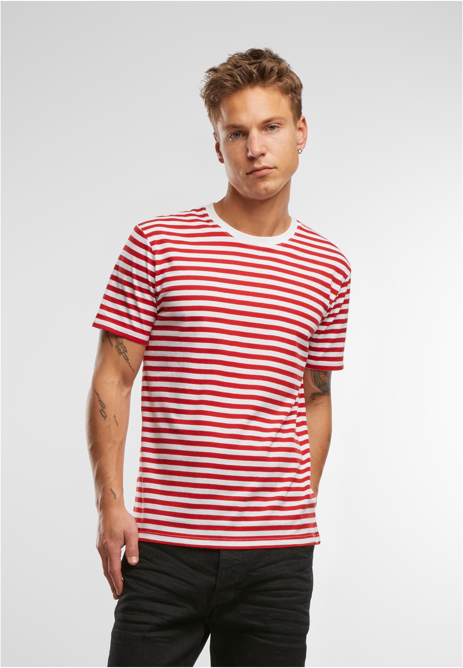
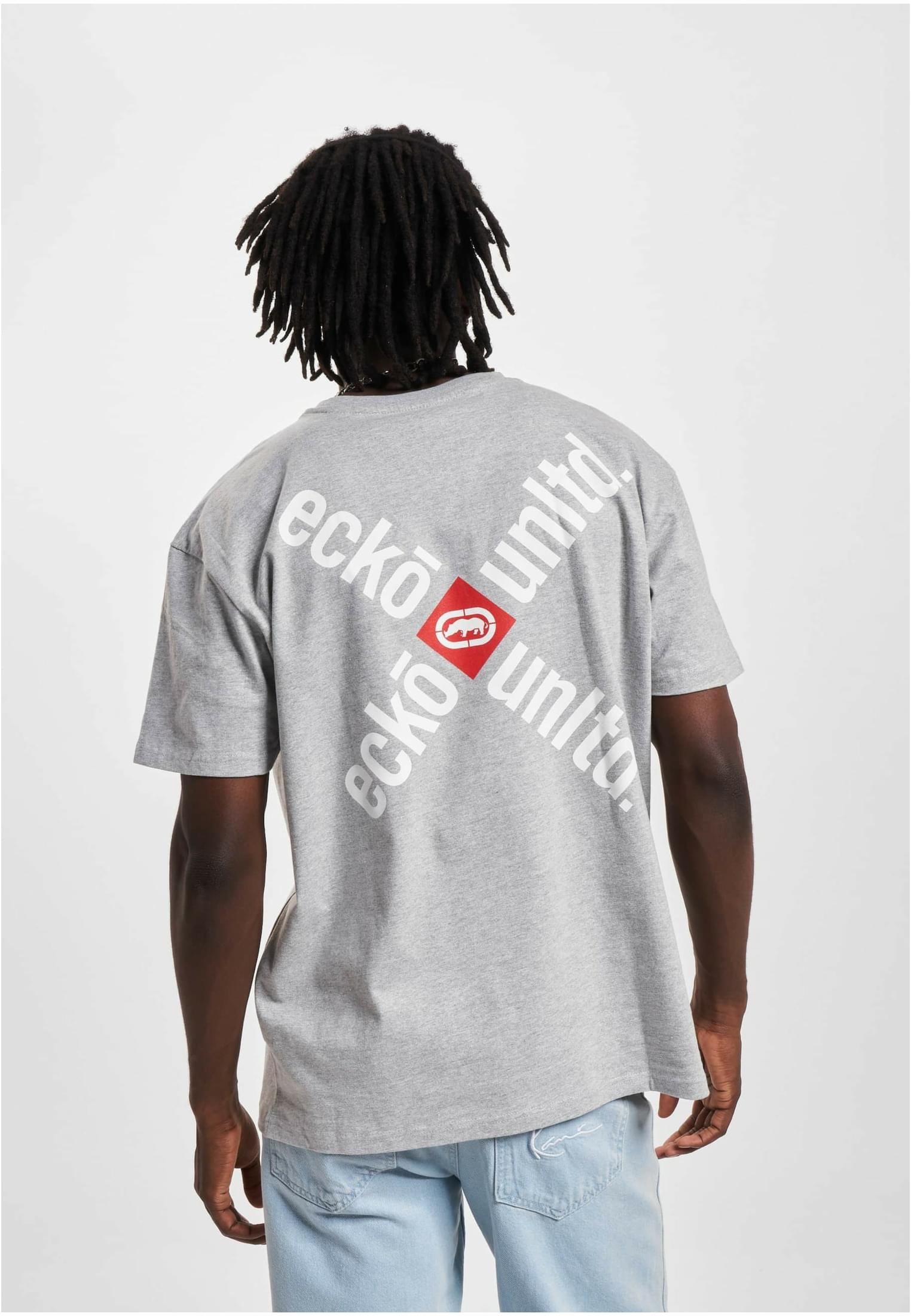
T-shirts med tryck
Herr & Dam


Streetwear & Träning - Blogg

Solglasögon skydda ögonen och lyft din stil med rätt val
Solglasögon är mer än bara en modeaccessoar – de är ett viktigt skydd för dina ögon mot skadlig UV-strålning. När solen står högt, särskilt under vår- och sommarmånaderna, utsätts ögonen för starkt...
Läs mer
Val av material och färg för att hålla dig sval i värmen
När temperaturen stiger blir valet av kläder avgörande för hur bekväm du känner dig under dagen. Rätt material och färg kan göra stor skillnad för hur kroppen reglerar värme, särskilt när du är akt...
Läs mer
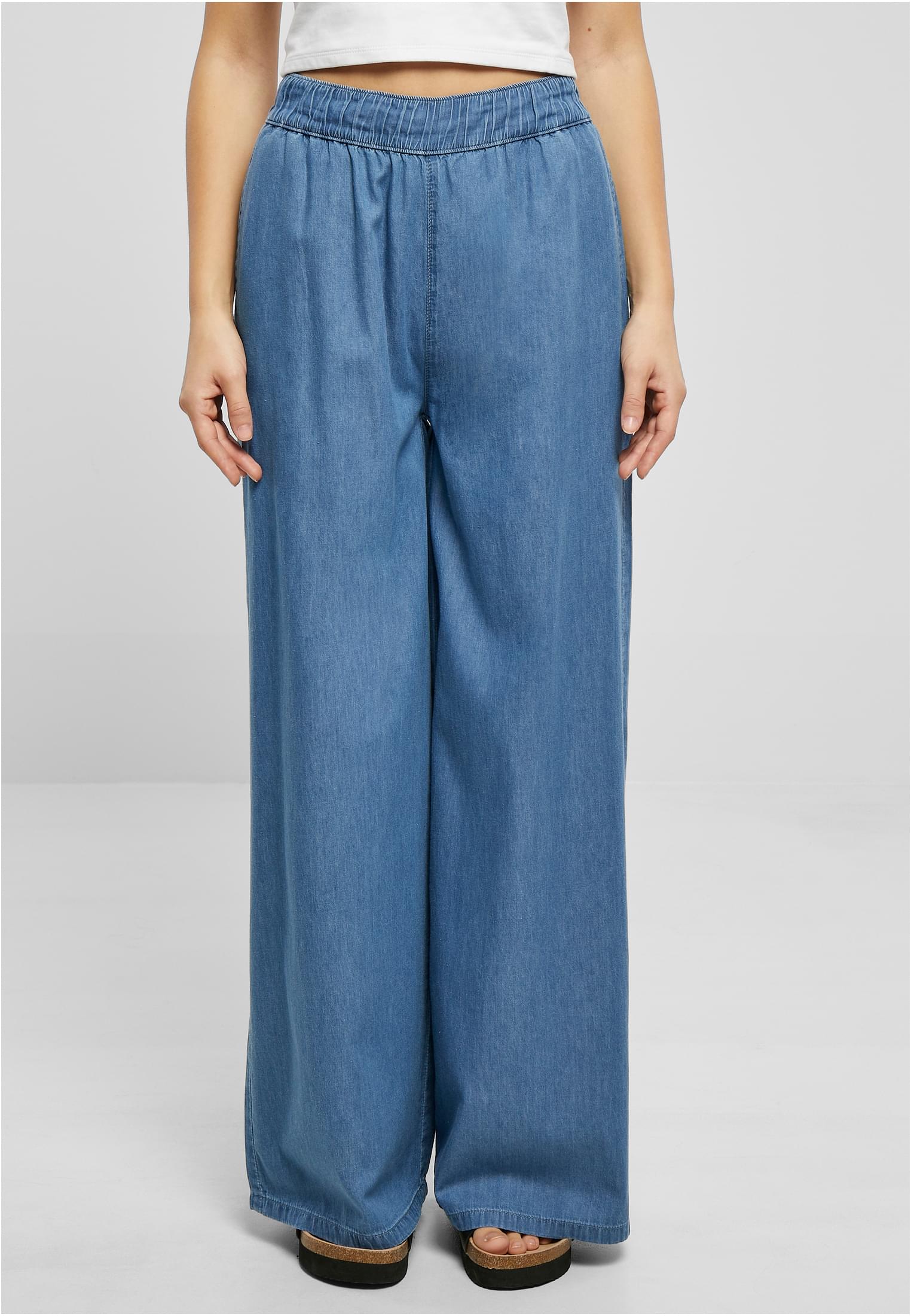
Komfort och stil för varje dag
Sköna kläder har blivit en självklar del av moderna garderober där komfort väger lika tungt som stil. Oavsett om du är hemma, på väg till jobbet, ute på stan eller har en aktiv dag vill du...
Läs merVanliga frågor & svar
Leveransmetoderna varierar beroende på plats och visas tydligt i kassan, så att du kan välja det som passar dig bäst.
Vi levererar innom 3-8 dagar inom hela sverige.
Du kan kontakta vår kundtjänst på info@workoutbrands.com
Hos oss har du alltid 30 dagars öppet köp, förutsatt att plagget är i nyskick.
Vi erbjuder storlekarna XS–5XL på de flesta av våra plagg. Tillgängligheten kan variera beroende på lagersaldo.
Vi erbjuder flera smidiga och säkra betalningsalternativ. Betala enkelt med kort, Swish eller Klarna . Vi accepterar alla större betalkort, inklusive Amex.
När din order har skickats får du ett leveransmejl med en bekräftelse. I mejlet finns en spårningslänk som gör att du enkelt kan följa ditt paket.